Design Dilemma: Amazing Attic Conversions
With more people opting for smaller homes, it’s natural that more of us are also looking to carve out some extra living space from formerly unused parts of our houses. First on the list? The attic!
Formerly left to boxes of holiday decoration or a visiting squirrel, today’s attics are now used as family rooms, bedrooms, media rooms, studies, or even separate mini-apartments. These spaces, when planned smartly, can become cozy areas perfect for gathering with the family for a boardgame or curling up with a good book.
Let’s take a look at some nicely planned spaces:
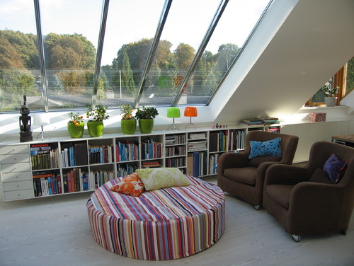
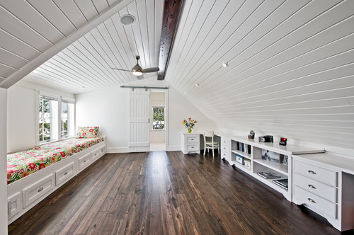
Above, this attic family room is bright, airy and beautiful. That’s because the architect smartly designed the space to get in as much light as possible. In fact, that seems to be one of the primary rules in attic conversions: look for opportunities to open up skylights and attic windows where possible. Increased light and airflow will go a long way to making your attic feel livable. Here’s another example:
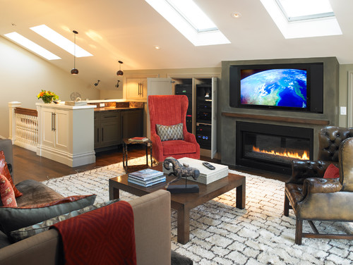
Remember that in most cases, the more skylights you are able to add, the better your space will feel.
Another secret for a successful attic remodel includes the liberal use of built-ins for storage or sitting. The attic conversion below smartly makes use of the low part of the attic for a window seat, a study space and built-in drawers and shelves.
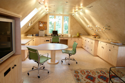
The attic conversion below uses a built-in cabinet and countertop to utilize low ceilings. It’s perfect as a workspace or hobby counter:
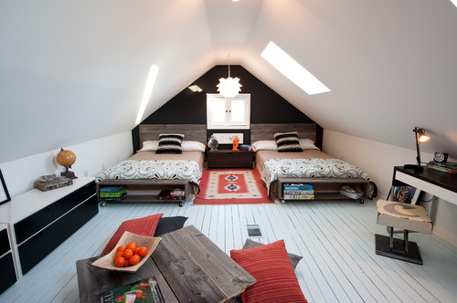
Even if you opt not to add built-ins, you can still utilize the low part of your attic by including lots of low furniture. Low ceilings are the perfect opportunity to add Japanese-style platform beds and other types of furniture with a low profile. Notice how the twin beds below make use of every inch of space in this attic conversion:
Attics are the perfect places for floor pillows, futon mattresses and low-slung ottomans.
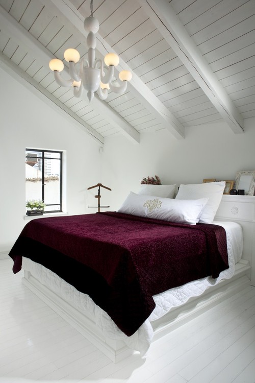
Many of the best attic conversions we’ve seen make use of one easy principle. They keep walls and floors light and bright. Take a look:
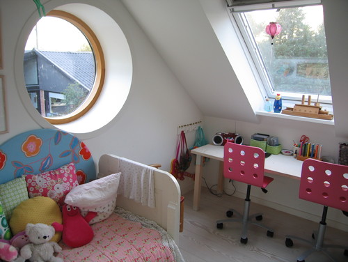
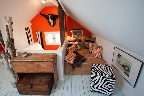
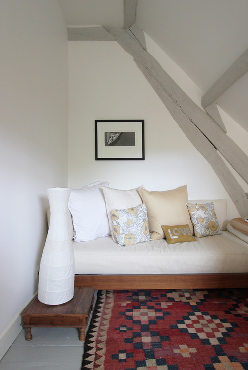
In the attic conversions above and below, white walls AND white floors reflect light and allow the space to feel expansive. It even works in the tiny space below.
It’s fine to highlight architectural details in your attic but doing so won’t make your space feel larger. One way to both show off architectural details while keeping the space expansive is to highlight details, like the beams above, in a light neutral color that is only a shade or two darker than your white walls.
So let’s recap on the keys to a successful attic conversion:
- Get light and air into your space by adding lots of skylights and windows. Usually, you can’t add too much light.
- Use built-in features to make the best use of low ceilings.
- Use low-slung furniture, including low platform beds.
- Paint everything white, including floors.
By following these few basic rules, your attic may become your favorite part of your home!
Leave a Comment