Design Dilemma: A Small Bungalow with Style
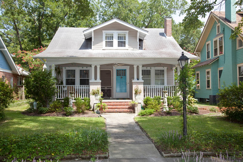
A bungalow is defined as a low house, with a broad front porch, having either no upper floor or upper rooms set into the roof, typically with dormer windows. Bungalows are a big part of the American landscape — especially in cities like Los Angeles and San Francisco, where many neighborhoods are a mixture of bungalows done up either in Craftsman or Spanish stucco style. The picture above is very typical bungalow.
What’s really cool about bungalows is that their small stature — usually just five or six rooms of no larger than about 1500 square feet — is perfect for today’s lifestyle. Small means less to furnish, less to heat, less to decorate, less to pay for, usually increased walkability, and certainly a lighter footprint on the earth. And that’s where we’re all at these days!
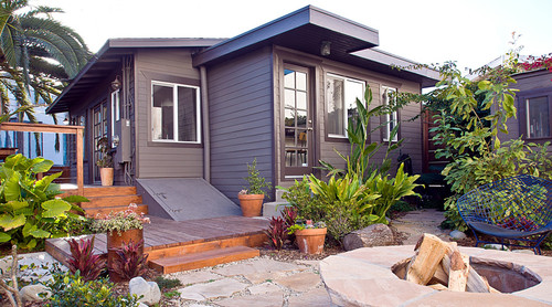
The best thing about bungalows is that though they normally have a very classic layout, they are incredibly easy to adapt to any family’s needs. Below a beachy bungalow in Venice, California exemplifies the adaptability of this house style, showing that the bungalow does not have to mean dark or drab, as many people think.
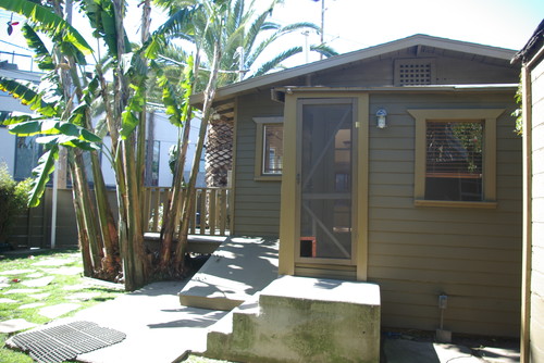
The exterior shot above gives you a sense of the small size. This two bedroom home, owned by architect Cayley Lambur and her partner Kyle Blasman, is a diminuitive 750 square feet. A 1914 Craftsman bungalow, the home, at the time that the couple bought it, suffered from problems with mold and dated finishes But Lambur was able to dramatically change the character of the home by opening things up and keeping everything bright and light.
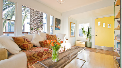
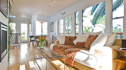
In the long, narrow livingroom, pictured above and below, the front door opens directly onto the livingroom (as is true in many bungalows) that means there’s no wasted space of a hallway. A long bank of windows makes natural light the stand out feature of this home.
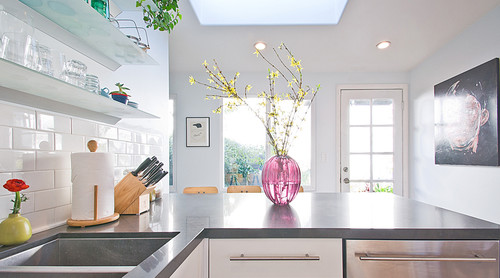
Lambur opened up the floor plan of the home by taking down a wall that divided the living room from the kitchen. She added a peninsula to give the kitchen an L-shaped layout.
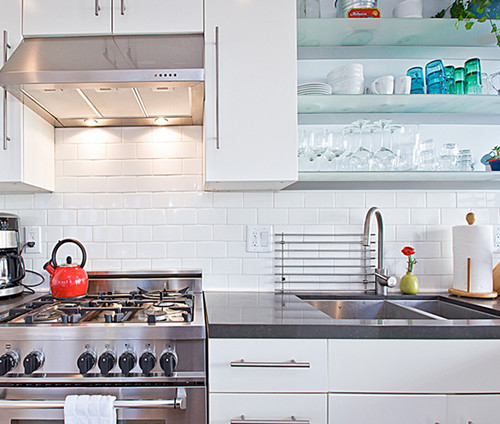
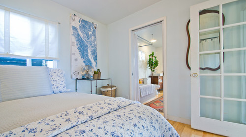
In keeping with the small scale of the home, Lambur chose smaller, Euro-styled appliances. And below, the bedroom feels airy and open, thanks to Lambur’s choice to open up an extra door leading to the bathroom, which was formerly only accessible directly from the living room.
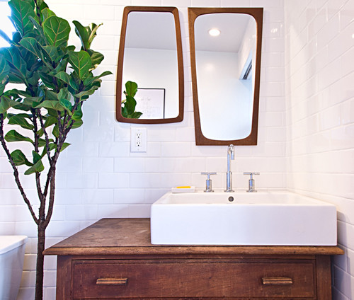
Below, a photo of the renovated master bathroom.
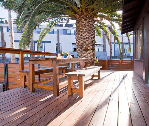
And here’s the backyard deck:
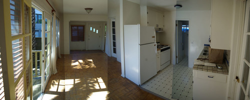
And in case you’re interested in what it looked like before, the photo below gives you an idea:
What a wonderful transformation, proving that comfortable, bright and light, doesn’t necessarily mean big!

Leave a Comment