An Artist and his Wife Retires to Home that Soars Over Nara
This work by architect Yoshiaki Yamashita features a unique roof with an amazing sky box.
The home is sited on a hill that overlooks the city of Nara in Japan.
An incredible cantilever far over the entrance is starkly solitary, the only detail on a blank wall, with just a hint of the hole in the roof.
As you approach it is clear that interesting things are going to happen.
While bedrooms are on this floor, you are compelled to continue to explore the sky.
As you continue, the light becomes brighter.
You’ve made it to the top of the world!
What a homecoming.
Under that perch in the sky is what seems like an outdoor living space for eating and living.
The space can actually be enclosed by sliding glass.
But it can also be enjoyed as an open air platform during Nara’s warm summer and spring weather.
What appears to be a dropped ceiling above the concrete kitchen counter is actually that sky box viewing spot.
The bold and brave home is all the more surprising as it is for a retired couple.

Unusually, while the living room is upstairs, bedrooms are on the middle floor.

The basement floor is an art studio.

The husband enjoys the deep quiet space of exposed concrete in the basement to work on oil paintings.
And after a day’s work oil painting in the basement, where better than to rest than in this magical place in the sky!
Design Dilemma: Black and White and Green with Envy
Are you looking for a way to bring classic simplicity to your kitchen without seeming too out of step with today’s modern looks? There’s one reliable way to bring classicism and spunk all at once to your kitchen: Go black and white!
Black and white comes in many flavors and there are tons of opportunities to bring the stark graphic feel to a kitchen and either dial it up a bit or tone it down according to the effect you’re seeking.
Let’s check it out.
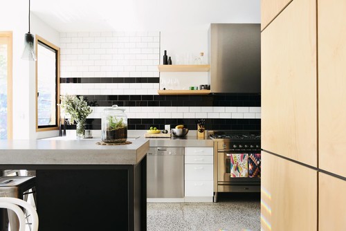
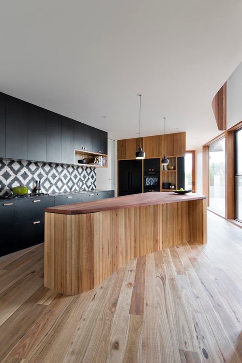
While the kitchen above retains a very classic feel using black and white subway tiles, a classic terrazzo-style black and white speckled floor and a stainless steel, commercial grade stove, it still has a modern vintage feel. The kitchen below, however, uses black and white in an unmistakably modern way by going with modern cabinetry and a striking modern organically-shaped island. All the drama comes in the black and white tiled backsplash that retains a kind of Ikat look.
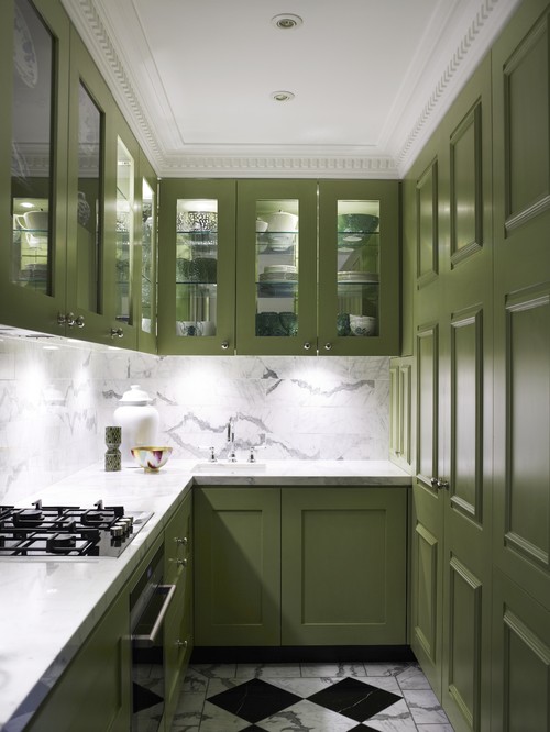
The kitchen below is totally classic. From the Carrara marble backsplash to the window-paned cabinetry boasting beautiful mouldings to the black and white tile floor (the white in the floor picks up on the marble backsplash) this kitchen speaks of Old World elegance that will never go out of style.
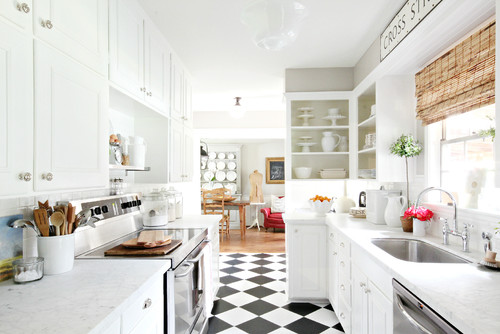
And speaking of black and white tile floors, you can absolutely never go wrong with them. Retro but so now! The kitchen below keeps everything white and simple, to allow the floors to carry the show.
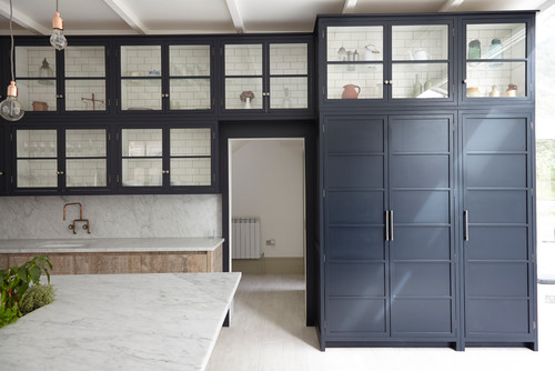
Are you looking for something even more dramatic than the black and white linoleum look? What about kitchen cabinetry painted black? The subway tiles inside the cabinets and the naked light bulbs make this kitchen feel completely on-trend:
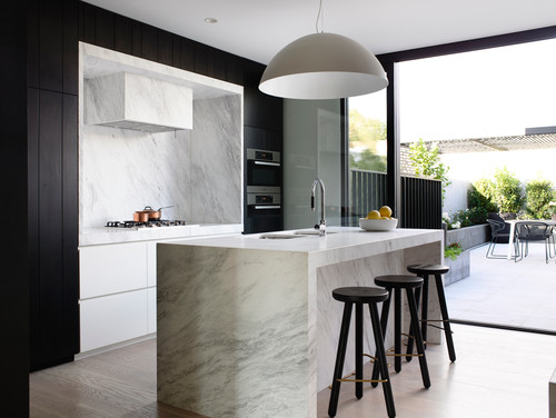
Below is an equally dramatic black and white kitchen:
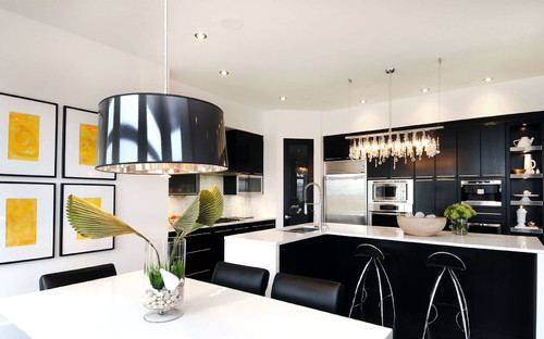
If you are a serious lover of drama, try using only black cabinets in a white room:
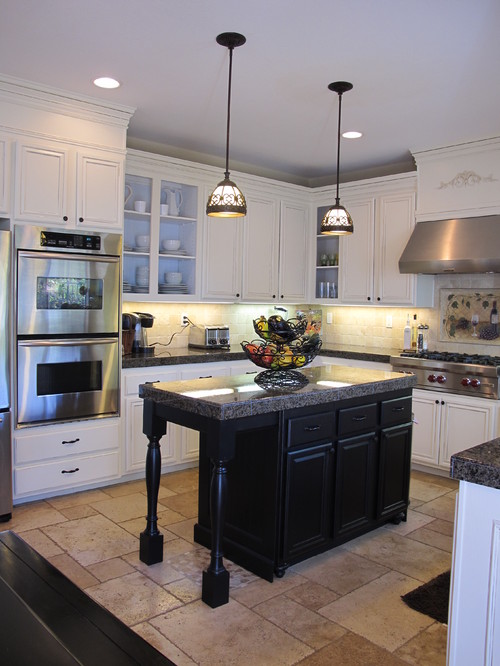
Not really feeling that much black? One easy way to get a crisp graphic look is by incorporating a black island into a white kitchen:
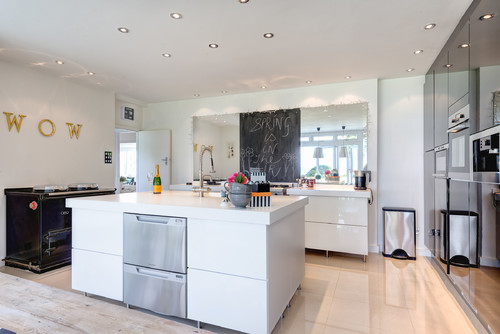
And what about bringing black and white in through unexpected elements. In the kitchen below, a chalkboard functions as the one graphic element that plays nicely against the white counters and cabinets. The wall of black cabinets adds modern chic.
So there you have it — black and white is one of the easiest solutions if you are unsure what kind of look or color you’d like to use in your kitchen. It’s simple, it’s easy, it always works. Plus, you can easily incorporate a third bright color such as red or yellow to really make things pop. We say, go for it!
A Vacation Home in Brazil Centers on an Indoor-Outdoor Pool
Overlooking Lake Furnas in Minas Gerais, Mutabile Arquitetura have built a vacation home that provides the perfect viewing platform.
Diners look directly out over the peaceful view from the center of the large family home.
The pool extends out from the center of a long building housing bedrooms on both sides.
Local stone slab walls and deep red stucco walls mark the private bedroom wings to each side of the central pool.
Stone slabs walls provide a real textural contrast.
A cozy smaller interior living room, faced in the stone slabs, is set to one side of the central pool.
The large family is housed to one side of the pool, while guest bedrooms are lined up along the opposite side.
The sun is to the opposite side from the view, cooling the interior.
Along the back corridor along both wings, the bedrooms can also be approached under a glass roof.
Pebbles and concrete suggest that this corridor is outdoors.
What could have been dark corridors along the bedroom wings is sky lit, sharply delineating the gritty texture of the stone.
This long winding sky light marks the path throughout the circulatory bedroom wings.
By contrast, textures in the central social areas around the pool are polished, smooth and cool.
The indoor-outdoor pool with its overhead doors in metal and glass can only be closed to above the water level, so this home works only in a temperate climate like Brazil.
This is a wonderful vacation home that houses 12, for the family and their many guests to enjoy.


