Design Dilemma: Accent on Accent Chairs
So what’s all the fuss about accent chairs? If your living room includes a couch, you’re good to go, right?
Well, maybe, but maybe not.
While accent chairs can provide useful and practical seating in many instances, they can also play a decorative role that can set the tone of the entire room. If you think of the extra depth an added spice can give to your favorite chili recipe, you’ll be coming close to what an accent chair can do for a space. Not only does it provide seating for guests, but it adds a little pizazz at the same time. An accent chair can be dramatic, warm and homey, iconic, sculptural or simply utilitarian. If you want to choose one that will complement your space, keep a few things in mind.
1) Mood, baby, mood.
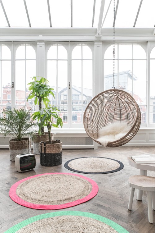
An accent chair is the perfect place to bring the mood of your space to its fullest expression. If your room is formal, then by all means, pull out all the stops and opt for an elegantly traditional wingback chair. Don’t be afraid to play it for all it’s worth. And if you are a minimalist looking to create a relaxed and playful, feel in your room, then why not do something really risky, like the swing chair above? This open and airy loft just wouldn’t feel the same without it.
2) Add color.
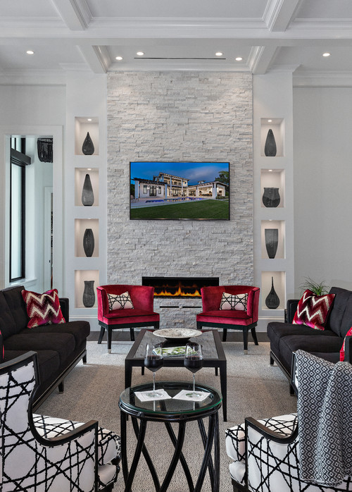
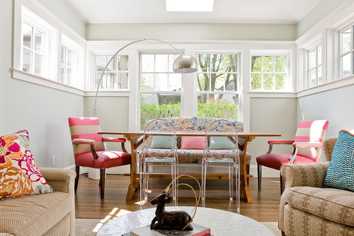
Are you afraid of color and pattern in your room? Afraid you’ll tire of a graphic black and white pattern or a brilliant magenta on a couch? Do you have a tendency always to gravitate to “greige?” The solution for you is an accent chair — but this time outfitted in the biggest, boldest color or pattern you can imagine. This is your opportunity to go completely off the deep end, into territory where you never thought you’d venture . Above, bold magenta chairs and a graphic black and white pattern on two wingbacks manage to look perfectly civilized, at the same time they are both bold and chic.
3) Do the exact opposite.
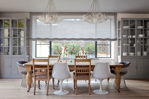
Sometimes, you get the biggest impact by getting an accent chair that contrasts with the predominant style or theme of your room. If you’ve got a chic and modern living room, throw in an antique for some added interest. If you’ve gone traditional everywhere else, consider a modern accent chair. Two examples, are the chairs used in the dining spaces above and below. The mid-century modern Saarinen tulip chair is mixed with what seems to be similar to a traditional Shaker chair. Below, Kartell’s Louis ghost chairs are mixed with traditional Martin arm chairs. Eclecticism is hip. When mixing and matching the main thing to keep in mind to get it all to work is that the scale of the furniture should be roughly similar. Very low, sleek pieces may not work with large scale, heavy or tall pieces.
4) It’s your chance to be artsy.
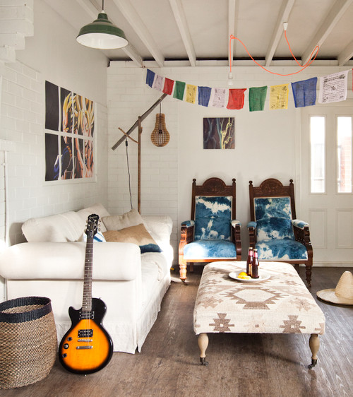
Are you looking for art for your place, but you don’t know where to begin? Begin with an accent chair! A chair can add interesting lines, texture and shape to your room in a pleasing but entirely non-threatening way. Any of the chairs below could help elevate your home the way that art can.
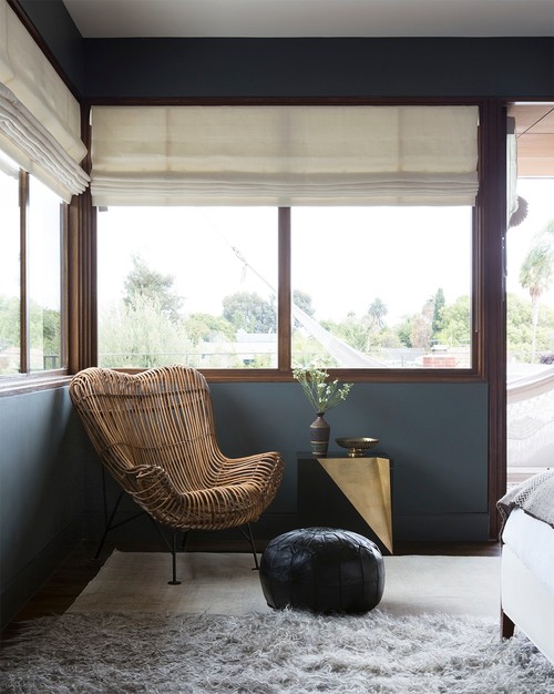
The organic feel of the chair above would look perfect in a home featuring lots of African art.
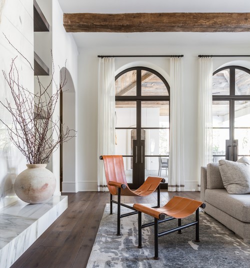
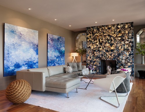
The sleek minimalist chair above would look great in a home with large, color field paintings.
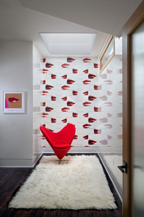
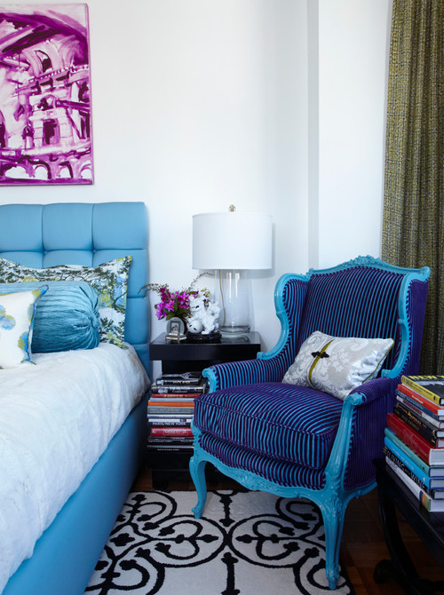
This eyecatching traditional chair outfitted in neon bright colors and patterns would look great in a home featuring lots of pop art or boldly modern figurative paintings and portraits — maybe Chuck Close or Andy Warhol.
We can see this chair in a room filled with Western memorabilia and bold landscapes.
And above, this chair can work in a room with large abstract canvases, as you see, but would also look good with pop art, or no art at all!
The takeaway: adding an accent chair to your room is often a necessary and practical thing, but it’s also one area in which you can totally let loose, have fun, and step out of the box. Give it a try and you will be amazed at how a simple chair can turn your room into a whole new space!
Design Dilemma: Living Outdoors in the Middle of the City
One month into Spring, we’re already thinking about spending more days out in the sun. But have you thought about making the outdoors an essential part of your home? One couple in Barcelona did, taking an old unused terrace and transforming it into a vital part of their homes.
This is what the terrace looked like before:
The apartment is only 517 square feet but its terrace is nearly twice that size at 753 square feet. The sheer size of the terrace in comparison with the size of the apartment, made it imperative for the owners to make use of all that space. Since the apartment is located in the sunny city of Barcelona, it’s possible to use it nearly year round making this renovation of $118,000 truly a great value.
Here’s another before picture:
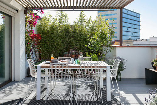
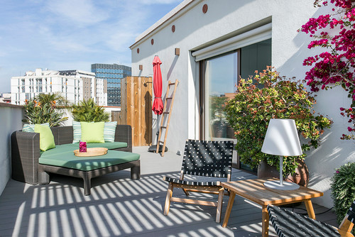
And here are some after shots:
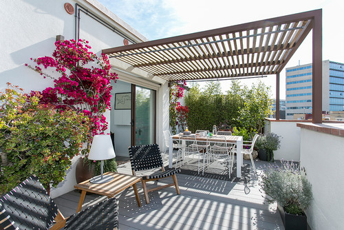
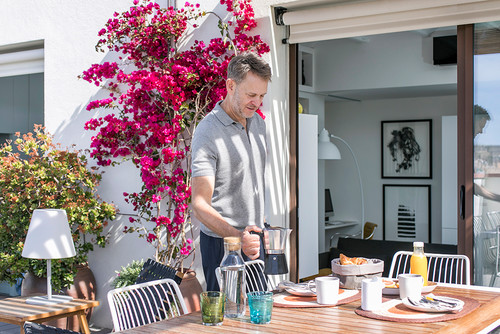
And here:
One of the biggest feats of the renovation involved lowering the terrace floor so that it would be at the same level of the apartment floor inside. Just this part of the job cost the couple nearly $12,000. But lowering the floor made a big difference, because it allowed the terrace to blend seamlessly with the apartment. A new sliding glass door out to the terrace dining area makes it easy to carry trays and plates from the kitchen.
The couple eats almost all their meals outside. They erected a pergola to protect them from the sun in the hottest summer months. Protective curtains allow them to linger on the terrace as long as they like.
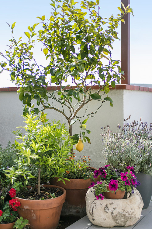
The living area of the terrace also functions as a workspace. A small kitchen garden, below, includes a lemon tree, strawberries, cacti, geraniums, lavender, mint and other aromatic herbs for cooking.
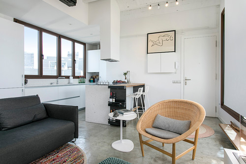
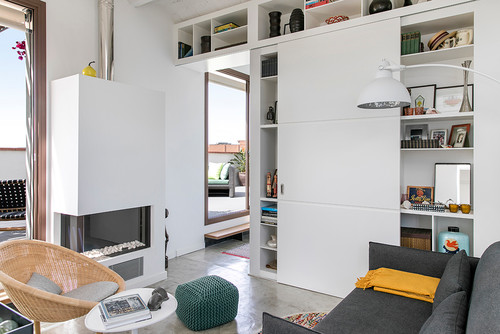
And here’s a view of the apartment’s interior:
And here:
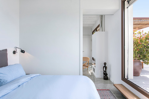
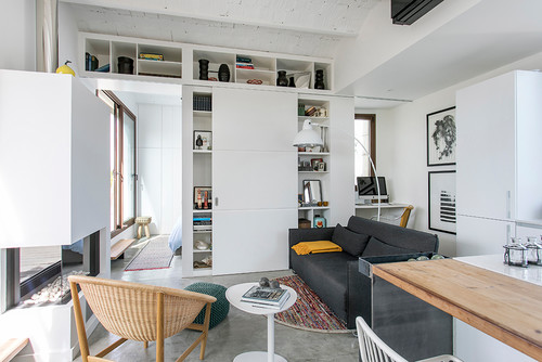
It’s easy to see just how essential the terrace is to the functionality and feeling of the apartment itself.
Here’s a view from the bedroom.
And another view from the living room:
Kudos to this couple for nearly doubling their apartment space, making for wonderful indoor/outdoor living!
Design Dilemma: Adding A Touch of the Theatrical in Rome
Ever feel like turning your home into a theatre set? Every now and then, we all do. Our homes. after all, are the stage sets of our lives, right? But in this particular apartment, a creative director and theatre director teamed up to provide a touch of theatricality to their Rome apartment. They do so by going the eclectic route, mixing and matching furniture styles, eras, patterns and colors.
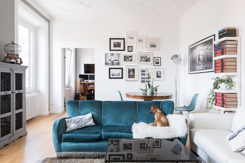
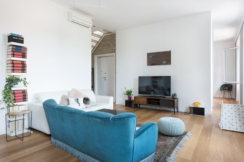
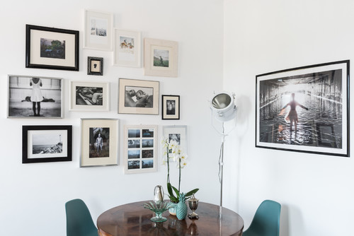
Let’s begin with the blue velvet couch in the living room. It’s something you might expect of your grandmother. It’s from an entirely different era than the leather couch it is combined with. Just that contrast alone lends the living room a bit of drama. Touches around the living room make reference to the stage. A spotlight in the dining room references both the theatre, and photography, both passions of the owners.
Here’s another view of the living room — and the couch.
And here, a better view of the dining room, combined with photographs and the spotlight. The dining table was bought by one of the owner’s Neapolitan grandmother. It is combined with mid-century Eames chairs. Each of the photos on the walls represents a project one of the owners has worked on.
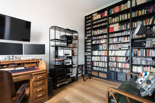
There are plenty of combinations of high and low, antique and modern. The video monitors sit atop a 1930s desk that belong to the grandfather of one of the owners. Across from the antique desk is a Billy bookcase from IKEA. Another spotlight highlights the theatrical edge.
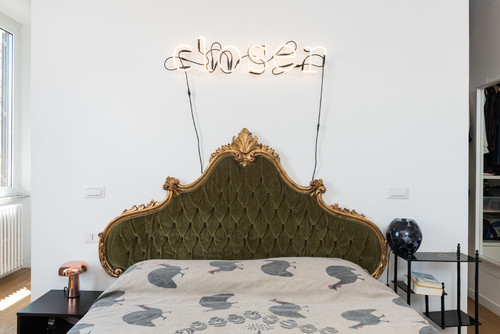
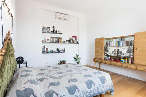
The bedroom is particularly dramatic. The headboard is from the 19th century. The neon sign above the bed says “closer” and is the title of an English play by Patrick Marber that the owner adapted for an Italian audience. The dresser in front of the bed was manufactured in Sorrento, Italy, in the 1950s.
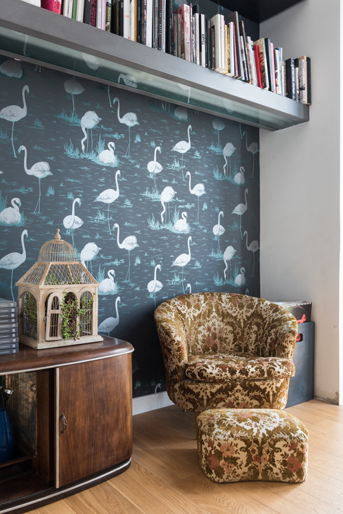
In the bedroom, a reading corner stands out because of dramatic flamingo wallpaper. An antique stereo and chair provide an interesting contrast of patterns and eras.
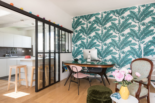
Below, the kitchen. Tropical-themed wallpaper is another unexpected choice. The pink chair comes from a flea market. The stall’s owner explained that it had been the teacher’s chair at a school.
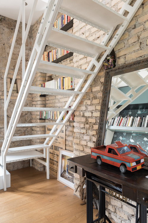
A stairway from the reading nook in the bedroom leads upstairs to an office and the kitchen.
So what makes this space dramatic?
- Furnishings that are unexpected, and eclectic. Eras and styles are mixed with abandon, lending the space a whimsical feel. Antique and modern play off each other.
- Patterns are used boldly. Wallpaper is one of the best ways to create instant drama.
- Keeping the rooms relatively spare allows for focal points to stand out.
- And speaking of focal points, there IS one in just about every room, from the gallery wall in the dining area, to the neon “closer” sign above the ornate headboard in the bedroom, to the boldly tropical wallpaper in the kitchen.
This Rome apartment proves that you don’t necessarily have to have the latest in trendy design to have a stand-out space. All it takes is a good eye!
