Design Dilemma: How to Do Blue
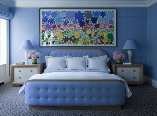
Are you feeling a little blue? So are we! But in this case, it’s not a bad thing. Blue can be one of the baddest, boldest colors to use as an accent in interior design.
Why’s that? It’s because although blue is a “cool” color, it actually comes in so many emotional temperatures, ranging from fresh to calming to electric to moody, that it offers a wealth of design opportunities. It is the color of the skies, lakes and seas, so it has a very grounding, elemental appeal, but it also speaks of energy and renewed life, giving it quite a punch. It can feel youthful and modern or traditional and preppy. Let’s take a look:
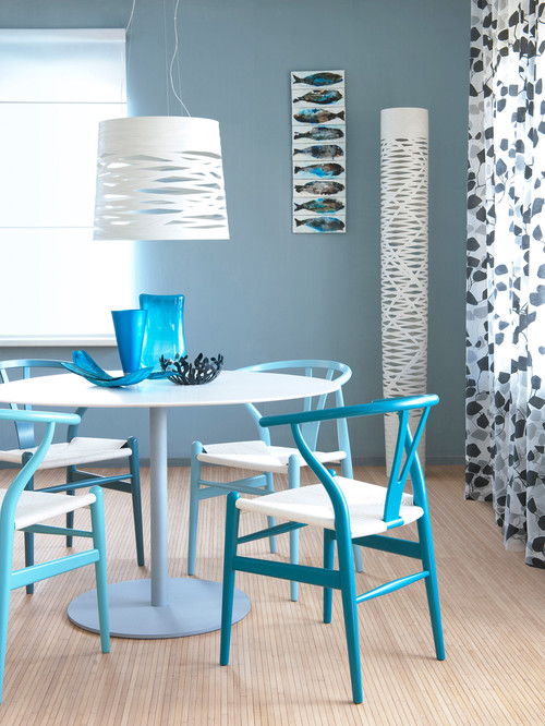
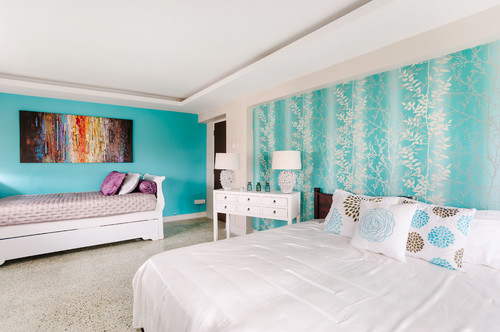
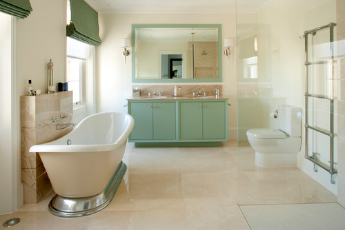
If you’re looking for a beachy feel, choose aqua and seafoam green.
Above, varying shades of aqua in a dining room and bedroom contribute to a sense of airiness. Below, seafoam green in a bathroom.
These shades are a natural if you want to recall the soothing, relaxing tones of the water. They have a lightness that helps interiors feel fresh and bright.
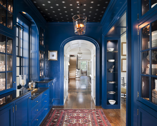
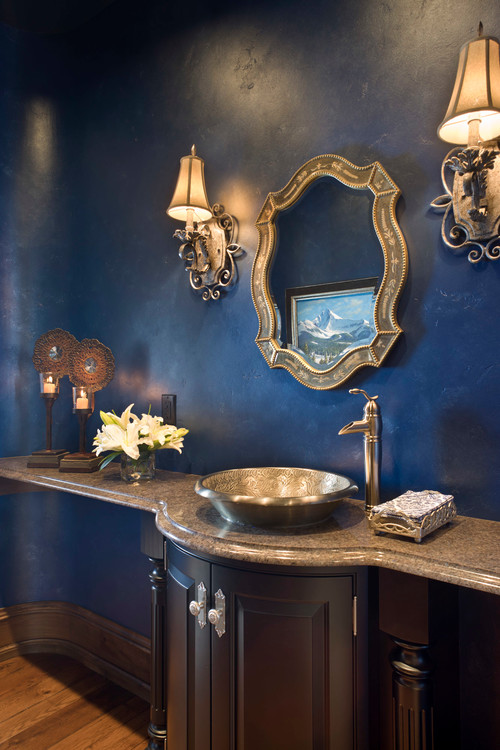
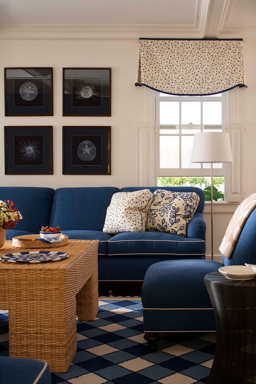
A darker navy blue can feel either mysterious and moody or preppy and traditional.
Below, a darker shade in a pantry lends the space a sense of timeless elegance.
And here, a traditional bathroom:
And below, a room that makes liberal use of blue, with a preppy feel:
Use blue as a foil to art work.
As seen below, a blue wall can perfectly set off artwork, providing drama without overpowering it.
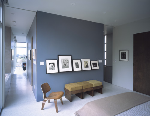
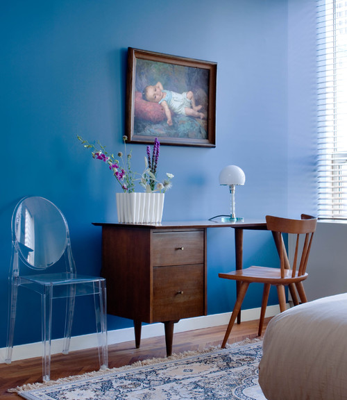
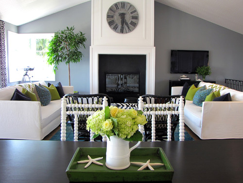
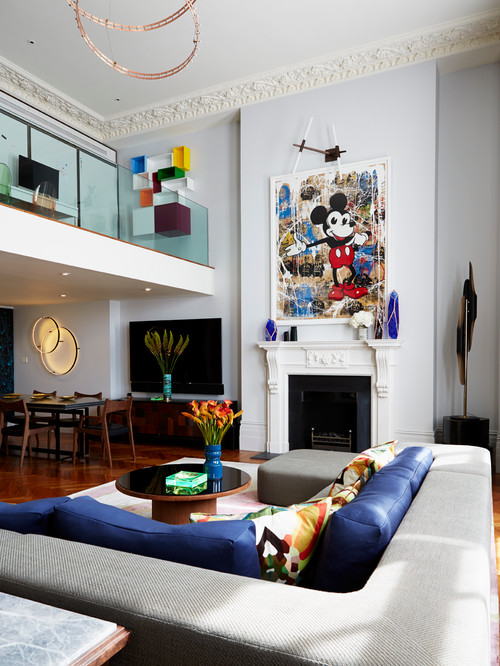
Going modern? Opt for a gray-blue or a periwinkle.
Below, a modern blue living room veers into gray.
And here, a modern blue living room with shades of periwinkle:
What else to know about blue?
- On exteriors, use blue to highlight architectural details on colonial homes.
- Light shades of blue look great on a beach cottage.
- Slate blue works well on a Craftsman style bungalow.
- Sapphire blue is a traditional choice for shutters on Mediterranean style homes.
A Sweet Solar-Powered Studio for an LA Graphic Designer

New York architect Mike Jacobs brought this sweet update on the Cape Cod saltbox all the way to the west coast.

The charming house is for a live-work space; with the work – a graphic design studio – upstairs.

The upstairs studio stretches the entire length of the compact building.

In an unusual move, the nearly invisible cooking, eating and sleeping is all done downstairs.

The home is clearly designed for an artist whose real joy of life is her work.

The cross ventilated loft space is conducive to creative thought, so the relaxing space is up in the studio.

The upstairs studio is a bright sunny space where the artist meets with clients.

This downstairs kitchen barely registers as a kitchen, but connects directly to the earth and grounds the artist in the reality of Los Angeles – with the swimming pool just outside.

Floor to ceiling cabinets fill the dining room wall.

A huge sliding glass wall opens the living space totally to the outdoors.

And in a sweet touch, all the electricity the house needs is attractively supplied by the sleek solar system on the roof, with any excess fed to the LA grid.
A Boxy House of Seven Columns in a Japanese Persimmon Orchard
From Airhouse Design Office comes this design with the naive charm of a child’s drawing.
Although it has the proportions of a very small shed-like single story dwelling, the building is actually two stories tall, towering above the roofline next door.
To get this effect, a structural design based around seven thick supporting columns was used.
The client wanted wide open spaces with high ceilings.
So the interior proportions are exceptional, not a typical two story home, but what looks like a – very tall – single story open space.
But hidden in these structural columns are ‘second floor’ rooms.
Because there is no second floor, this results in a lot of staircases.
A bathroom is contained within the kitchen area structural column so it can share the plumbing.
Above it in the kitchen column, is a peaceful meditation room.
And climbing up to bed at the end of the day has the feeling of ascending to your own private tree house.
Indeed, this childlike imagining of a home is conveniently set within a Japanese persimmon orchard.
