A Perfect White Villa for Sublime Relaxation Outside Tokyo
A wraparound S shape defines this small but sweet all-white villa an hour from Tokyo on the Boso Peninsula by Kiyonobu Nakagame & Associates.
The serene simplicity of white concrete reveals the elegance of the S shape and establishes a peaceful counterpoint against the balmy blue skies just east of the capital city.
The very well-stated design consists of one continuous wall that is folded in different directions to set up the various views.
The utmost in serene minimalism continues in the single master bedroom suite upstairs.
Here a deep soaking tub for relaxation within the vast ocean views occupies one corner.
On the ground floor the sun penetrates deep within the floor-to-ceiling glazing.
The isolated, simple setting is reflected in the villa’s elegant and minimal design so the viewer is able to fully experience the vast panorama of the Pacific Ocean.
A very elegant residence, utterly basic and spare.
Design Dilemma: Red 101
Got a hankering for red? We do! Red is bold and modern. It’s snazzy and snappy. Best of all, it can be the easiest way to wake-up an otherwise boring room.
But red can go wrong too. Use too much, and you lose the cool factor. Use the wrong hue, and it just doesn’t work. Here are a few things to keep in mind about RED.
1) A little bit goes a long way.
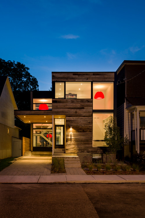
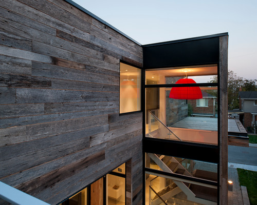
The best thing about red is that you don’t have to use much of it to get the most dramatic effect. In fact, just one red object in a room can have much more impact than a whole lot of red scattered around a room. For instance, in the home above and below, just a few red lampshades placed in windows make a bold, and very cool, statement to the entire neighborhood.
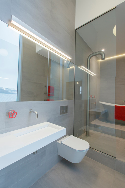
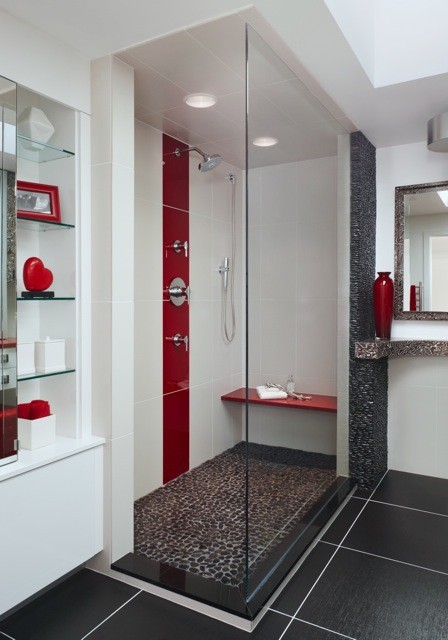
And in the bathroom below, just one red faucet (and a red towel) make a truly modern statement.
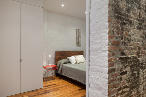
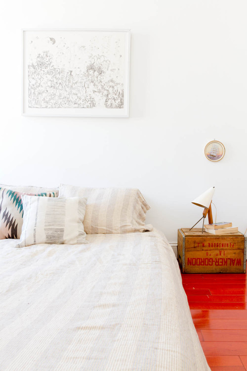
In the neutral bedroom below, one red nightstand provides plenty of pop.
2) Get your red right. Bright orange red reads modern, darker, maroon-like, burgundy reds summon up the traditional. If you’re going for a more traditional look, your red might look something like this:
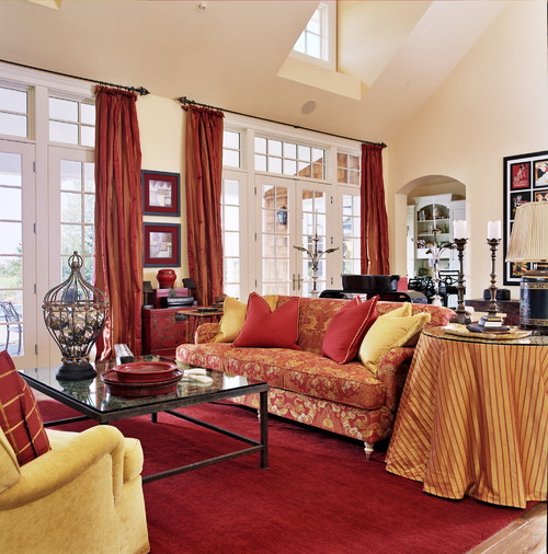
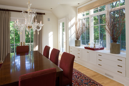
Deeper, darker maroon reds suggest coziness. This is a color we associate with autumn and settling by the fire. It’s a hue we often see in oriental rugs. It works well in Victorian settings with lots of wood paneling and often gets paired with deep blue or golden yellow. Here’s another example in a Maryland Georgian home that veers more toward the transitional:
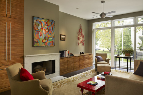
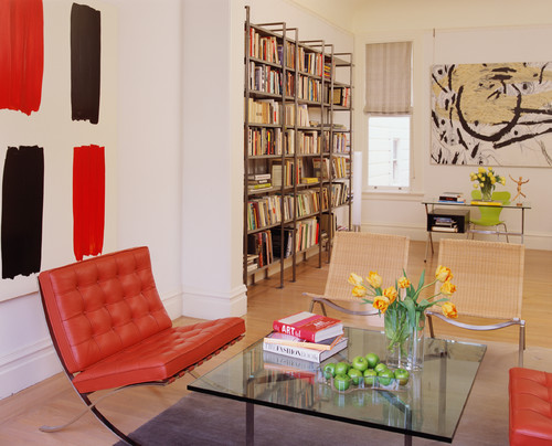
On the other hand vivid tomato reds and reds veering into orange work better in modern, clean-lined homes. Here’s a vivid tomato red, used with discretion in an otherwise clean-lined room:
And here’s an example of the red-orange hue in a very contemporary home:
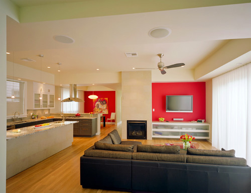
3) If you want to make a very bold dramatic statement, consider an accent wall or red kitchen cabinetry. The beauty of the accent wall is that it can easily be repainted. As the walls below:
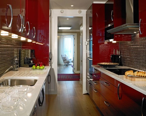
And look how cool, modern yet classic a red kitchen looks:
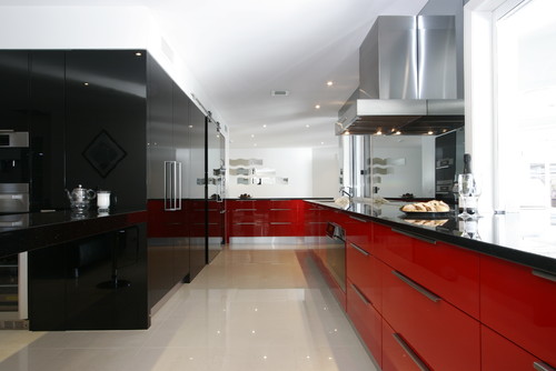
Or here:
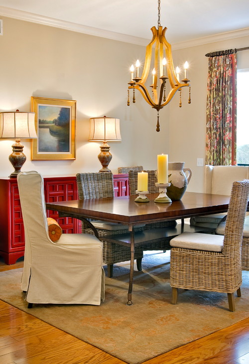
And if you’re not brave enough for kitchen cabinets, a sideboard painted a bright red can be a great, more flexible alternative:
4) There’s no need to scatter. While it’s tempting, once you get the “red” bug to scatter multiple red accents around a room, the more modern way to decorate is to concentrate the red in just one or two pops. Below is a bathroom that looks great but might look better with one or two fewer red accents:
And here, a slightly more modern use of red, by concentrating all the color on the floor:
So are you ready to paint the town red?
Shatotto Creates Another Astonishing Edifice of Concrete and Water
As in their Concrete House of Green Water, here SHATOTTO Architects are working just with concrete and water to create another stunner – this one in the tropical southern city of Chittagong, Bangladesh.

The heavy southwest wind from the Bay of Bengal and the year-round scorching sun are two major considerations for the deeply shaded and water-cooled design.

Lush tropical vegetation is the perfect counterpoint to the simple formed concrete structure.

Almost the entire second floor consists of water, both to cool the home, and for a more direct cool-off.
Viewed from a diving platform over the pool, one is conscious of an amazing concrete ceiling, two storeys tall, shields the pool from the hot sun.

A colorful wall next door is cleverly included into the aesthetic.

The perfect color balance of rust-colored concrete pavers, the bisque wall, the dark teak wood diving platform and the pool, provide the perfect jolt of color within the very incognito exterior.

The architects use a series of layered exposed concrete parasols against the sun and levels that contain water, cooling the air.

The monumental concrete edifice is not out of place in its urban setting.

A series of shadowed passageways cool the walker underfoot.

A stepped series of green roof gardens make their home in these concrete cliffs and caves.

To the street, the house is nothing but the most mysterious presence.

A marble stair entrance that is grand and also scrupulously correct in its textural balance of glass, dark tropical wood, lush greenery and concrete meets a door of lovely proportions.

From here it provides just a fascinating glimpse of an interesting and complex design.


