Design Dilemma: Patterned Tile Floors
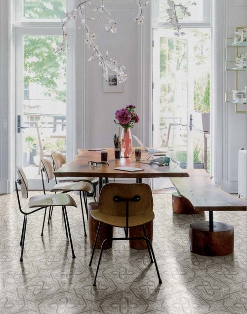
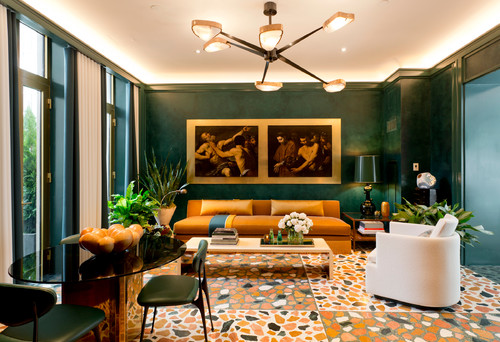
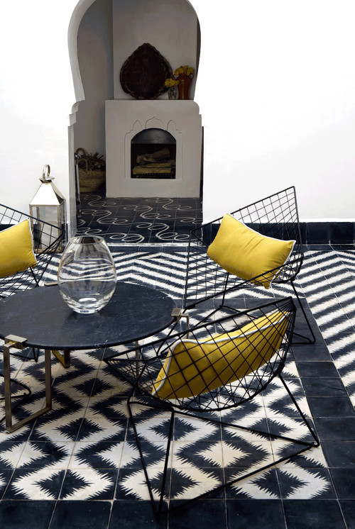
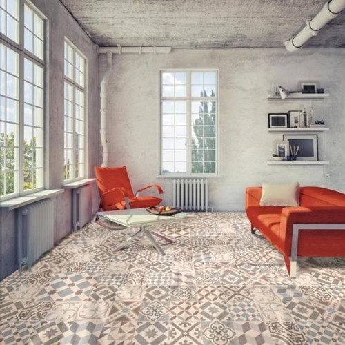
With “maximalism” as the newest design trend for 2017, we’re seeing much more pattern at home. And one place we’re seeing it is in the newest fascination with patterned floor tile. Traditional in Europe, in places like Italy and Spain, as well as used widely in South America, patterned floor tiles have been less popular in the United States. But increasingly, some bold homeowners are ceding to the desire to move beyond safe neutrals in choosing a flooring material. The move toward patterned floors also reflects a new fascination with all things “vintage” and many of these floors were standard in houses in the early 20th Century. Installing one now is a risk, to be sure, as a patterned floor is a fairly permanent statement that can’t easily be covered up. But if you choose wisely, the pay off can be substantial. You will have a look that is highly individual and very stylish.
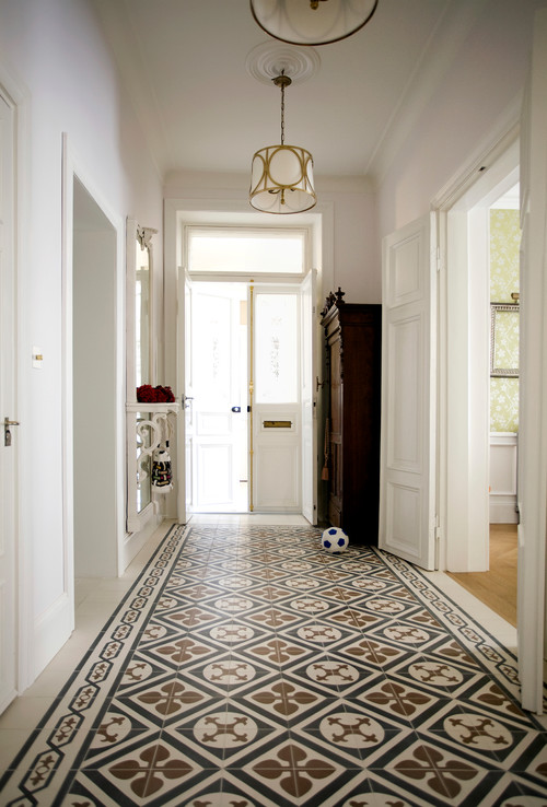
Above, for instance, a London townhouse makes a strong design statement by choosing a black, white and brown patterned tile in the entryway. Although the tiles appear to have been laid diagonally, they have actually been laid in a standard grid layout. Their pattern tricks the eye into seeing a diagonal line. These tiles have an Old World feel, as they were typical in many turn of the century houses in Europe.
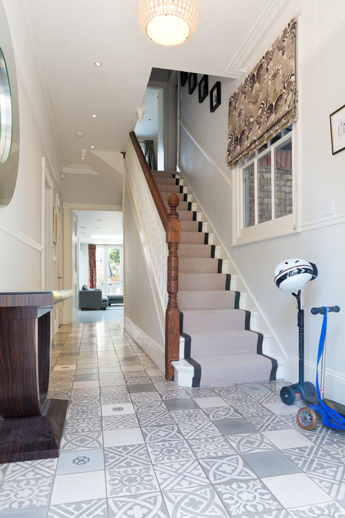
Here, another entry also sports patterned tile, but by choosing gray and white, offering less of a contrast, the look comes off as more modern.
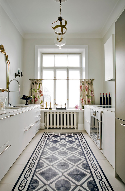
Below, a modern kitchen has adopted the same sort of look as the London townhouse for a “rug effect.” Black and white is always chic, always classic. Although the cabinetry in the kitchen is modern, the floor feels like something you might see in a house in the 1920s.
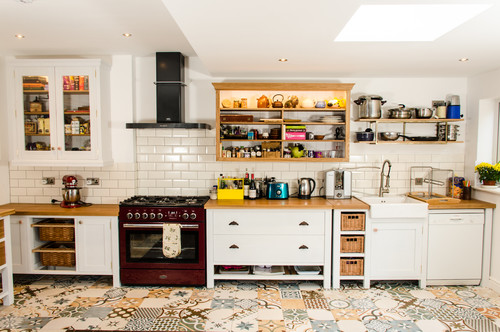
In another kitchen below, a note of quirky, playful color has been introduced by an energetic pattern:
And in the kitchen below, a more subtle floor tile adds a note of vintage elegance which is continued in the selection of vintage chairs and wooden table.
And what about patterned floor tiles in the living room, in place of a rug? Talk about maximal!
Also here:
And here:
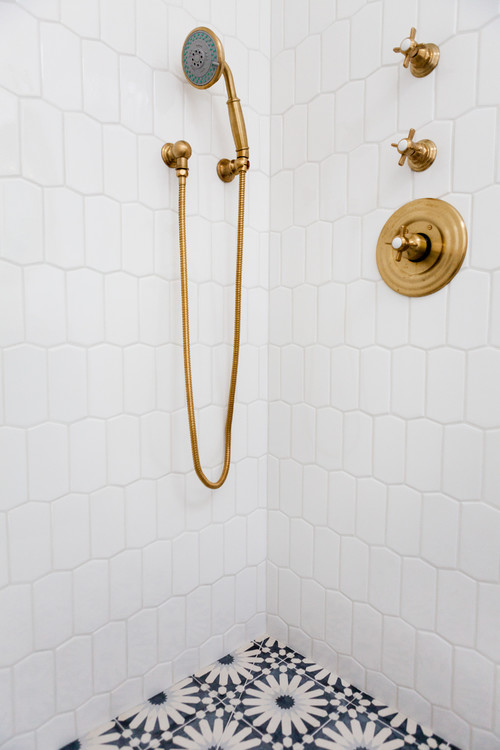
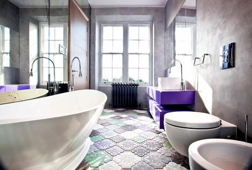
If you’re worried that a patterned floor is too confining or too busy, you can always try out a much smaller dose in the bathroom and shower.
And here:
And here:
Are you ready to get on board with this trend?
Here are a few tips to successfully adding a patterned floor in your home:
- If you’re a novice to pattern, choose a patterned floor in a small area. A small foyer, a bathroom, a kitchen, are perfect places to introduce tile where you are least likely to experience buyer’s remorse.
- Stick to classic looks and color combinations. Although it may be tempting to do something really bold and colorful, you’re safest best is to stick to tried and true looks that have withstood the test of time. That means black and white tiles and patterns, or patterns and colors that offer less contrast.
- Smaller patterns will be read as a “neutral.” Another way to take a chance with pattern is to opt for a smaller one, that the eye will read as less “busy” than a very big, bold pattern.
- Let your floor be the focal point. Keep the rest of your furnishing low-key if you’re going with a very bold tile.
Design Trend: Decorative Glass Doors Make a Statement at Home
You may be used to seeing decorative glass doors in restaurants, retail environments and offices, but did you know that decorative glass is making inroads at home too?
That’s because glass doors offer a whole lot of advantages:
1) They are an architectural detail that quickly sets a tone for a room, creating a focal point and a sense of elegance in one fell swoop. You know a room is truly special when you enter via a spectacular door. For this reason alone, glass doors have long been a staple in Victorian and turn of the century libraries and dining rooms where stately glass doors (often paneled French doors) could impress visitors and guests.
2) They allow light into the dark recesses of your home. If you can’t knock down a wall to let light in, installing a glass door is your next best option!
3) They can be custom made to fit any need. If you need privacy you can frost or texture glass. If you have tall ceilings or a wide door opening, it’s not a problem. Plus, custom made decorative glass doors are not nearly as expensive as you might imagine. Prices range from roughly $300 for baseline doors to $1,000+ for ornate doors.
Let’s take a look at how some homeowners have gotten creative with decorative glass doors:
Textured glass
If you’re looking for a way to add a little pizazz while still maintaining ultimate privacy, textured glass is the way to go. The door above is a great illustration, offering both a texture and a pattern that make it impossible to discern anything other than vague shapes on the other side. Below, a patterned and textured door has a similar effect.
Because of they are so adept at allowing light in while preserving privacy, textured glass is a natural for dark shower stalls. The “Sandstorm” shower door, available at CBD Glass Studios is both elegant and discreet.
Etched glass
If you’re less worried about privacy, you might opt for an etched glass door of the sort pictured above. Etched glass is the result of artistic carving of the glass surface to leave a white, frosted finish. It’s the same sort of etching you’ve always admired on fine wine glasses. There are three ways to create a piece of etched glass: sandblasting, chemical etching, and acid etching. The beauty of etching is it provides for an almost unlimited number of custom patterns and designs and can seem particularly tasteful and refined, if done well. Below, an etched glass shower door:
Custom Designs and Treatments
Beyond textured glass and traditional etching, there are a myriad of designs and treatments that move glass into the artistic realm. The only limit is your imagination. Above, a bronzed effect is achieved on a glass door, giving the door an almost sculptural feeling. Similarly, yet utterly different, the glass door below has an artsy, funky, colorful feel with an almost 1970s retro vibe.
Doors are not the limit in decorative glass. Many homeowners who admire the versatility and artistry of glass opt to add glass partitions and glass walls. The artful glass partitions below allow light to filter from one room to the next while preserving a sense of separation.
 And in the bathroom below, a glass partition helps separate the tub from the toilet in a stylish, richly opulent way.
The short take is that decorative glass doors can open up a wealth of possibilities. If you’ve never considered using glass doors at home, it may finally be time to do so!
Design Dilemma: 5 Ways to Add Personality in a Kitchen
Below is a traditional kitchen that appears fresh, open and modern, simply because there are no upper cabinets but lots and lots of windows instead.
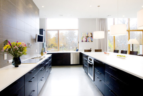
And here we see a more modern look. The owners used the empty wall for sleek tiles and a television.
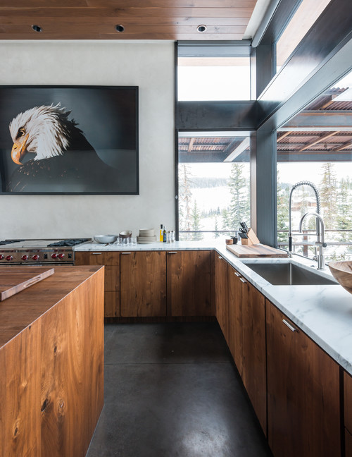
Empty walls in the kitchen below was the opportunity to hang a dramatic piece of art.
2. Experiment with open shelving.
On the other end of the spectrum, we have open shelving. Open shelves have their supporters and detractors. Some argue they are too impractical, inviting dust and a chaotic, messy look in the kitchen. Others say that open shelving can open up a space, making it appear larger and livelier, depending on what you fill your shelves with. We can see the merits of arguments on both sides. But one thing you can say for sure is that open shelving is an opportunity to give your home personality that would otherwise be hidden by bland cabinetry. Take a look:
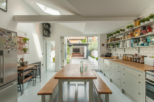
In the kitchen above, open shelves are an opportunity to add color and decorative objects, including plants, for a cozy, homey look.
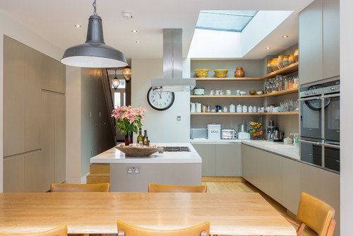
In this London kitchen, open shelves provide an opportunity to display beautiful pottery and a collection of vintage kitchen canisters. In fact, canisters like these are necessary to making this work, as they protect food from dust and keep shelves looking more uniform and tidy.
3. Play with texture and materials.
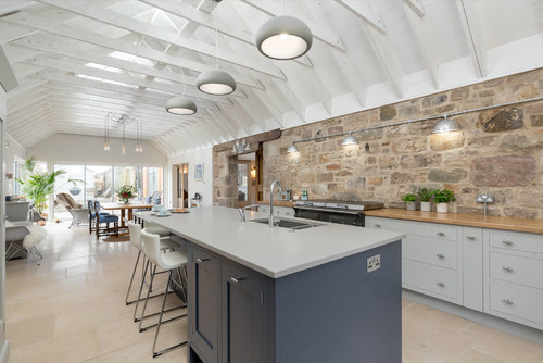
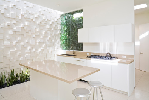
Bring new, unexpected textures into the kitchen including rough stone, raw wood and steel. Above, rough stone walls pack a huge punch in a casual, farmstyle kitchen. And look how texture transforms a plain white kitchen into something truly cosmopolitan, below.
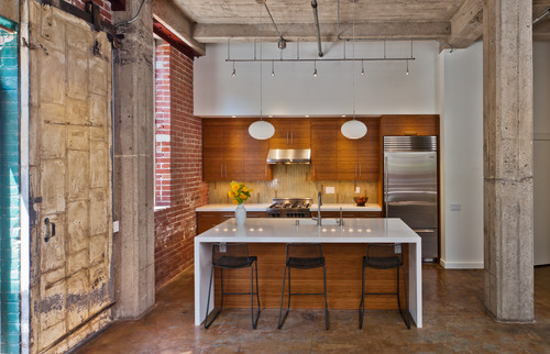
Below, concrete, wood and metal up the cool factor in a loft kitchen.
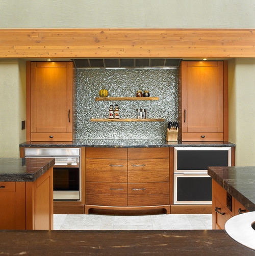
And here, textured metal as a backsplash.
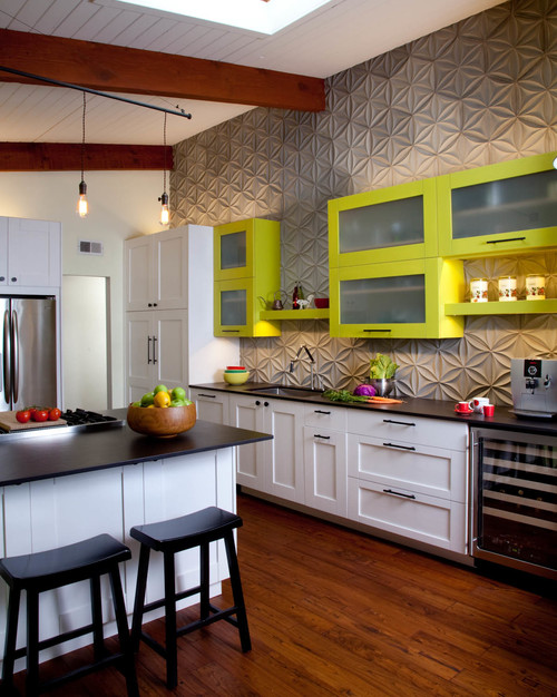
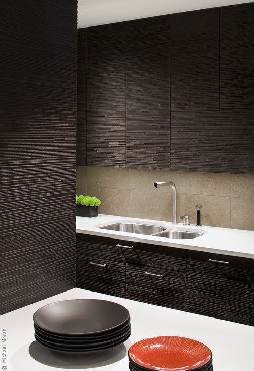
And below, textured cabinets add a note of refinement to an elegantly modern kitchen.
4. Add a cool backsplash.
One sure-fire way to add personality to any kitchen is to pep things up with a snappy backsplash. Here are a few examples.
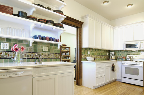
The traditional kitchen below would look utterly run of the mill, except for the colorful tile backsplash.
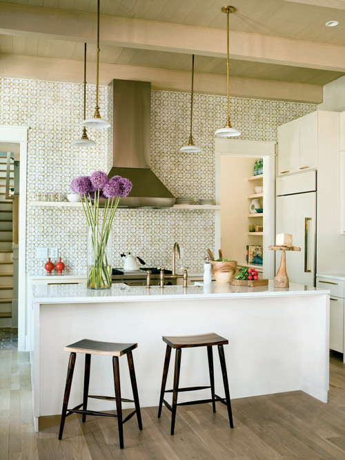
This patterned tile backsplash is a beauty and again the focal point in an all-white kitchen.
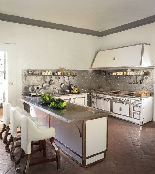
And below, a metal backsplash is unexpected and fresh.
5. Add color.
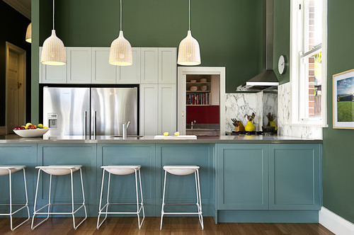
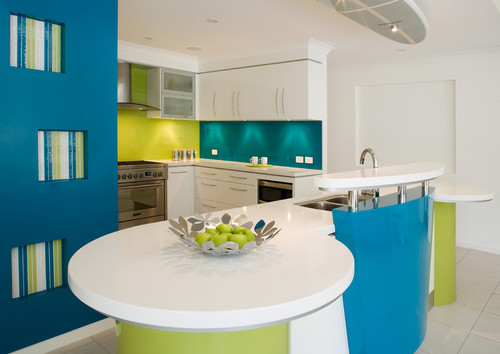
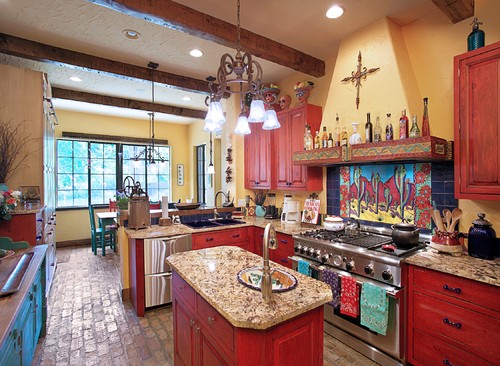
There’s no more powerful way to inject a dose of personality than to emboldened your kitchen with color. Take a look at the examples below:
And this:
The message is clear. If you want more personality in your kitchen you can have it!
