Design Dilemma: 5 Ways to Redecorate Lite
Recently, I wanted to redo the bathroom. Completely. My thought was to change every surface — new tile in the shower, new tile floor, new vanity, new bathroom fixtures, minor repainting. It was a tiny bathroom, so I figured our budget could handle it. Until, that is, we had a contractor take a look at the job. The estimate for redoing our simple little bathroom rang up at a staggering $18,000. And I just couldn’t figure out where the money was going, since we were not planning on doing anything to the actual plumbing.
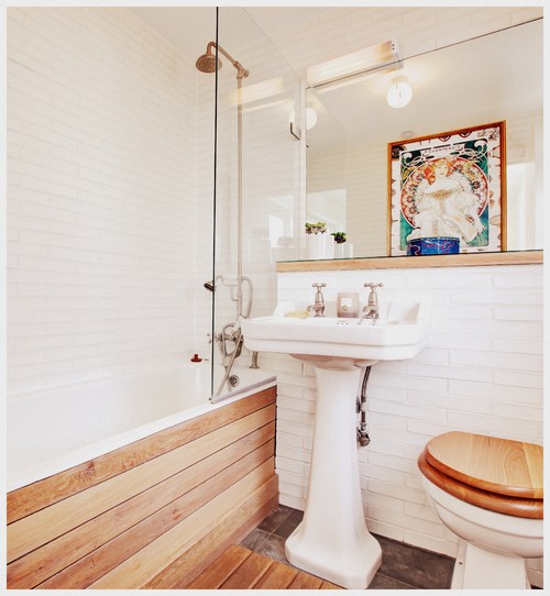
Knowing that an $18,000 remodeling job was totally out of our budget, we downsized the scale of our project and decided to do something I’m calling “redecorating lite.” Instead of changing out the tiles and the floors, the shower kit and the toilet, we opted to focus our hard-earned dollars on the areas that were most in need of some help, and that would provide the biggest bang for the buck. This meant reducing the reining in the work to simply replacing the vanity and faucet, and giving the bathroom a fresh coat of paint. Final cost of the project: about $1,000. On this much smaller sum, the bathroom looked fresh and revitalized and we were happy and relieved that we had chosen the simpler path.
Moral of the story is this: sometimes a lite remodel is all you really need. If you want to redo the kitchen, you may not need to totally revise the floor plan and go for all new appliances. Maybe you just need a new backsplash. If you want to redo your living room, maybe you only need to change the wall color. Wondering what a “lite” remodel might mean? Here are a few ideas:
- Rearrange the furniture.
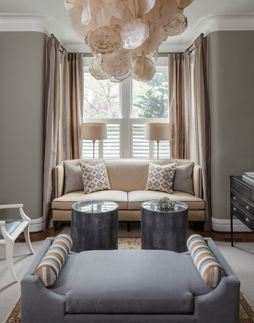
It’s the simplest and easiest way of all to get a totally different look without spending a dime: Play around with your room’s configuration for dramatic results. In the picture above, a fainting couch is the type of unique piece that has immense flexibility. While here it’s placed in the middle of the room, it could just as easily be placed near the window, or moved onto a diagonal in a corner of the room.
2.Re-upholster.
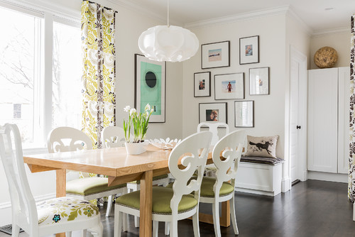
Can’t afford new furniture? Reupholster what you have! While reupholstering can sometimes cost as much or more than buying new furniture, there are certain changes you can make to textiles and fabrics that are pretty inexpensive. In the photo above, for example, putting a fresh, vibrant fabric on each chair seat could be a simple Saturday afternoon do-it-yourself project. So, too, with the patterned drapes that lend this dining area a youthful, punchy vibrancy.
3. Rearrange your art.
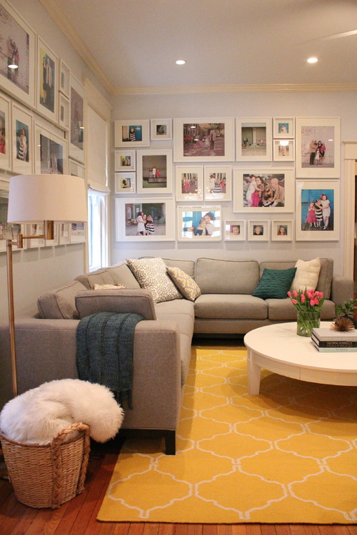
Here’s another free way to dramatically change any room’s look in record time. You can switch out multiple pieces of artwork and create a gallery wall, which can make any room feel “curated.” Or you can do the opposite, you can move one dramatic piece of art you may own — a painting or sculpture, from one room or location to another. If you don’t have much art to work with, you can create really nice pieces by framing magazine covers, botanical prints or old photos. If you are looking for larger scale, original art, check out numerous online sources for original art.
4. Repurpose.
Chances are, you’ve got items floating around in your garage, basement or storage room that aren’t living their best life. Why not drag them out into the sunshine and find new uses? Clever and innovative ways of using old items can revitalize a space. For example, in the bedroom above, an old milk crate has been turned into a fun and funky bedside stand — a bedside table with character.
5. Swap out or invest in a new area rug.
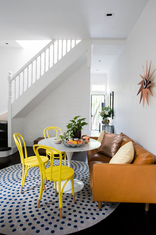
In my opinion, this is the number one change you can make for the biggest, most dramatic change of atmosphere. Area rugs define spaces in one powerful punch. Through color and pattern, they can breathe new life into a room.
So the takeaway is simple: you don’t have to spend thousands of dollars if you are looking to revitalize your home — repurpose, reuse, rearrange, and you may be surprised at how fresh and new your home feels!
Design Dilemma: Lagom, the art of not too much, not too little
“Lagom” is a Swedish word meaning “just the right amount.” Living lagom means you’re living in balance, in moderation, with not too little and not too much. It’s a concept that particularly resonates in 2018, in an era in which many of us are awash in too much stuff that we can’t use or take care of while the earth suffers mightily for it. Not just by happenstance, lagom became a concept that arose into world consciousness last year, with several magazines and books dedicated to the concept. And we’re betting that given its emphasis on living a happier, more balanced and more sustainable lifestyle, lagom will also be much in vogue in 2018, much the way that the Danish word “hygge” hit it big in 2016.
“Lagom is very much a part of everyday life, including the home,” Niki Brantmark, founder of My Scandinavian Home and author of Modern Pastoral ” told MyDomaine.com. “The Scandinavian home strikes the perfect balance between minimalism and over-cluttered, resulting in a clean, calm space that is also warm and inviting.”
Are you interested in making your own home a little more “lagom?”
Here are some tips to getting there.
- Eliminate something.
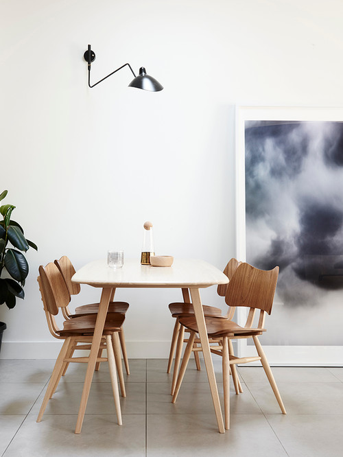
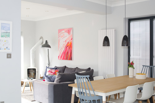
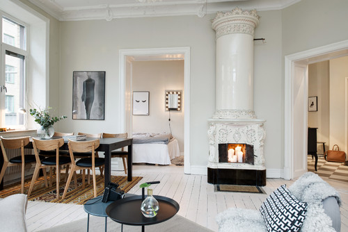
Most of us have much more than we need. The reality of life is that stuff accumulates, and if you never purge, eventually your home will be overwhelmed. One step to lagom means eliminating something that really isn’t necessary. In fact, you might start by not collecting the unnecessary to begin with. Scandinavians typically invest in far fewer furniture pieces, but they choose better quality pieces that have style without being too trendy. Scandinavian design, of course, makes this all so much easier. In the dining room above, for instance, the typical American impulse would be to add a buffet or a china cabinet or to include large, bulky chairs. But not in Sweden. Resist the urge to fill corners and empty spaces and buy over-sized furniture. Opening up a little more space at home often improves your home’s functionality.
2. Get practical.
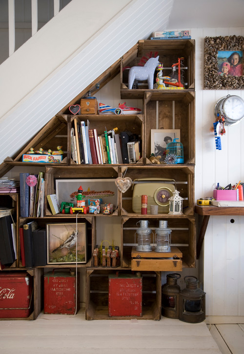
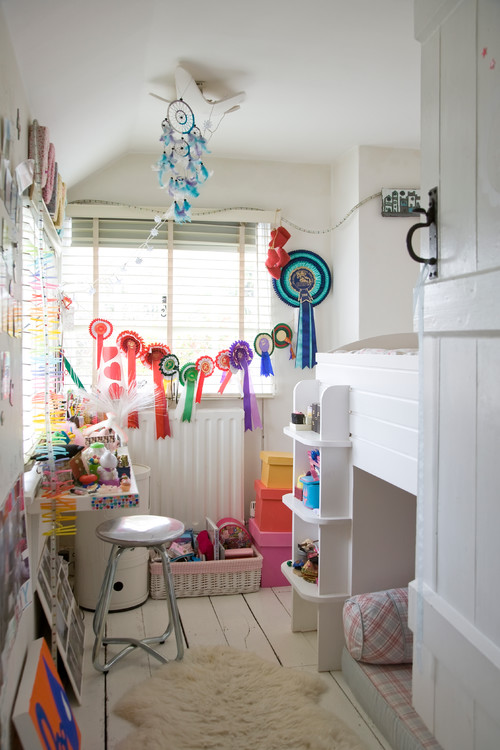
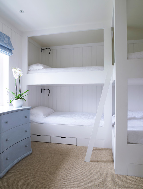
The Swedes are a practical people, and one clever way they’ve developed of making a home “lagom” is to make use of storage as decor. In that way, you fulfill two purposes at once. A clever bookcase, above, of vintage milk crates strikes just the right vintage note in a country house. Below, in a child’s bedroom, 4-H ribbons won at the local fair also act as brightly-colored streamers in a child’s bedroom.
3. Choose calm colors.
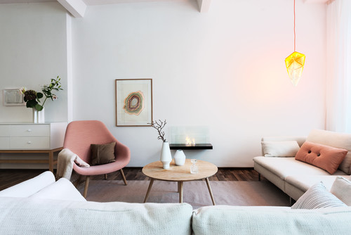
It’s rare to find a Scandinavian home that is a riot of color. Instead, Swedes go for whites and grays with touches of blue here and there. The effect is soothing and never feels cluttered. Above we see a white bedroom with a touch of blue, below, soft gray with blue chairs.
And here, more soft colors and quiet, monochromatic artwork :
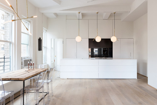
And below, an all-white kitchen with light oak floors couldn’t be more scandy.
4. Go wabi-sabi.
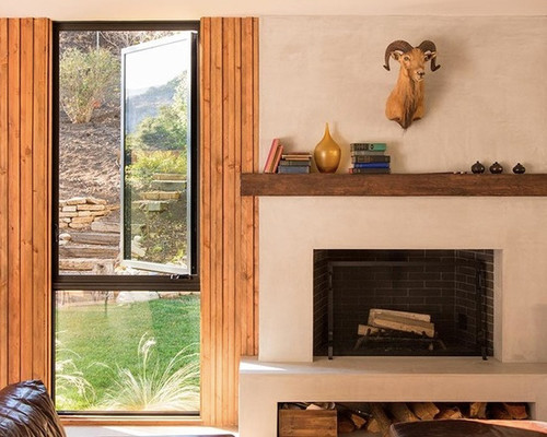
Part of the beauty of lagom is that it embraces the used, the worn, the reclaimed. These things have soul and show that you are not trading in good furniture just for fashion’s sake. So enjoy worn leather, reclaimed wood, and don’t fuss too much over little nicks and scratches. And be sure to incorporate some slatted wood into your home somewhere!
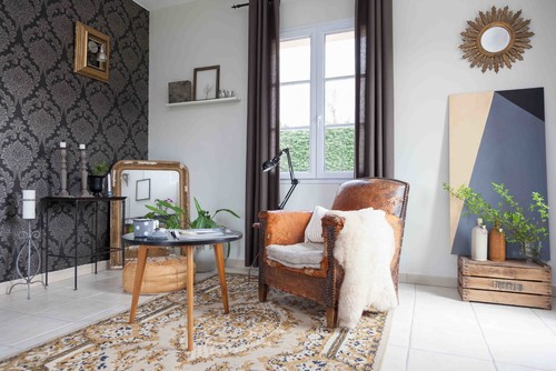
Below, worn leather makes a statement of timelessness and resilience.
5. Enjoy the small things and keep the curation going.
Enjoy the small pleasures in your home, like a vase of fresh flowers, or tea out of a special tea pot. Constantly edit your collections and keep a wary eye out for when it’s time to pare down. If you do this, we guarantee that your home will always feel fresh and inviting and you’ll feel lighter and happier too!
Design Dilemma: Ringing Out Old Design Ideas
We’ve talked about what’s in for 2018, but what’s on the way out? We’ve come up with a list of things that have seen their day. Some of these things are still in the process of a slow death, and some are almost nearly extinct.
Edison bulbs.
It’s not that these bulbs weren’t very cool to see when they first came out. The problem, no pun intended, is overexposure. These bulbs are in every hip coffeehouse from San Francisco to New York. They hang in every industrial-style loft and in every tech start-up. Now that they’ve become quotidian, they’ve definitely lost their novelty.
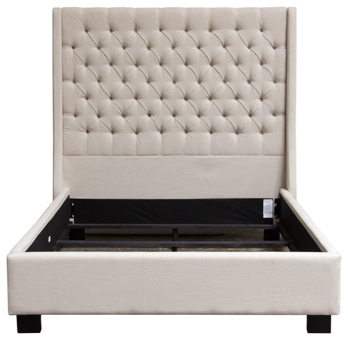
Tufted headboards.
For a brief moment, tufted headboards surfaced on the scene, only to quickly disappear. We think difficulty in keeping these headboards dust-free had to be a good reason for their short shelf life. We’ve always been in favor of hard surfaces that lend themselves to regular cleaning, particularly in the bedroom.
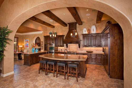
Tuscan kitchens.
Kitchens in Tuscany look nothing like this. We’re not sure where the designation comes from, but today, no one is looking for a heavy, dark, faux countrified look in their kitchen.
Granite countertops.
Granite was nice in the beginning, when it was an upgrade from laminate. But now that it’s in every builder’s special, it’s lost its appeal. Today, homeowners are looking for something unique, hopefully a surface with a lighter, brighter feeling.
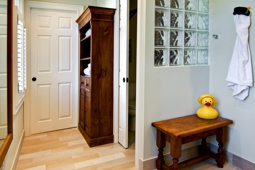
Glass Block.
Fifteen or 20 years ago, glass block was a clever way to bring light into a dark space that had no direct access to the outside. Today, glass block mostly feels dated, since there are so many other interesting ways to bring light into a dark space.
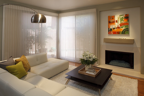
Vertical Blinds.
Vertical blinds feel office-y and dated. Newer treatments and blinds feel much fresher, streamlined and are easier to keep clean too!
What else is out?
Ruffled bedskirts, heavy headboards, wicker furniture and plaid. But you probably knew that already!

