Design Dilemma: Time to Try Something Different
Have you tired of streamlined modernist interiors that derive from a Mid-Century Mod vision? Do you crave a little bit more texture, a little bit more pattern, something….different… in home design? If so, do we have a few places to show you!
Eclecticism is where it’s at these days, the only way to truly let your individuality shine. An eclectic style of decorating involves fearlessly mixing up various style and eras without worrying too much about whether it “goes” or not. The best eclectic interiors develop over time, as new objects, art, textiles, slowly find their way into your home, and some find their way out of your home.
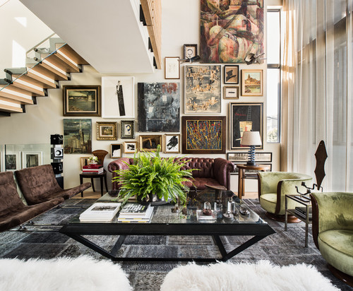
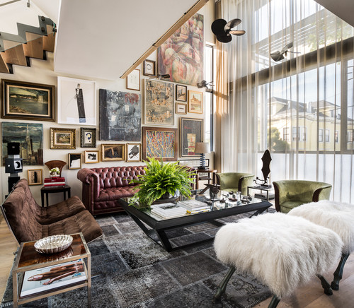
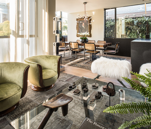
Above and below is a perfect example of an eclectic interior. A San Francisco home that is actually quite modern, the space manages to feel timeless, fresh, modern and yet a bit Victorian at the same time. What makes it work? In part, individual, unusual pieces like the ottomans with faux animal legs covered in Mongolian lamb’s hair. They are statement, one-of-a-kind pieces. When placed alongside Art Deco chairs, mid-Century chairs and a Chesterfield couch, what you have is a feeling that the homeowner is marching to the beat of his own drum.
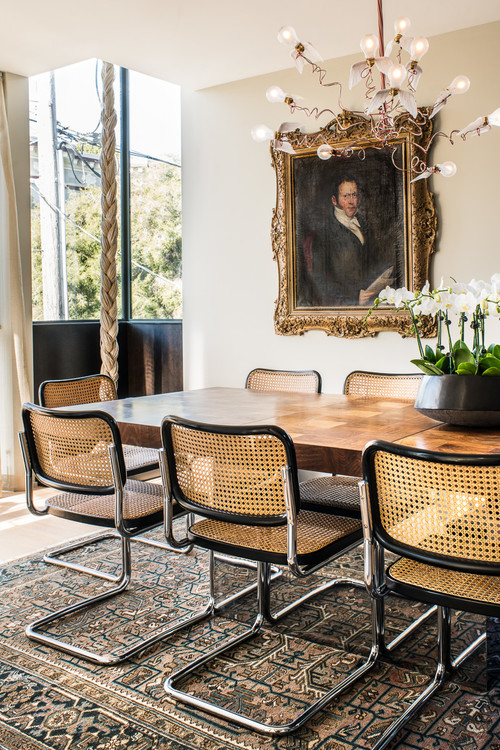
There’s some Mid-Century Mod in this interior, but it doesn’t feel trite or overbearing because of the interesting mix. Marcel Breuer chairs paired with an oriental rug and a gilded frame Colonial-Era portrait makes the room feel alive and surprising. And the modern coiled chandelier with naked lightbulbs brings in a contemporary flare.
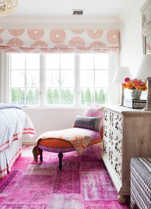
Below, an eclectic feel comes from layering pattern with pattern. Everything stays cohesive by keeping colors within the same family.
Here, a very eclectic kitchen mixes an elegant crystal chandelier with industrial and commercial elements, such as a stainless steel countertops and a commercial stove. We think we spot Ikea cabinets in the mix too. The best thing about eclectic interiors is that they are trend resistant. They don’t easily go out of style because they are not beholden to one “style.”
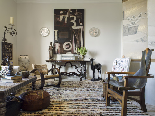
Ethnic touches — textiles, sculptures, furniture — are a great way to introduce eclecticism into an interior. Below, Moroccan ottomans, Asian vases, sculptural chairs that feel a little bit African, give this living room a trend-proof look:
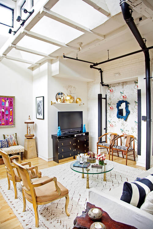
And here, a space featuring exposed pipes feels like an industrial loft, if it were not for the period side chairs and a beni ourain rug.
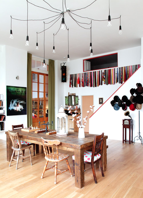
And below, in this fun and funky interior, it’s the chandelier and hanging ties and hats which help to give the space its fun feel.
Eclecticism is a state of mind. Allow your imagine to roam and free yourself up from worry about what “goes” with what. Fill you home with the things you love!
A Renovation Imaginatively Reuses Stone and Brick

A scrumptious textural feast awaits the visitor to this gorgeous renovation by Marcelo Alvarenga at Play Architecture.
The house is made of an unusual combination of earth-made materials, from brick to various kinds of stone.

Set in the tropical climate of Brazil, it is a sumptuous demonstration of the palette.
The house is a renovation of a home built in the ’70s in Belo Horizonte, Minas Gerais.
“We had to make significant changes to meet the demands of family,” says the architect.

A well-placed opening in the brick wall connects to the living space to meet the client’s brief.
These rooms had been walled off from each other.

In the eat-in kitchen, precast concrete slabs define the island.

Bright primary colors offset the earthy brick and stone.

The materials in the old building were kept and reused in the new structure.

The result is a study in gorgeous complementary ‘dry’ textural materials that contrast with the wet greenery of the surrounding jungle.
Lucid Contemporary Glass on Glass Home in Ontario
Architecture studio Guido Costantino designed this stunning clean lined contemporary home for a family in Canada.
Large shifted concrete pads welcome you into the residence, transitioning internally into a polished concrete floor.
The raised concrete defines circulation, creating a path leading you into the house and back out.
The kitchen is on a raised stage-like section of this concrete pad transition, while the living space is sunken.
3 The concrete pads then step back down out to the exterior opening out on the courtyard pool.

The brief was to preserve the individual needs of family members, while preserving an open plan.

So an L-shaped plan was chosen, enabling private work spaces, while connecting all through the materials and the views.

The material palette is cool and calm.
A collection of clear and smoky glass, polished white sand concrete floors, natural concrete walls, and white metal treads for the stairs.
Spaces are defined through small level and/or material changes like this step down stone tile floor creating a bathing space.
Cool and calm colours prevail throughout.

As if stating the family preference for restrained elegance, the entrance includes the drama of water and an equally refined palette of local river stones.
