Design Dilemma: A Pop of Orange
There’s no happier color in the rainbow than orange. Orange represents sun and warmth. It feels vivacious, expansive and bold. It was a favorite color in the 70s, when it moved into American homes along with avocado green. But unlike avocado green, orange maintained some staying power, and it still goes strong today, particularly in modern kitchens where it just feels right. Orange kitchen islands have become a favorite way to bring orange into the home, because it’s a way of doing it in a relatively small dose. It’s a powerful accent that can immediately pull a room together. And there’s something about orange that just seems to go well with food, too.
Don’t believe us? Come take a look:
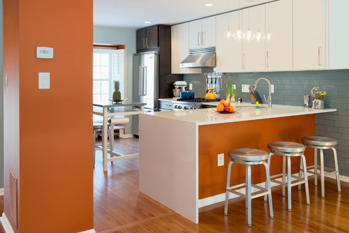
Above, an orange accent wall and a kitchen island painted a pumpkin orange lends character and spunk to a kitchen that might otherwise come off as sterile considering the white cabinets and glass tile. The vibrant orange island adds personality without ever feeling like too much.
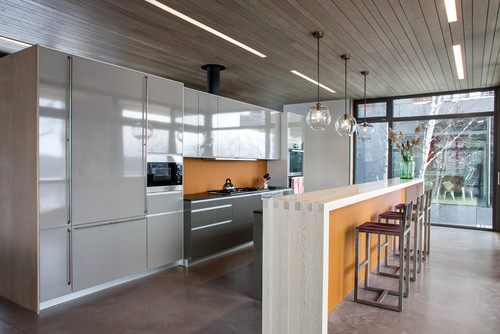
Similarly, a slightly more muted orange serves as a backsplash and accent underneath a waterfall countertop. This time, the orange with a bit more gray comes off as smooth and sophisticated when paired with gray taupe and dark brown cabinets. Now that’s a great way to do modern.
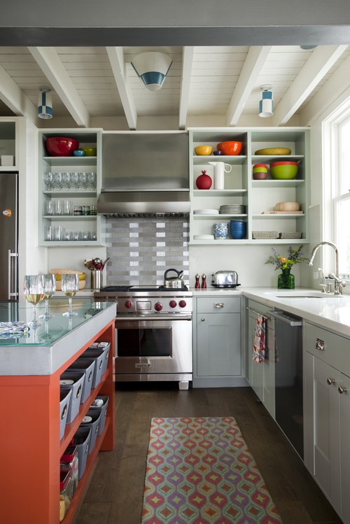
Again orange is paired with gray for a fresh feeling in a more traditional kitchen. What’s delightful is that the orange is nicely balanced by bright pops of color in dishes and the rug.
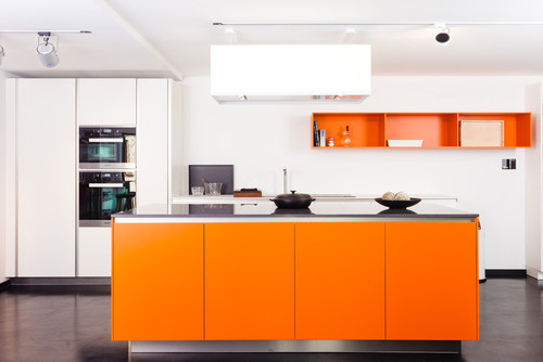
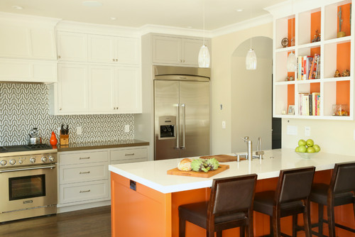
A smart way to ensure that orange looks like a plan and not an afterthought is to tie it in with smaller accents of the same color. Above, the orange island looks smashing when the back wall and niches painted in the same striking shade.
Finally, above, a beautiful modern kitchen uses orange not only on the kitchen island but on upper cabinets too. It never feels like too much. So the moral of the story is simply this: don’t be afraid to do orange. In an age of gray, taupe and beige, a bright, funky color can transform an otherwise boring space!

Leave a Comment