Design Dilemma: Another Look at Small Space Living
There’s been A LOT of talk of small space living these days. In fact, “micro apartments” have gotten a lot of buzz in places like Boston, San Francisco and New York, where affording a larger space can be difficult. Some of the tiniest of these tiny apartments include 220 square foot minis in San Francisco at a price of $1500 a month. (Apparently very low in San Francisco.)
Since there’s been so much talk of ultra-small places, we thought it was worth taking a look at one really pretty space.
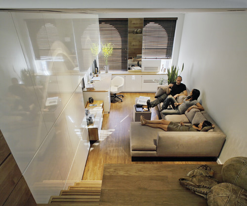
Above and below, check out a tiny but perfectly well-planned apartment in New York’s East Village:
Here’s more:
And more still:
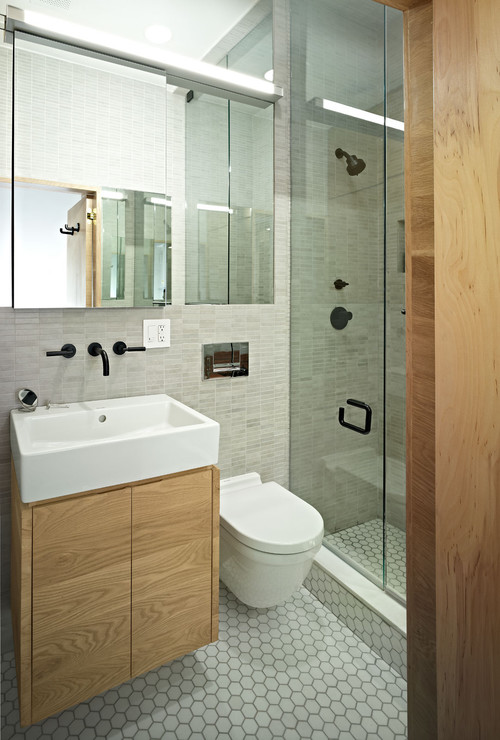
Here’s the bathroom:
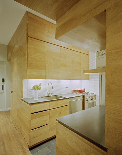
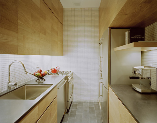
And another view of the kitchen:
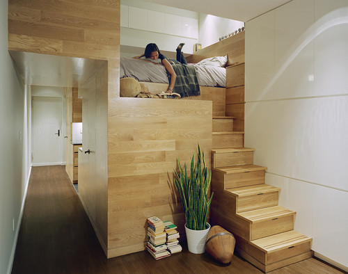
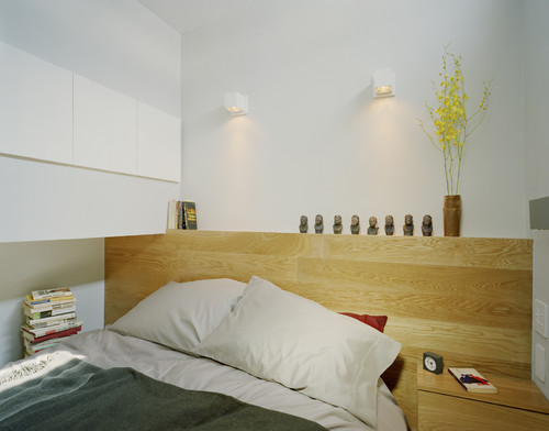
And the bedroom:
Let’s analyze why this space is genius.
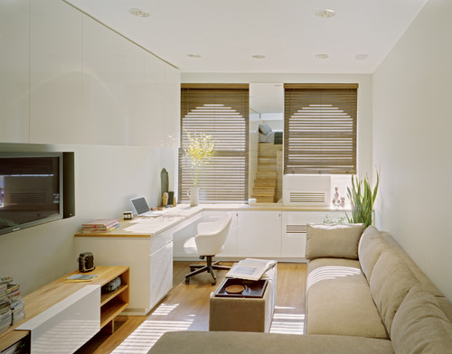
- First, liberal use of built-ins eliminates the need for almost all furniture. In the living room, a wall of cabinets and the bank of lower cabinets fulfill a number of needs in short order. The lower cabinets provide storage and an area that can function as a study. The upper cabinets provide storage for books, electronic equipment and other necessities of daily living. The flat screen TV is tucked neatly under the upper cabinets, preventing the TV from dominating the room.
- The fact that the cabinets are white and glossy expands and lightens the space, preventing the dark heavy feel that conventional furniture might create. This space only has two windows, but it doesn’t feel dark at all.
- Keeping the finishes consistent, with the use of a light wood throughout the house, helps expand the space rather than divide it.
- Colors are kept neutral, to keep the eye flowing throughout.
- Full use is made of vertical space. Cabinets extend all the way up to the ceiling.
- Every stick of furniture can multi-task. For instance, the cabinet in the living room can be a desk while studying or a bar while entertaining. And the stairs that lead to the sleeping loft also function as drawers for socks and underwear!
Leave a Comment