Design Dilemma: Black, White and Red All Over
When is a classic palette also a very modern one? When you’re combining black, white and red!
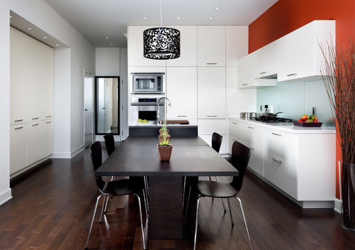
This trio of colors always feels youthful, dramatic and vibrant and has become classic, as it never seems to go out of style. It can work in a minimalist, less is more context, but works equally well in a maximalist home replete with antiques, pillows and wallpaper. Lately, we’ve been noticing this color combo in more and more kitchens, and we have a theory. In an era in which more and more of us have “open” kitchens that are integrated into the rest of our homes, we also need less “kitchen-y” colors that can translate easily to the rest of the house. The picture below is a good example of what we mean:
Because the kitchen is really just a part of the living room and dining room, the same color palette is needed throughout. And that’s harder to do with traditional kitchen colors like lemon yellow, peach or pale green. Black, white and red, on the other hand, feel sophisticated, urbane, chic and dramatic, and what’s more, according to those into color therapy, the color red stimulates the appetite. It is also a color combination that looks just as good in other contexts as it does in the kitchen, making it perfect for those who are looking for a vibrant color combination that never gets tiring.
Let’s take a look:
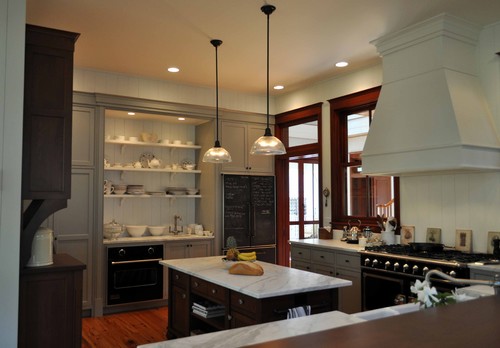
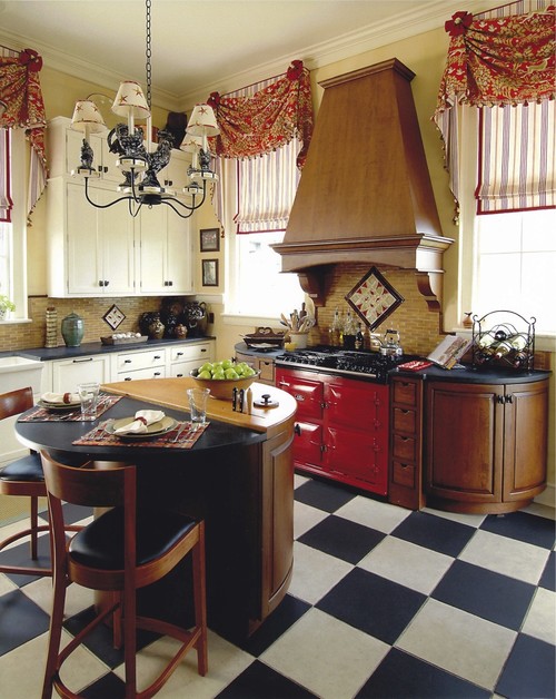
The traditional kitchen below feels warm and inviting with a pop of red in the doors. It would still be a nice kitchen without the red, but it would lose the sense of hipness it now exudes.
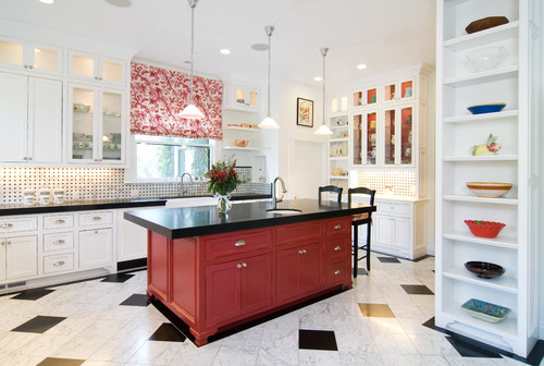
Then there’s an airier, more transitional take on the black, white and red kitchen. Painting the kitchen island red instantly provides an unexpected pop of color which the owners have picked up in the window coverings and interior color of some of the cabinets. The black countertops against the white cabinetry provide dramatic contrast which is echoed in the floor choice.
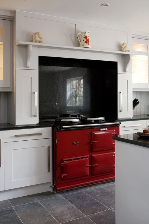
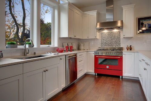
We’ve noticed a theme in all of the kitchens we’ve run across. You only need to have one red element in the room to totally make it work. Check out the kitchen below in which the one red element — the stove — is complemented by a black granite backsplash.
Different kitchen, same idea:
And yet another take on the same idea:
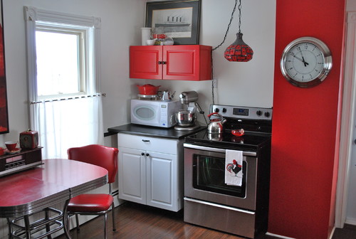
However, kitchens that go for more than just one red element can work well too. For example, the red wall, red cabinet and red dinette set look sweet and funky in this tiny kitchen:
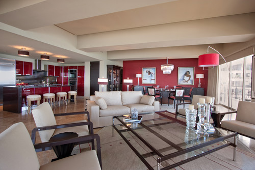
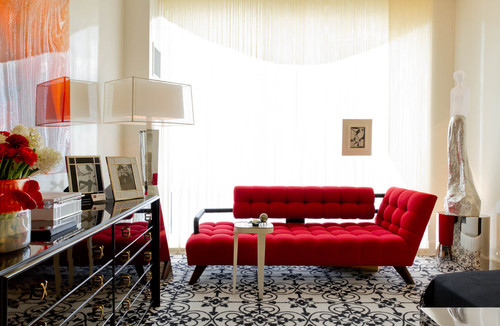
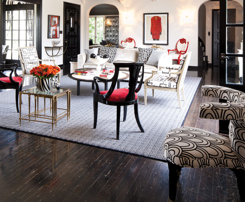
Now let’s imagine, for a moment, that you’ve got a black, white and red open kitchen. If you want to see how well the color combo translates to other rooms take a look at these photos:
And this:
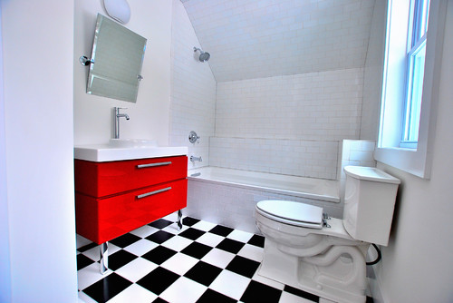
And this:
So what’s the take away on black, white and red kitchens?
- If you’re wary of red becoming overpowering, use it on just one element in the room, preferably an element that can easily be changed. Obviously wall color is much easier to change than cabinetry, so that might be a great place to start, as in the first photo of this post. The second easiest option would be a door and frame, and a third option could be a kitchen island.
- Black and white tile or linoleum are a natural in this color combo. It’s a classic combination with a lot of pop, and it never goes out of style. It looks great in bathrooms, too!
- Red appliances are uber-cool. Red stoves are always hot (no pun intended) and break the stainless steel mold. Also very cool are red refrigerators. Our favorite is the Smeg.
- Keep it simple. Red is kind of like a spice. You add a little and it can give necessary zing to any interior. Add too much and oddly, red loses it’s impact. You can repeat red in a few pieces of crockery, or perhaps in a window treatment, but you’ll be better off if you refrain from layering red upon red. The result will be fresher and you’ll never tire of the impact.
Leave a Comment