Design Dilemma: How to Do Blue
Are you feeling a little blue? So are we! But in this case, it’s not a bad thing. Blue can be one of the baddest, boldest colors to use as an accent in interior design.
Why’s that? It’s because although blue is a “cool” color, it actually comes in so many emotional temperatures, ranging from fresh to calming to electric to moody, that it offers a wealth of design opportunities. It is the color of the skies, lakes and seas, so it has a very grounding, elemental appeal, but it also speaks of energy and renewed life, giving it quite a punch. It can feel youthful and modern or traditional and preppy. Let’s take a look:
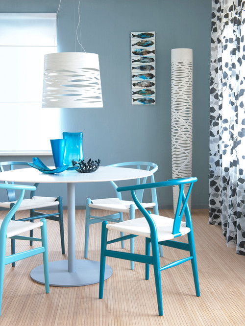
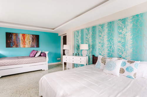
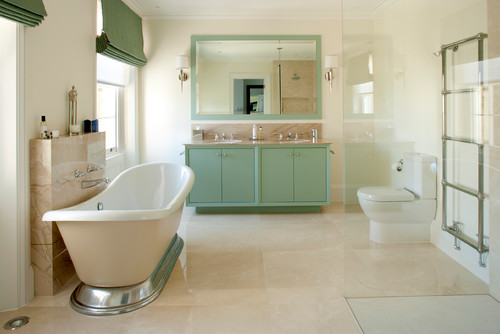
If you’re looking for a beachy feel, choose aqua and seafoam green.
Above, varying shades of aqua in a dining room and bedroom contribute to a sense of airiness. Below, seafoam green in a bathroom.
These shades are a natural if you want to recall the soothing, relaxing tones of the water. They have a lightness that helps interiors feel fresh and bright.
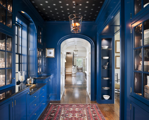
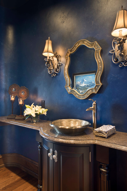
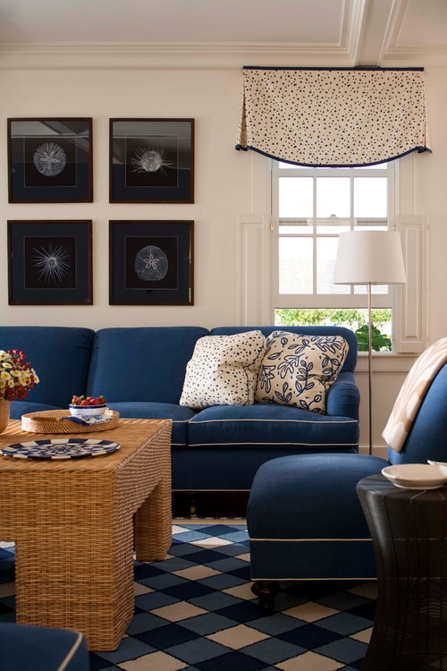
A darker navy blue can feel either mysterious and moody or preppy and traditional.
Below, a darker shade in a pantry lends the space a sense of timeless elegance.
And here, a traditional bathroom:
And below, a room that makes liberal use of blue, with a preppy feel:
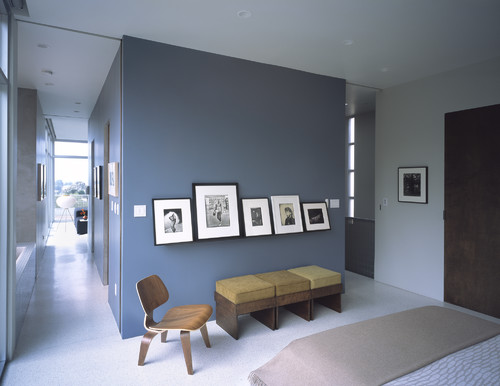
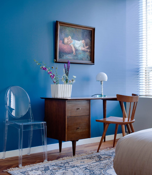
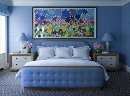
Use blue as a foil to art work.
As seen below, a blue wall can perfectly set off artwork, providing drama without overpowering it.
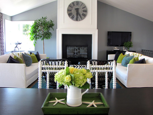
Going modern? Opt for a gray-blue or a periwinkle.
Below, a modern blue living room veers into gray.
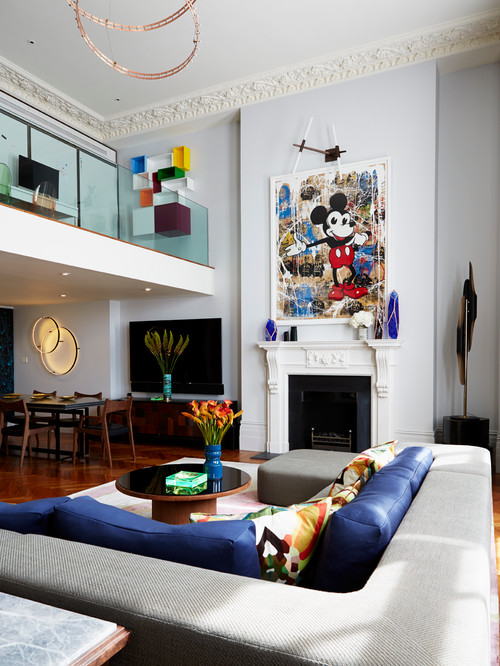
And here, a modern blue living room with shades of periwinkle:
What else to know about blue?
- On exteriors, use blue to highlight architectural details on colonial homes.
- Light shades of blue look great on a beach cottage.
- Slate blue works well on a Craftsman style bungalow.
- Sapphire blue is a traditional choice for shutters on Mediterranean style homes.
Leave a Comment