Design Dilemma: Less is More and Other Lessons
Before and After make-over photos are fascinating. Not only do they show off the design prowess of proud designers and homeowners, but they always hold lessons for us all when it comes to designing and furnishing our own interiors.
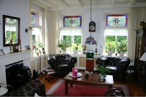
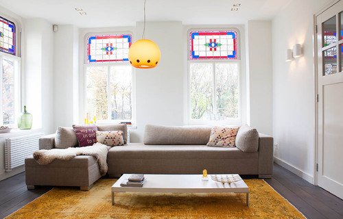
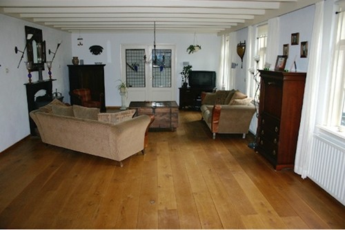
Recently we ran across these before and after photos and were floored by the dramatic differences we saw. Most of all, we felt there were a few basic design lessons that any of us could take away from this makeover, even spending a fraction of the money spent in this particular reno. Just take a look at the above living room transformed below:
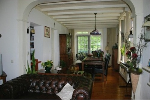
What a difference, huh? And here’s more. Here we have a before view into the dining room:
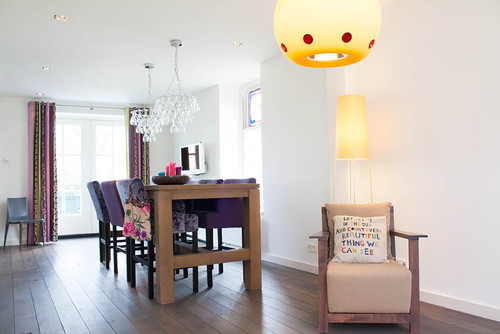
And after:
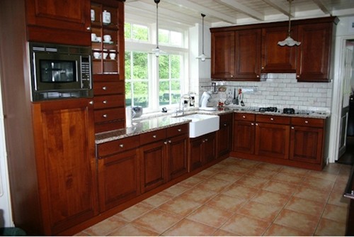
Here’s a before of the kitchen:
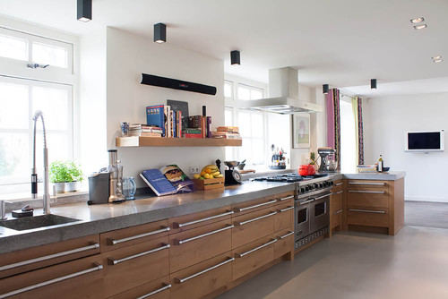
After:
What’s the take-away of these before and after photos?
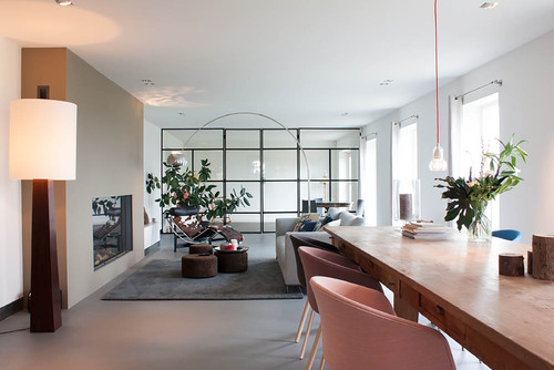
1) Less is More. Yes, these homeowners have made a whole lot of structural changes that involve paring down. The ceiling beams are gone, along with arches and mantles. But just the furnishing choices alone are enough to make a dramatic difference. In the case of the living room, two bulky chairs and a couch were exchanged for one streamlined sectional, freeing up more floor space, while providing ample seating. The small plants on the window sill are gone, along with the curtains, another bulky china cabinet, radiators, footstools and tchotchkes. In the kitchen, upper cabinets disappear. In their place, appear simple open shelves. The space is one simple, light-filled space with a built-in storage cabinet.
2) Pops of bold color make a difference. The above photos show a space that is mostly brown — brown couches, chairs, tables and furnishings. Without all the dark wood, and with the addition of a sizzling bright orange over dyed oriental, the “after” photos sizzle, without trying too hard. In the dining room, bright purple and patterned chairs add more color and spark, as do the patterned curtains in the dining room. Lighter wood tones feel much more modern than the dark wood in the before.
3) Lighting adds drama. A dramatic pendant lamp in the living room, and equally dramatic wineglass chandeliers in the dining room give these rooms a panache they lack in the before photos. The black down lights in the kitchen make a modern statement without dominating.
Here’s another view of this amazing transformation:
After:
So if you’re hankering to effect a change at home, try getting rid of some furnishing, adding a little color, and adding new lighting.
Leave a Comment