Design Dilemma: Quirky in Stockholm
Have you ever craved quirky, kooky, colorful design in your home, but you don’t quite feel you have the courage? Well, we’ve found some inspiration for you! This home, in Stockholm, Sweden, appeared on a Swedish real estate site, and we took notice. It’s a 56 square meter apartment up for sale for 5.05 million kroner. And it couldn’t be funnier or freer in design!
What we’re liking is its bold use of primary colors — the sort of colors that come straight out of your child’s box of crayons, along with wacky, idiosyncratic, design choices that move this apartment out of the realm of the simply colorful into the world of the wild.
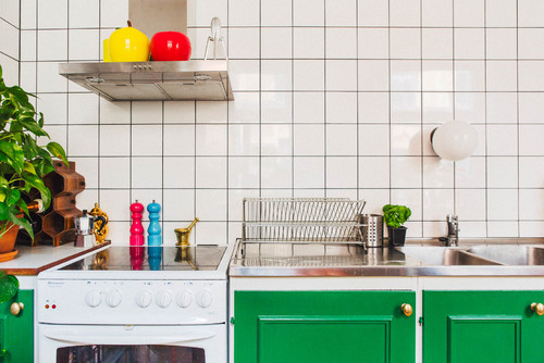
Above, the lower cabinets in the kitchen are painted a bright kelly green which stands out, in a good way, against the basic white tiled kitchen wall that remains a clean, modern, grid backdrop. Accessories like salt and pepper shakers in magenta and sky blue and bowls and tea kettles in cherry red and lemon yellow, help balance the color of the cabinets and pick up on the happy, child-like theme.
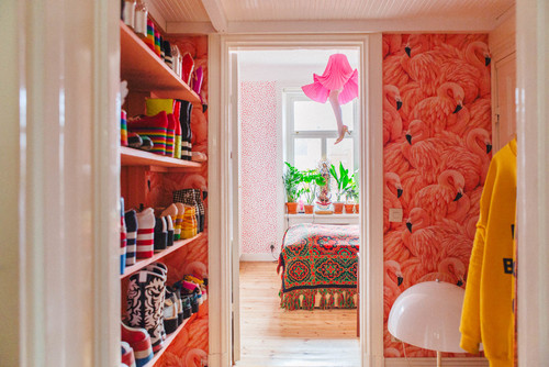
Pink flamingo wallpaper in the hallway continues the feeling of the unexpected. And the funky platform shoe collection points to more off-the-wall individuality. We wonder if the owner of this apartment might actually be a professional clown?
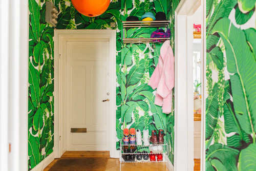
In a different hallway, bold, green palm-frond wallpaper again picks up the playful nature theme. Contrasting elements are the bold pumpkin orange pendant, along with a few colorful shoes and clothes on a practical shoe and clothes rack.
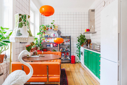
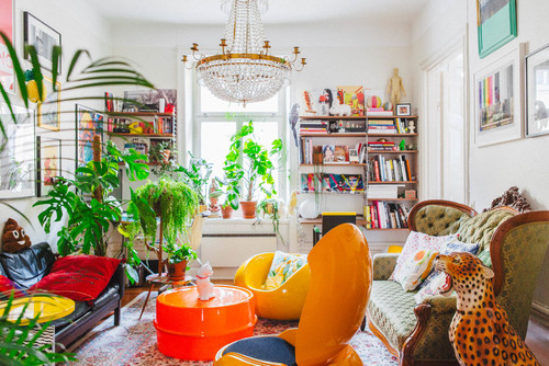
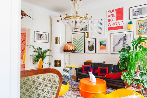
Take a look at this living room. We’d call it unapologetically maximalist, with its mix of eras, colors, prints, and artwork. And the best thing about it is that there is nothing particularly trendy or costly in sight. This is pure vision (and a practiced, studied eye) at work.
Another angle:
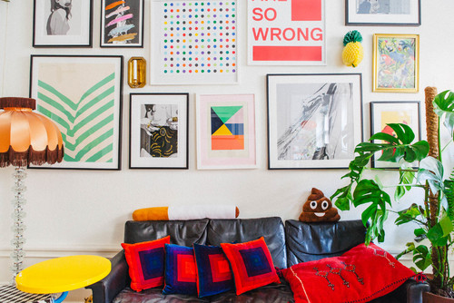
And here’s a view of the gallery wall:
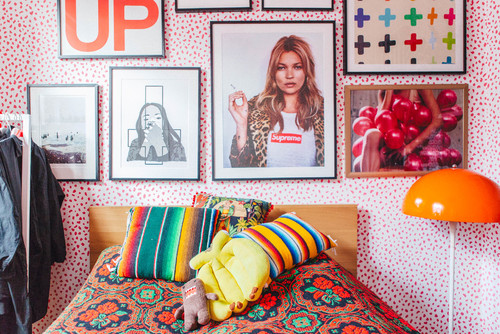
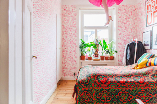
Here’s more in the bedroom:
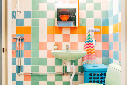
And the happiness continues in the bathroom:
Polka-dot wallpaper and a hanging pendant leg lamp make for pure laughs.
This Scandinavian home is the exact opposite of what so many of us associate with “scandinavian” design. It’s not about minimalism or all white, or all black, and we applaud the owner of this home for taking a path so very different from most.
What’s our take away for going quirky?
- Be fearless. Take chances with color and design choices. It’s okay to go kitsch!
- Use wallpaper. It’s an opportunity to inject instant funk into any space, depending on how bold you go.
- Mix patterns. In the bedroom below, a small polka-dot wallpaper looks great with a larger-patterned, bolder bedspread.
- You can never go wrong mixing bold primary colors. Colors of equal intensity that contrast and complement on the color wheel will always look great together, as long as they are also allowed to breathe with a white or neutral backdrop.
- Forget the name-dropping. There’s no need to drop a lot of money on new “brand name” and “designer” pieces. All you need is a thrift shop around the block and a good eye.
So the question is, would you have the guts?
Leave a Comment