Design Dilemma: Red 101
Got a hankering for red? We do! Red is bold and modern. It’s snazzy and snappy. Best of all, it can be the easiest way to wake-up an otherwise boring room.
But red can go wrong too. Use too much, and you lose the cool factor. Use the wrong hue, and it just doesn’t work. Here are a few things to keep in mind about RED.
1) A little bit goes a long way.
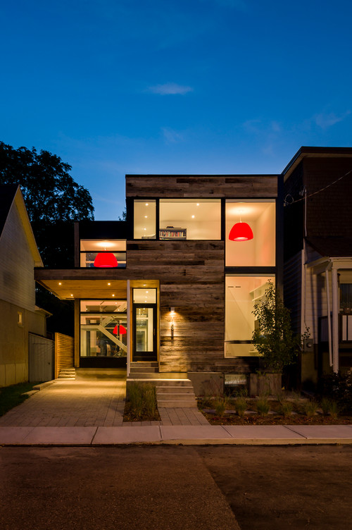
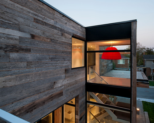
The best thing about red is that you don’t have to use much of it to get the most dramatic effect. In fact, just one red object in a room can have much more impact than a whole lot of red scattered around a room. For instance, in the home above and below, just a few red lampshades placed in windows make a bold, and very cool, statement to the entire neighborhood.
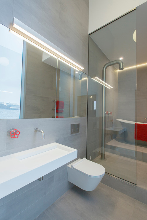
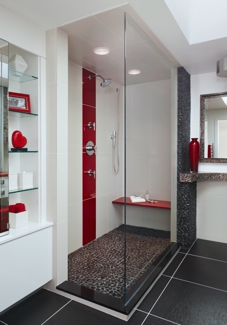
And in the bathroom below, just one red faucet (and a red towel) make a truly modern statement.
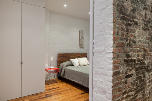
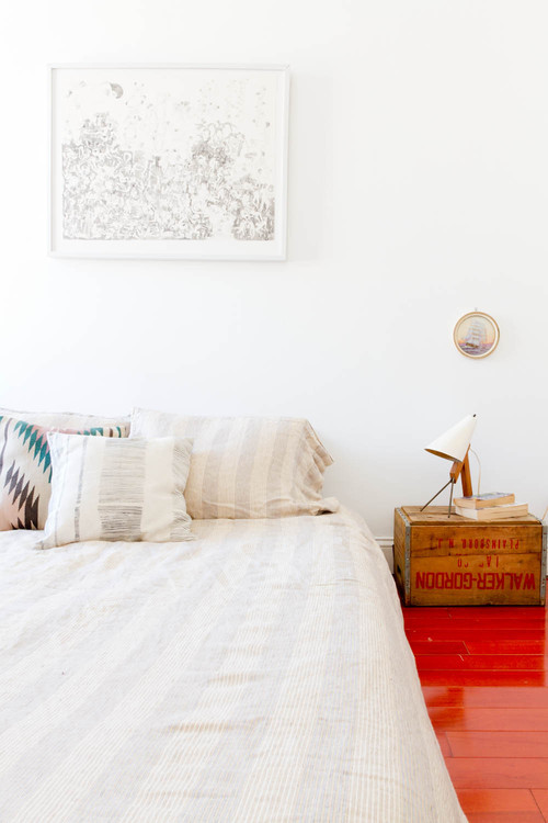
In the neutral bedroom below, one red nightstand provides plenty of pop.
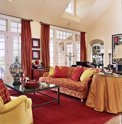
2) Get your red right. Bright orange red reads modern, darker, maroon-like, burgundy reds summon up the traditional. If you’re going for a more traditional look, your red might look something like this:
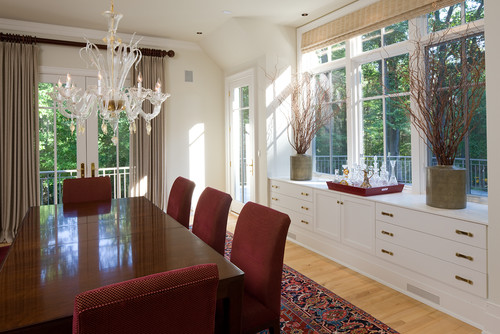
Deeper, darker maroon reds suggest coziness. This is a color we associate with autumn and settling by the fire. It’s a hue we often see in oriental rugs. It works well in Victorian settings with lots of wood paneling and often gets paired with deep blue or golden yellow. Here’s another example in a Maryland Georgian home that veers more toward the transitional:
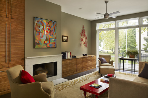
On the other hand vivid tomato reds and reds veering into orange work better in modern, clean-lined homes. Here’s a vivid tomato red, used with discretion in an otherwise clean-lined room:
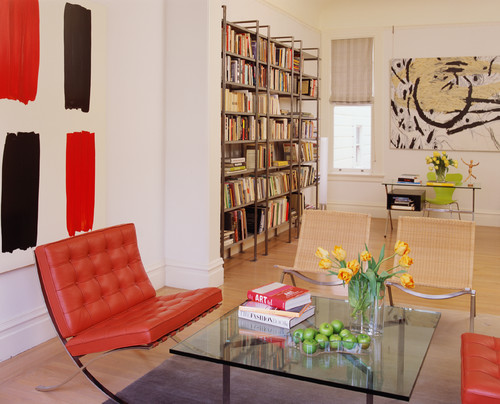
And here’s an example of the red-orange hue in a very contemporary home:
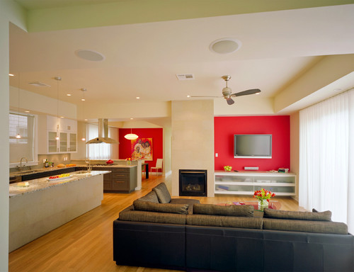
3) If you want to make a very bold dramatic statement, consider an accent wall or red kitchen cabinetry. The beauty of the accent wall is that it can easily be repainted. As the walls below:
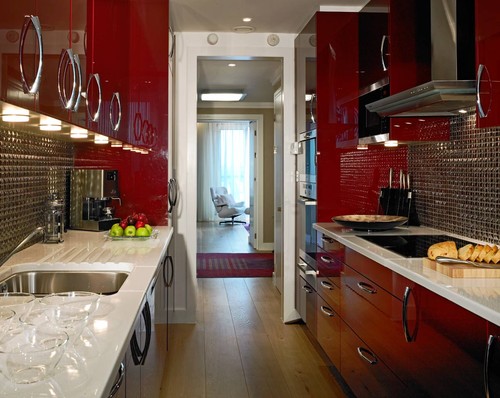
And look how cool, modern yet classic a red kitchen looks:
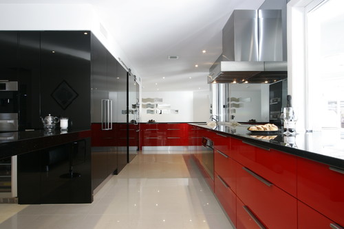
Or here:
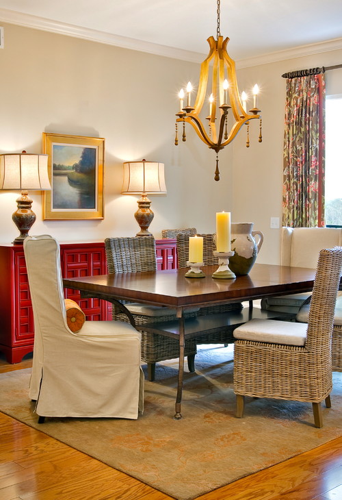
And if you’re not brave enough for kitchen cabinets, a sideboard painted a bright red can be a great, more flexible alternative:
4) There’s no need to scatter. While it’s tempting, once you get the “red” bug to scatter multiple red accents around a room, the more modern way to decorate is to concentrate the red in just one or two pops. Below is a bathroom that looks great but might look better with one or two fewer red accents:
And here, a slightly more modern use of red, by concentrating all the color on the floor:
So are you ready to paint the town red?
Leave a Comment