Design Dilemma: Three Common Design Mistakes that are Easy to Fix
It turns out that the most common interior design mistakes are also the easiest to fix! And that’s good news, since many of us live with a lingering sensation that something in our interior design is a bit “off.” Take a look around and see if you are committing one of these common interior design errors.
1) Hanging art too high.
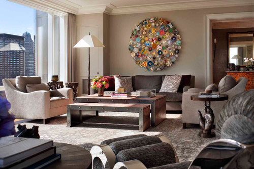
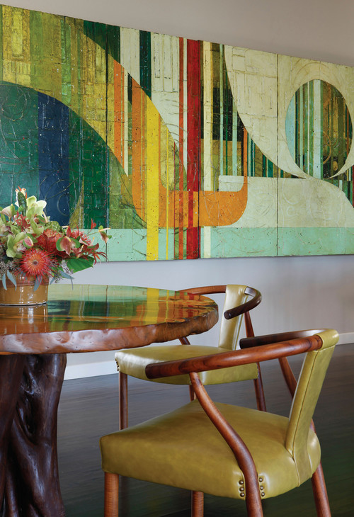
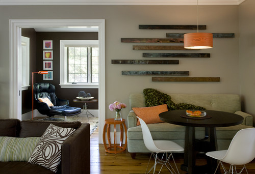
Take a good look at the photo above and below. Notice how the painting and artwork is hung so that the average person, when standing, will be able to look in the center of a painting. (In galleries, that means that the center of most paintings hovers about 60 inches from the floor.) You should aim for the same in your home. It’s important that any painting work within the context of a furniture grouping. It needs to relate. For that reason, even if you are hanging a piece in a great room with very high ceilings, you should aim to hang artwork at a level that still connects with furniture. Notice how nicely these pieces relate to the furniture groupings around them.
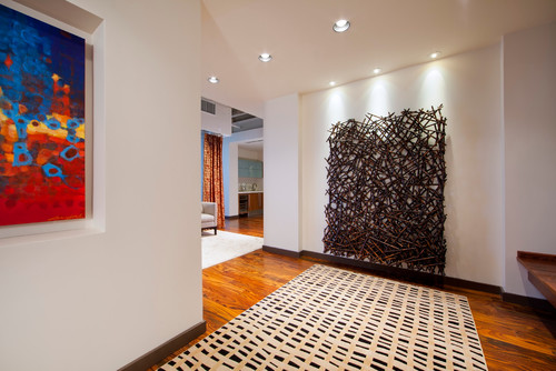
And here in this hallway, the piece is hung at a level in which you feel like you could become a part of the sculpture:
Note that it’s okay to go higher on a wall when you are creating a “salon” effect by hanging several paintings:
2) Going overboard with houseplants.
Plants can be a beautiful thing in a home, bringing in a bit of nature indoors and acting as a natural air purifier. But people often get carried away with lots of little cuttings in jars scattered about on every free surface. The effect is one of clutter and chaos. In fact, houseplants are best used as a sculptural element. That means going larger, paring down and thinking carefully about placement.
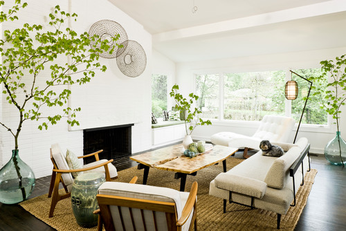
In the room below, three carefully-placed large tree branches add a natural, balanced note that manages to bring in lots of greenery while totally working within the clean, minimalist confines of the room:
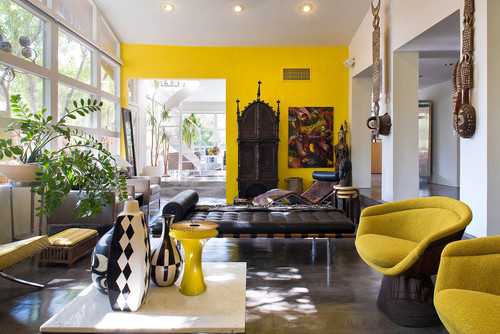
In this room, one well-placed houseplant looks just like another sculptural element, picking up perfectly where African masks have left off:
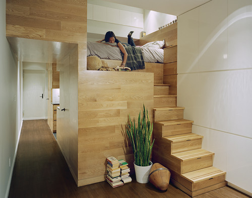
In this ultra tiny East Village studio, one plant manages to bring the outdoors in, dispelling any feelings of claustrophobia without taking up a lot of space.
3) Retreating to Neutrals.
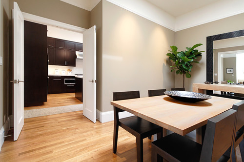
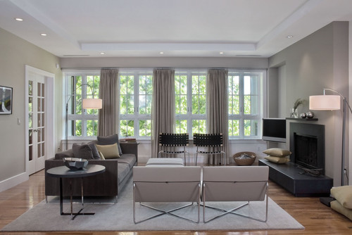
People are so terrified of making design mistakes that they often opt for the easiest choice when shopping for furniture or choosing wall colors. They go beige. Or gray. The effect is one endless expanse of greige on walls, rugs, couches, etc. It’s bland, boring, and totally lacks personality. And sure, it can be tasteful at times, but it’s also so safe that it lacks dynanism. The room below is a perfect example.
If you’ve got a case of the “greiges” know that it can easily be remedied by injecting a bit of color into your home in places where you feel safe doing so and at a relatively low cost.
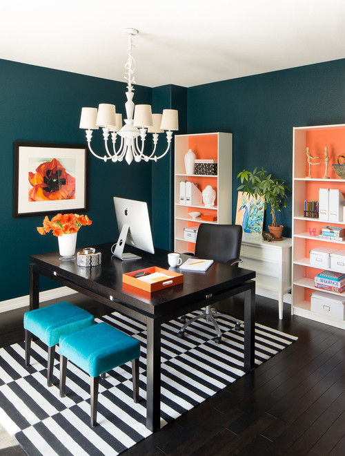
You can paint the walls a dramatic color, or invest in an interesting patterned rug:
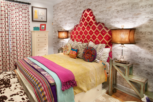
You can throw some patterned textiles into a room, via sheets, blankets and pillows:
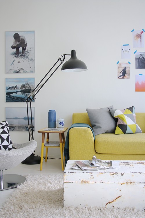
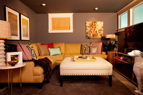
You can opt for one colorful piece of furniture, such as this yellow couch:
Or this one, complete with colorful pillows and artwork to boot.
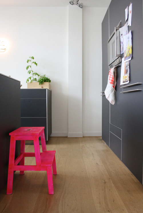
Sometimes, all you have to do is add a fluorescent pink stool!
So if you’re guilty of committing one of these design errors, take heart. It takes just a moment to fix these problems and you’ll find your home’s interior much improved.

Leave a Comment