Design Dilemma: Two Contrasting Strategies for Tiny Spaces
There are all sorts of approaches to small space living. Some go minimal, others maximal. Some create different zones, others go for one big open space. Let’s take a look at how different designers have approached spaces of less than 400 square feet.
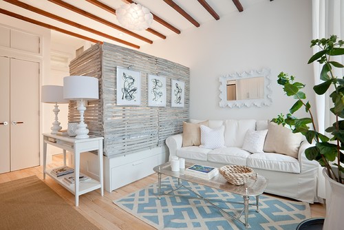
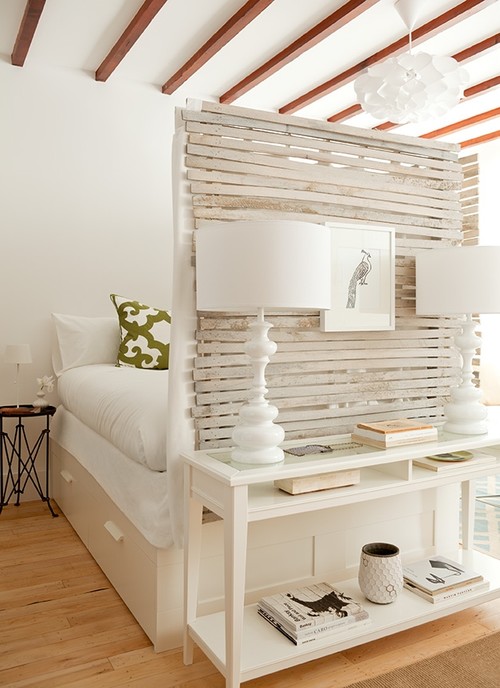
Above and below, check out a space by designer Lyndsay Caleo of Brooklyn Home Company. Caleo and her colleague Fitzhugh Karol, both designers with backgrounds in art and furniture design, tackled this 400-square-foot studio apartment in Park Slope, Brooklyn by creating distinct zones, including an entry way, a bedroom and a separate living area.
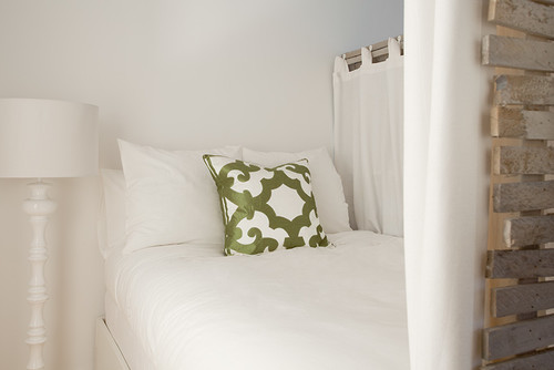
One clever idea was to use a lathe theme as a separation between bedroom and living room. The lathe keeps everything feeling airy and open and the texture and patina help to give the space character. It also allows a wall on which a small console can rest, providing the perfect landing strip for keys and other items. Here’s another view of the bedroom:
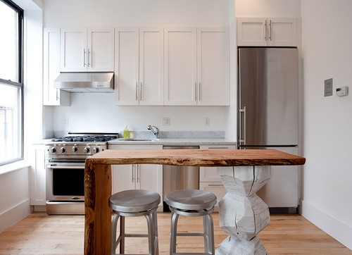
The kitchen keeps things feeling open and airy, as it features only one wall of cabinets. A sculptural island makes for an artsy transition from living room to kitchen and can also serve as a workspace.
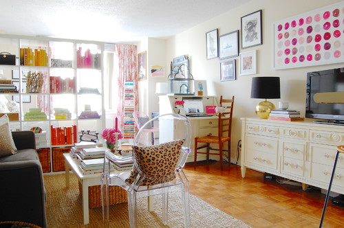
This 350 square-foot Manhattan studio takes a similar approach of creating separate day and night zones, this time using an Expedit bookcase from Ikea as a see-through wall.
What these first two homes have in common is a reliance on light bright colors to keep things airy, and a rigorous order.
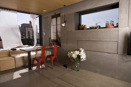
But it’s not always possible to section off a studio. And this is where the opposite strategy comes in — leave everything right there, together, in one open floor plan. For instance, this 260 square foot Barcelona studio is simply too small to contemplate divisions of any sort. And that’s where photographer Christian Schallert and architect Barbara Appolloni came up with clever built-ins to make the space functional and beautiful. Below is a view of the dining room. The dining room table can flip up and the bed can flip out in this same area:
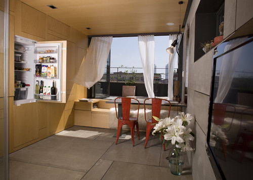
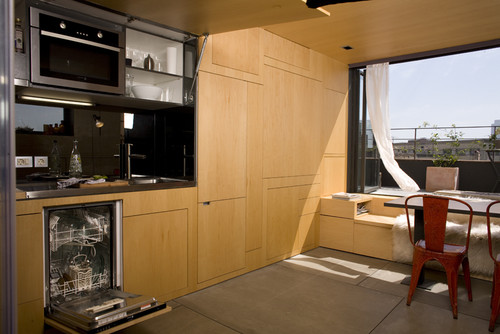
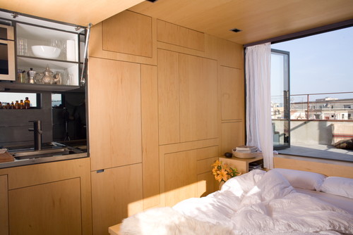
The kitchen and refrigerator are embedded in a storage unit on one side of the studio:
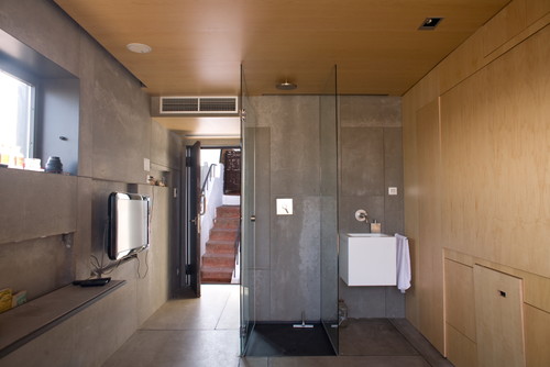
On the other wall near the entrance is an open shower, and across from the wall encompassing the kitchen is the entertainment center. The toilet is the only private space — in a small room with a little window, behind a hidden door next to the sink:
The bed can be pulled out of the area nearest a sunny balcony:
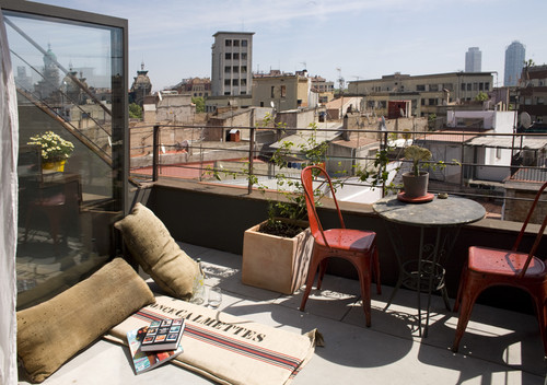
And what makes this microscopic apartment totally livable is the 65 square foot balcony, right outside the living area:
So you see, there are a multitude of ways to tackle small space living. Creating divisions with “removable” walls or creating built-ins are two great options for making a small space just as comfortable as a large apartment.
Leave a Comment