Design Dilemma: Unexpected Design Advice Worth Following
When it comes to decorating advice, we’ve heard it all. A lot of what we hear seems intuitively correct, and other things we hear sound downright silly. But every now and then, we hear something that we don’t expect and that we find actually works. We’ve decided to share a few of those tips with you here:
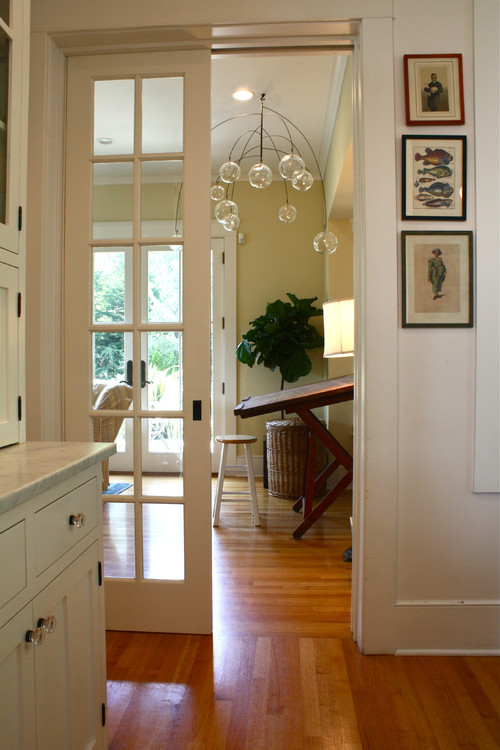
Tip No 1 : Install your door knobs at 34 inches — a bit lower than the usual 36 inches. It breaks up the doors into a prettier, more relaxed proportion. Richard Bories and James Shearron. We’d never heard this one before, but it makes sense as it echoes the ideas of the ancient Greeks who believed in the Golden Ratio for beauty of 1:1.618. When we’ve seen doors with lowered knobs, we have to admit — they look better!
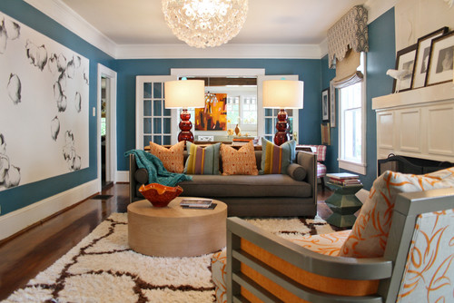
Tip No 2: Strong clear colors are easier to live with in the long run than pale color. Soft colors get boring more quickly — Richard Keith Langham. We never thought about this, although we do have a preference for strong clear colors like red or orange. Vibrant bold colors feel youthful and energetic and timeless while more muted colors often feel subject to the vagaries of fashion. For instance, the living room below features a bold blue wall that we could enjoy for many years to come.
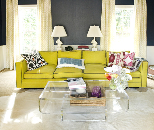
We feel the same way about this bold yellow couch, which wouldn’t have the same timeless appeal in pale pink or blue:
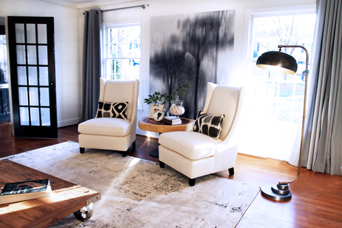
Tip No. 3: Don’t hang a mirror between windows. The void it creates distracts from the view. Don’t fall prey to using mirrors in every room over every mantle. Mirrors are not art, and a room needs art. — Carey Maloney. Here’s some advice where we can totally get on board. Yes mirrors are nice, but they will never have the energy and interest of a beautiful painting. So hang one mirror, but fill the rest of your home with art! The room below just wouldn’t have the same oomph if a mirror stood in place of the dramatic and moody tree painting.
Here’s another view of the same room:
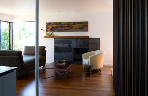
Tip No. 4: If you have a painting that looks too small above your sofa, don’t center it. Offset it a few inches to the left. The negative space called “ma” becomes part of the image. — Richard Mishaan. We hadn’t thought about this before but it makes total sense. Off-centering a small painting completely disguises mismatched proportions. Check out the painting over the mantle below. If it had been centered, it would have appeared too small.
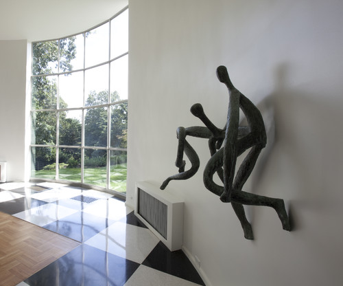
Tip No. 5: Small abstract sculpture is an instant way to modernize a traditional room. It could make J.P. Morgan’s death chamber look modern.” — David Netto. Sculpture is not used as often as it could be, and it’s a real shame. Nothing can activate a room, be it modern or traditional, like a dynamic modern sculpture.
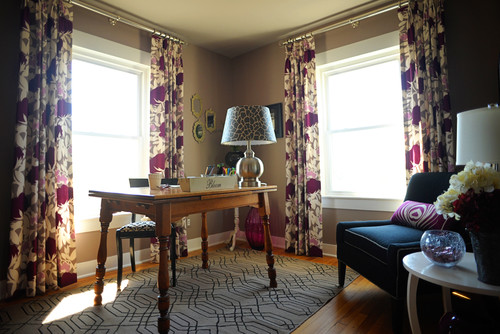
Tip No. 6: Once you’ve used a fabric in a room never use it anywhere else in the house. Do not match your fabrics! Do not let your fabrics make your room look too decorator-y. Garrow Kedigian. We’ve all seen those decorator showhouses with matched chintz drapes and sofas. Nothing looks more old-fashioned. The freshest interiors these days are much less studied, throwing in mismatched patterns and colors in free abandon. In the home office below, a variety of fabrics are used. They are related, but they don’t match.
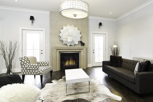
Tip No. 7: Best dog-proof floor covering: cowhide. Cannot beat it. Cannot hurt it. — Jill Sharp Brinson.
We have had personal experience with this one and we have to absolutely agree that it’s true. Cowhide is resistant to spills, accidents, stains, dog hair, mud, or whatever.
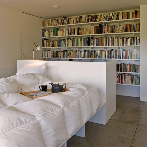
Tip No. 8: When it comes to bookcases, stick to books. Nothing is more chaotic than 46 shelves filled with random ‘stuff.’ —J. Randall Powers We’ve seen a lot of bookshelves filled with objects and tchotchkes, but if you have a sizeable bookcase, it’s true that filling it with random objects is going to look messier than a clean wall of books, as below.
And some parting words of advice from designer Erin Gates: “Definitely do not do all your shopping in one store or catalog. Don’t order a couch, coffee table, and bookshelf all from one place. Have patience. Take your time, and look at different sources like flea markets and antique shops. You can’t do it all in one day if you want the space to look like you and reflect your life. Move slow—wait for what you love. People rush, then feel uninspired and wonder why. That’s why.”

Leave a Comment