Design Dilemma: Vintage is In
If there’s one thing we’ve all seen too much of lately, it is that staged home, catalog look. You know the one —- neutral couch, beige shag carpet, neutral drapes, espresso furniture straight from West Elm. It’s all very nice, but… frankly, a little boring.
If you’ve fallen into the dreaded staged look, there is one sure-fire way to pull yourself out of it: go vintage. Just one or two vintage pieces can instantly make your home feel stylish, unique and very personal. No more boring flatness! Let’s take a look, shall we?
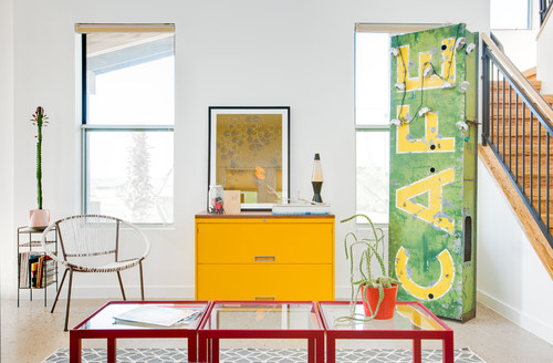
Above, a vintage commercial sign adds pop and vigor to an already colorful space. In fact, we’ve spotted quite a few interiors of late sporting this look — popular because every sign is one of a kind.
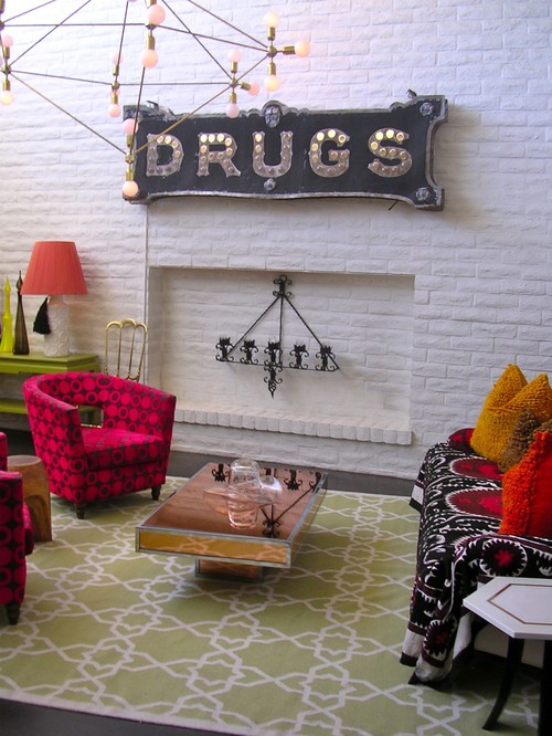
Here’s another funky, tongue-in-cheek sign, paired with vintage tub chairs.
What’s interesting about the above two examples is how they both use vintage signs to a dramatically different effect. In the first, the cafe sign adds pop to a youthful, minimal look. The font style and the color picks up on the bright, straightforward primary colors throughout the rest of the room. In the second room, the drug sign is decidedly baroque, campy, glam, naughty. The sign fits in perfectly with the bright, patterned, bohemian look in the rest of the room. You won’t find this in any catalog!
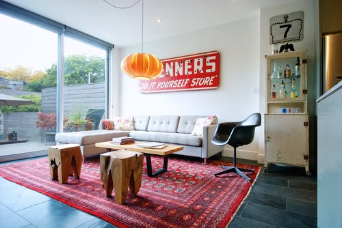
Here’s another polished interior that makes use of a commercial sign, along with a vintage medicine cabinet and chair:
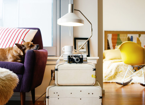
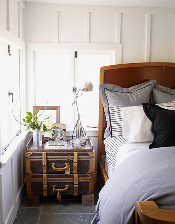
If you’re looking for a way to bring vintage style into your home in a slightly more subtle way, why not track down your grandmother’s suitcases?
Suitcases provide an unusual look for a side table, with the added benefit that they can serve as storage as well. The look here is casual and unplanned.
Here’s the same idea, with a more masculine, formal Old World look:
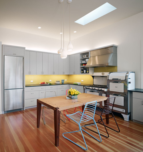
Going vintage can especially enliven a kitchen. For example, a vintage stove in an otherwise modern kitchen feels unique and unexpected:
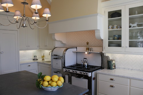
And same here in a more traditional kitchen:
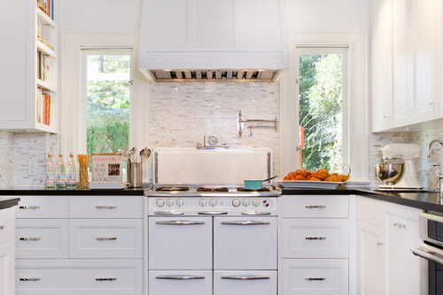
And here too in a kitchen that I would categorize as “transitional”:
Again, the most impressive thing is how vintage works with every style, whether it be modern, traditional or transitional. It’s a testament to how bringing in just one different element can magically transform a space.
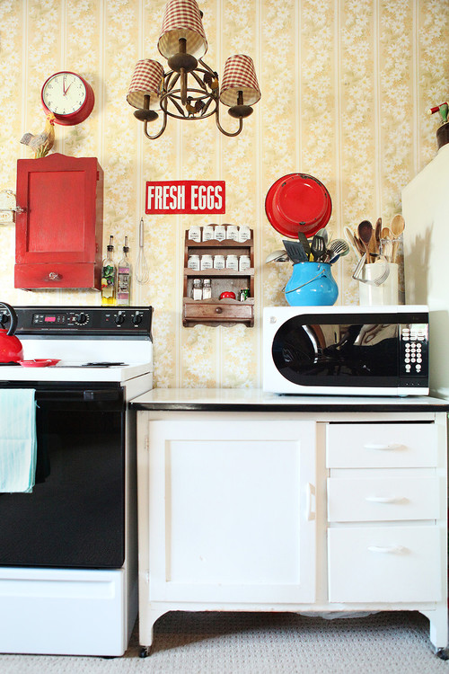
And vintage sizzle need not be contained to just appliances. You can choose vintage accessories, cabinets, lighting, whatever turns you on. The kitchen below contains vintage elements from a number of decades, a 1970s stove, a 1950s wall clock, a cabinet from the 40s, etc:
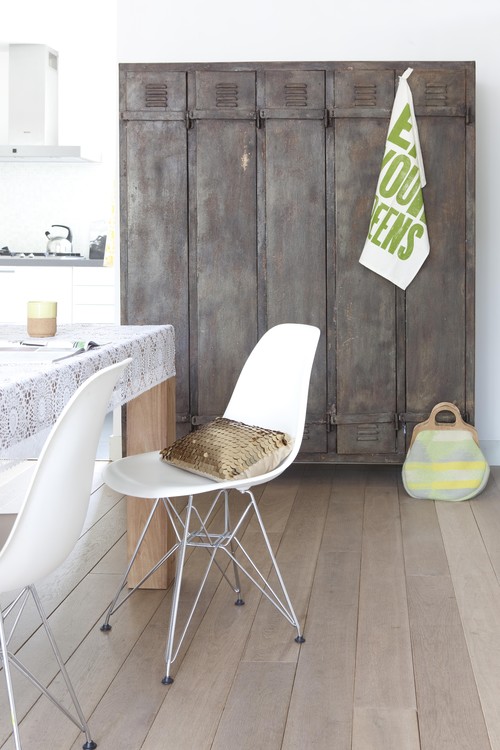
Vintage specialty items, like a vintage locker, can really make a boring space pop. For instance:
In fact, if you’ve been looking carefully, you’ll notice that many of the large furniture retailers bring in exactly such items into a catalog shoot to add more “texture” to their looks.
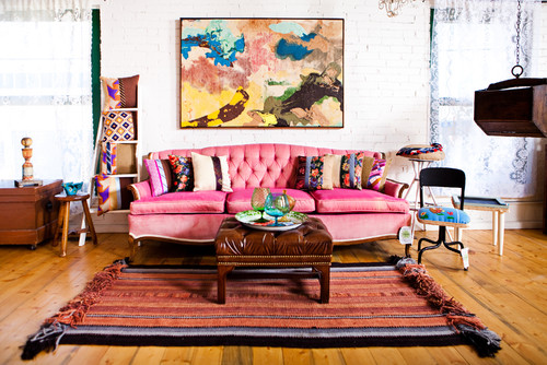
Another way to add a distinctive offbeat note is to invest in a vintage couch. Such couches can usually be had for a song on Craigslist. Their style can dramatically change the look and feel of your living room. For example, the pink velvet vintage number below adds a note of bohemia that would be missing with any other choice:
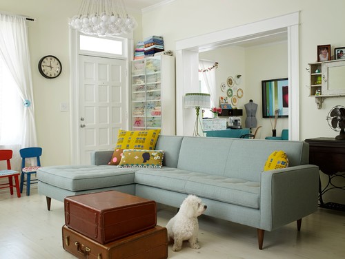
The mid-century couch below boasts clean lines, but still feels funkier than any contemporary couch would:
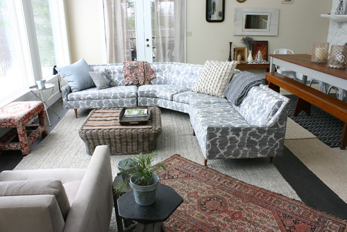
And here’s another vintage couch that’s been re-covered and updated using an IKAT pattern material:
Do you notice how each of the interiors featured in this post feels distinctly “uncatalogy.” Nothing is neutral or beige, and best of all, each interior features pieces from a variety of eras which add depth and interest. So if you feel the need to put a little pop in your space, try vintage. You can’t go wrong!
Leave a Comment