Design Dilemma: Warm, Colorful, Modern and Filled with Art
Whenever we run across rooms featuring art that are not the usual — you know, white walls, white couch, white rug — we like to share. That’s because the usual neutral background, though safe, is not the only way to showcase a kicking art collection.
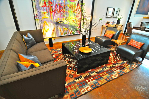
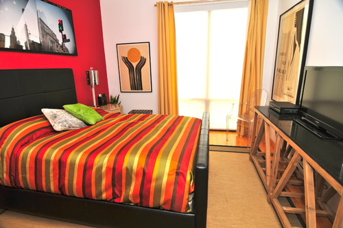
Both of the rooms above feature art — big, bold and colorful. But even so, the owner of this Dallas townhouse did not feel the need to drain the room of color for fear that it might fight with his art. Instead, he’s done quite the opposite, by adding a colorful kilim in the living room, and an accent wall and colorful bedspread in the bedroom.
Similarly, the owner of this South End duplex condo kept things lively and colorful throughout her home, despite her extensive collection of Outsider Art. In addition to a gallery-style floor to ceiling hanging of her art, she’s added Turkish rugs and patterned pillows. A brilliant red chair picks up on the red in so many of the works on display. Here’s another view:
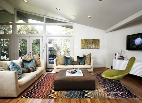
And below is another example of a room that doesn’t feel it has to give up on pattern or color, just because there is artwork on the wall. The Missoni rug and patterned pillow work perfectly with the abstract painting on the wall.
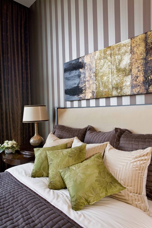
Here, patterned wallpaper is paired with artwork:
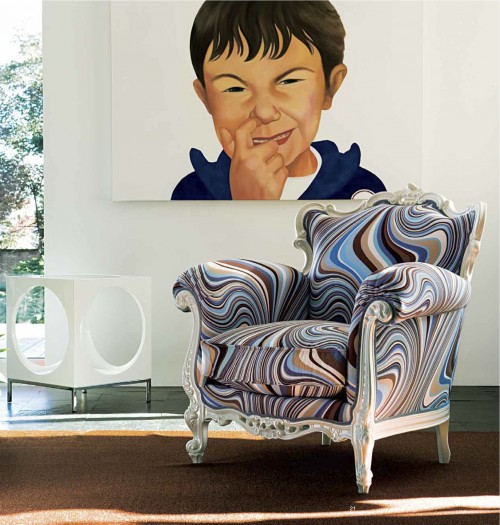
And here, a humorous portrait is paired with a psychedelic upholstered chair:
So what’s the key to using pattern and color throughout your home when you’ve also got an extensive art collection? It’s simple:
- Draw colors from your artwork. Use colors in your art as a departure point for the textiles, patterns and colors that you use in your home. A bit of red, or a dab of green could be exactly what you pull out to echo in a kilim rug, a batik pillow, an upholstery pattern or on an accent wall. The photo above is a perfect example, with the blue, brown, tan and white of the painting echoed perfectly in the swirling colors of the chair upholstery.
- Choose the scale in patterns to complement what’s going on in your artwork. For example, if your art is airy, moody, largely free of line and pattern, you can afford to go with bigger, bolder and more structured patterns in the rest of the room, as in the room above featuring striped wallpaper or the bold Missoni rug. And if your art work features lots of curves and swirly lines, feel free to echo those lines in the patterns you choose for upholstery and textiles. The swirly lines in the chair above echo the swirls and rounded contours in the portrait that hangs above it.
- Use balance. If a painting uses just a bit of red or a bit of blue, it is often precisely that color that is the best to repeat in colors and textiles. Spreading that color around the room helps to provide a room with a sense of balance. An example can be seen in photo number two, where a red traffic light (a small element of the photograph above the bed) is used to inspire the accent wall and the red stripes in the bedspread.
- Choose what you love. Don’t be too strict about choosing textiles or colors to perfectly match your art all the time. If you feel drawn to a pattern or color, you can usually make it work with your artwork. It is also the lack of perfection which can help keep your home from feeling over-designed and soulless.
Images: Houzz.com; Greg Premru for Design New England.


Leave a Comment