Design Dilemma: A Bright Idea in Paris
We love seeing smart-thinking and good planning applied to even the smallest of spaces. Good ideas lead to good living! That’s evident in this 388-square-foot Parisian studio, which formally was okay, but not as livable and bright as it could be. The owners resolved that problem by taking two relatively large closets and opening them up to become a bedroom set apart from the living room by one large partition of glass.
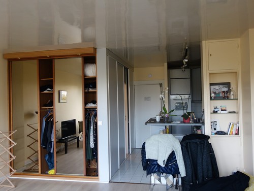
Below, take a look at the before:
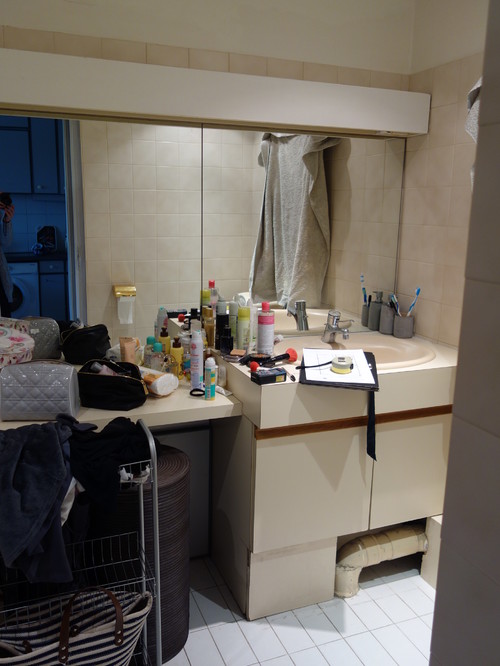
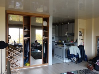
In this before shot, the open kitchen is on the right, and the bathroom is on the left behind the closet. Opposite this view, wall-to-wall and floor-to-ceiling windows overlook the street. Because the old bathroom (below) was disproportionately large for the space with a six-foot tub and large toilet, the owners decided to relinquish some of the space to create a true, very small bedroom.
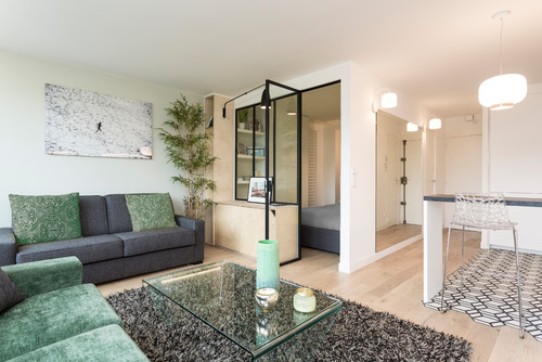
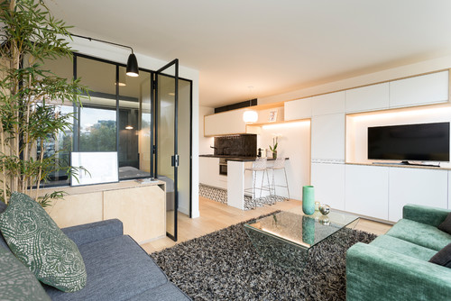
And here’s the after.
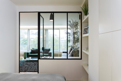
Here’s a view from inside the bedroom. The new design even allows for storage shelves and a built-in closet in the bedroom.
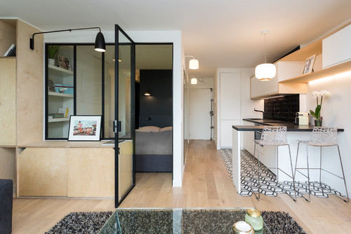
The large glass partition is smart design. It brightens up the bedroom, allowing natural light to filter into the small bedroom, while extending the sight-lines from both the bedroom out to the living area, and from the living area to the bathroom.
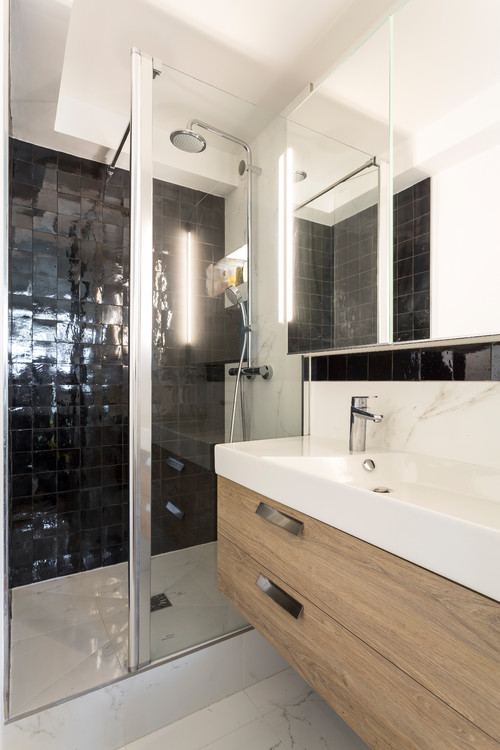
The smaller bathroom, below, is more functional than the bigger one had been. Eliminating the tub means a walk-in shower takes up less space. A vanity mounted on the wall makes the space appear larger than it would have otherwise. The glass partition in the shower also opens up the space visually. The black tiles in the bathroom match the tiles in the kitchen, helping the small studio to feel cohesive throughout.
In the old design, below, the kitchen was dark and tight.
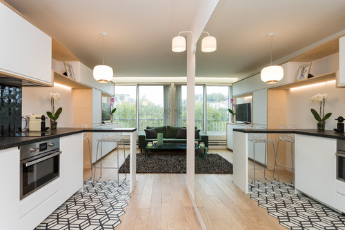
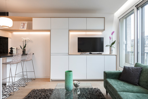
The new design, below, removes the small partial wall separating the kitchen from the living space. Sleek cabinetry extending from the kitchen straight to the living room blends the kitchen and living/room functions seamlessly. The enameled cabinets without hardware disappear. There is space for a new flat screen television. Patterned black and white tiles on the floor set the kitchen apart, adding a splash of interest.
A large mirror at the entrance seems to double the space.
The studio feels twice as large as before, and it’s more functional, thanks to much more cabinet space.
Bravo to this renovation par excellence!
Leave a Comment