Design Dilemma: Eclectic Small Space Living with a Euro Twist
In July, we visited the apartment of interior designer Robert Holgate, who impressed us with his eclectic, layered style artfully laid out in 600 square feet. This week, we decided to visit an apartment of a similar square footage, also eclectic, but more “Euro/Scandy” style. That is, it’s eclectic and visually rich, but also pared down, and of course, white.
This week’s small space belongs to Kees de Zwart, 53-year-old financial service employee who lives in a 549-square-foot Amsterdam apartment. de Zwart enlisted interior designer Anja Hesp and contractor René Koomen to create a masculine, but not a heavy, dark space.
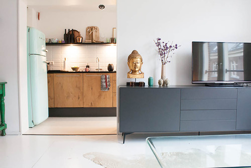
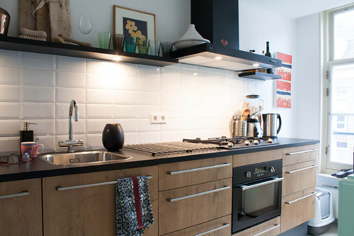
As with Holgate’s space, de Zwart’s apartment liberally mixes an array of styles and periods to create a space that feels intensely personal, even while retaining a spare, minimal look. Above, a 50s style Smeg refrigerator and classic subway tiles in the kitchen work add a little bit of retro punch to contemporary kitchen cabinets. Also in view in the photo above is a sideboard from Bo Concept.
Here are more kitchen views:
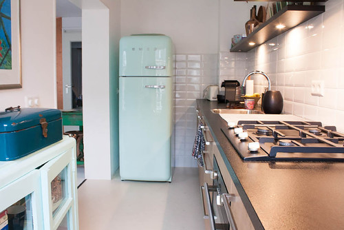
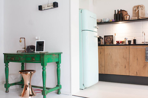
Above, de Zwart painted a vintage cabinet he already owned the same color as the fridge, to continue the vintage vibe. Below, a distressed green desk is paired with a sleek copper stool.
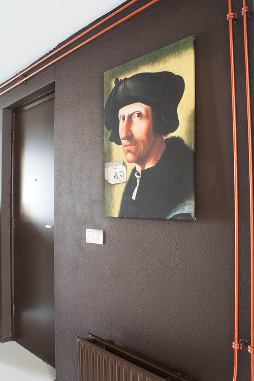
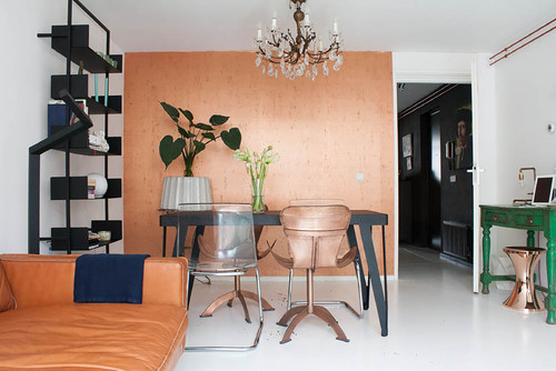
And to introduce a bit of an industrial vibe, in keeping with the desire for a masculine feel, the designer left copper heating pipes uncovered. The copper color has been repeated again in wall color and some furniture selections.
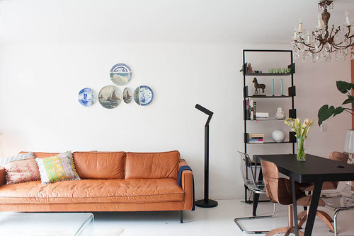
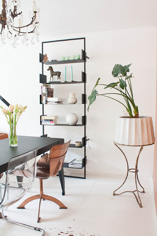
And talk about eclectic! Here vintage plates work with a modern sofa and contemporary lamp. A contemporary bookcase rests below a vintage crystal chandelier.
Here’s another view of the living/dining room:
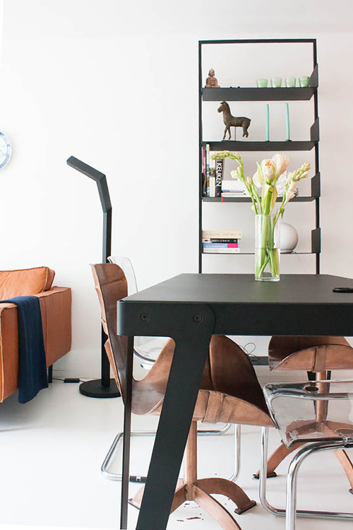
And here, two more views of the dining room:
Why does this space work so well?
- Although the space is small, it has a collected feel because furniture styles are liberally mixed.
- All objects are treated as sculpture, not just furniture. Interesting lines instantly make the apartment visually stimulating, even while objects are kept to a minimum.
- Keeping the floor and walls white keeps the space light and bright, despite a masculine feel.
- The space feels casual yet curated, adding to its appeal.
The look is sparer and more minimal than the small apartment we featured earlier in the summer, but these two apartments actually have a lot in common, thanks to eclectic choices that throw all the standard design rules out.
Leave a Comment