Design Dilemma: Going Very, Very Minimal
We’re not sure if we could ever do it to this extent, but minimalism certainly has its advantages: it’s easier on your pocketbook, it’s easier on the earth, it’s easier to keep clean, and it’s one less worry during the course of the day. People who live in minimalist homes aren’t worried about the cat scratching up that leather couch, because, oops, there is no couch.
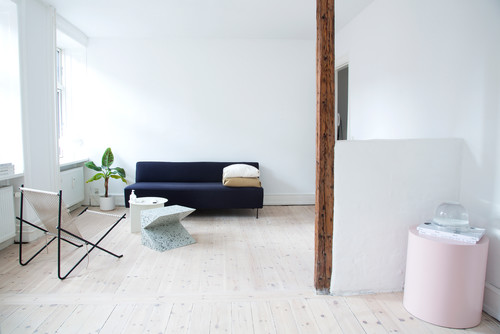
Bearing all these advantages in mind, we recently ran across this 700 square foot apartment in Copenhagen, Denmark, that takes minimalism to its final, white conclusion. The apartment is owned by Maiken Winther, a fashion stylist, blogger and former fashion editor who was looking for a serene blank canvas of an environment to combat her image-filled existence. She gets so much color at work, she couldn’t take any more of it at home. Her apartment is one option for those interested in going the minimal route.
First, everything is white. The few things that are not white are mostly not white for practical reasons. The owner says she wanted a white couch, but she is a heavy user of her couch and she likes chocolate. It didn’t take a rocket scientist to predict that sooner or later, little flakes of chocolate were going to end up smeared on her white couch. So she opted for a more forgiving deep blue couch instead, and we’re glad she did. The blue adds an unexpected punch of color and accent in what might otherwise be a predictably white apartment.
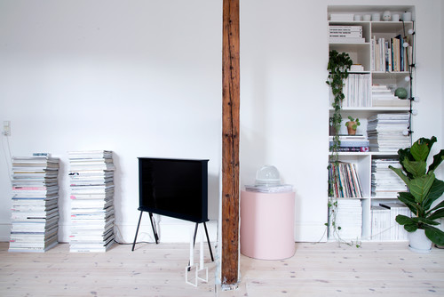
There’s one other touch of color too. Very pale pink shows up here and there, as in the round side table above and below.
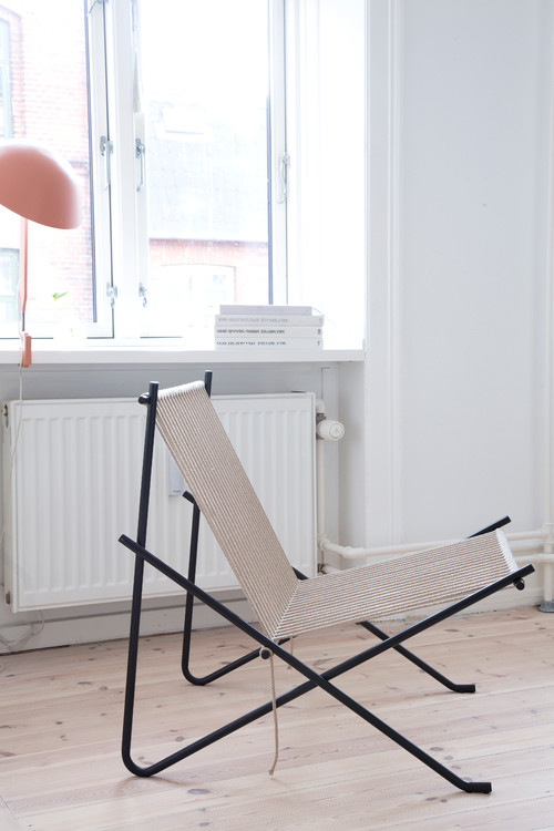
Pink also shows up on the lamp below and some of the doors have been painted the same pale pink. While we’ve never considered ourselves lovers of pink, we’ve seen this color pop up a lot lately. One thing we do like about it is that it feels relatively fresh, compared to other colors Winther might have chosen. When you’re working with only one or two colors, better make them really unpredictable ones for more impact.
When you’re doing minimalism this extreme, the look of every piece of furniture counts. That’s why Winther bought a TV she especially liked, even when it’s turned off. When you see it from the side, it looks like the san serif I. The lamp, the chair, everything has sculptural qualities that provide some nice eye candy.
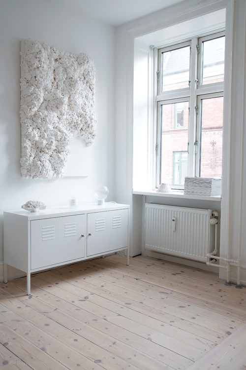
And that even applies to the wall art. The artwork below has lots of texture, which helps keep things much more interesting than a flat canvas might have in this serene environment.
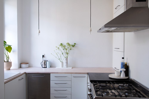
The kitchen dispenses with upper cabinets. Not having them is in keeping with the minimalist theme, opens up the space and helps the kitchen to feel larger.
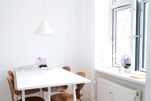
Here’s the other side of the kitchen:
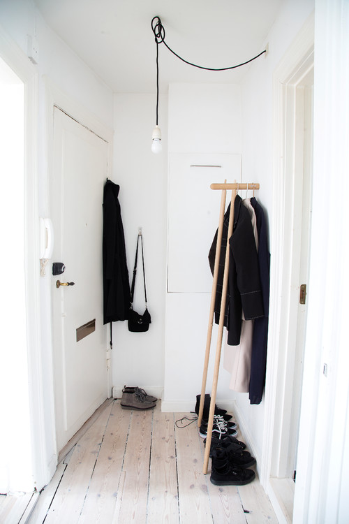
The naked bulb in the entry way and the visible clothes rack set the stage, as soon as you walk in. You know immediately what you’re in for:
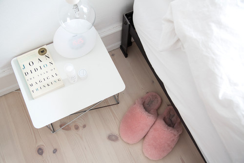
When you’ve gone this minimal, you have to take your indulgences where you find them. Winther’s one indulgence is a fluffy pair of pink slippers that fit in perfectly with the rest of her home.
So there you have it, minimalism at it’s most extreme. Do you think you could do it?
Leave a Comment