Design Dilemma: Ode to the Cottage
In the age of huge, expansive houses, one thing remains very near and dear to our hearts: the cottage home. The dictionary definition of a cottage is “a small home, usually of only one story.” There is no hard and fast rule about what “small” actually is, but for many, anything less than 1200 square feet would fit this definition.
It seems there are not many homes of this type being built these days, and too often, those in existence are being knocked down to make way for McMansions that are two or three times the size. Given this, we thought it worth posting a celebration to the cottage home.
What’s so great about cottages? For one, they cost less to buy, decorate, heat and cool. In other words, a cottage is naturally “green.” Carrying costs, like taxes and insurance are usually much lower, and so is maintenance. Cottage owners are a relaxed lot, since they have less to stress out about. And families living in a cottage often report a feeling of closeness, since there’s not much room to separate in tight quarters. That’s how owning a cottage can actually improve your quality of life! Plus, while cottages can serve their purpose as a family home, they also provide a great place to grow old. Small and single-story, there’s no stair-climbing when the knees start to give out!
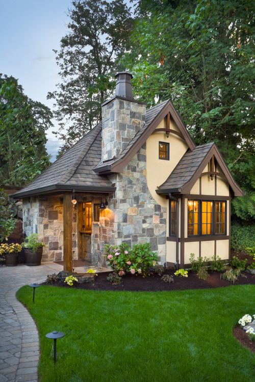
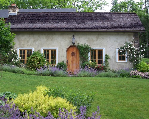
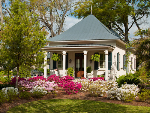
Here are two quintessential cottages as viewed from the outside:
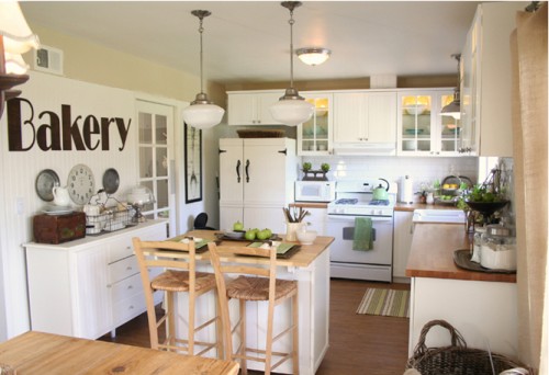
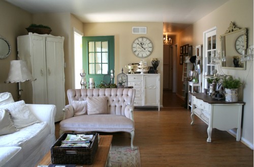
Inside these homes, owners often opt for a cozy traditional look. Something like this:
Or this:
The “shabby chic” look — painting everything white and throwing in a few distressed antiques, always seems to work in this context. However, even shabby chic can seem a bit too sweet and trite as the years pass. And so, more and more, cottage owners are going streamlined and modern.
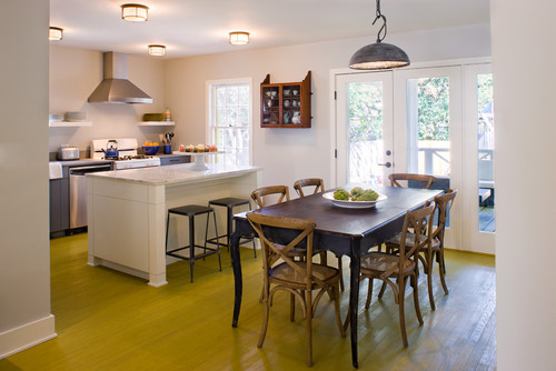
We found one fantastic example of exactly this direction in Texas, where a tiny bungalow got a makeover. The idea is to keep a few cottage elements in place, beadboard, for example, or industrial lights, but to streamline things, declutter, and inject an element of surprise with color. Take a look:
This cottage kitchen feels simple, but utterly modern, thanks to the bold mustard floor color and the removal of the traditional upper cabinetry. The industrial pendant light keeps things feeling rustic, but the open floor plan and light feel current. The effect is fresh and now, but still in keeping with the simplicity of cottage life. Here’s another view:
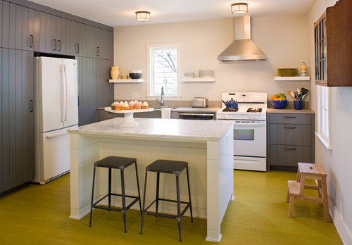
The owners kept the cottage style paneled cabinets and opted for Carrera marble counter tops. Among other things, we also love that these owners didn’t feel the need to replace all the white appliances with stainless steel!
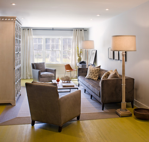
Small doesn’t have to mean boring and it doesn’t have to mean cluttered. Take a look at the living room from the same Texas cottage:
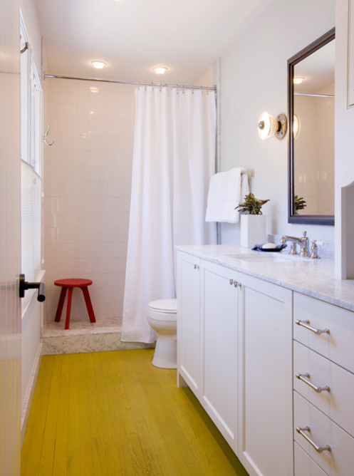
It’s simple, sleek, uncluttered and soothing but still comfortable. No shabby chic for these homeowners! And, from the same home, a cottage bathroom:
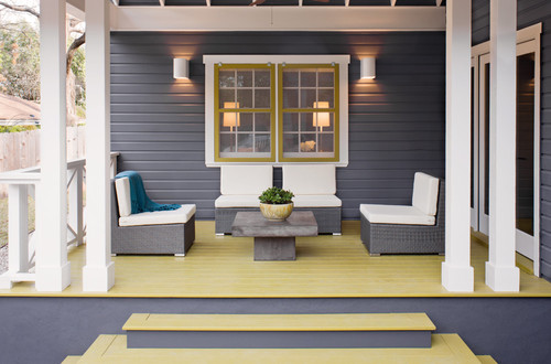
And here’s a front porch view:
What in our view makes this cottage so successful?
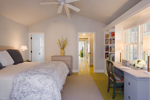
- A small space is kept unified by using the same gray and mustard color combination throughout, both inside and out.
The effect is quite soothing and makes the space work as one.
- Antiques and traditional furniture styles are used right along side more modern and “transitional” styles. In the kitchen, a farmhouse table holds sway, but in the living room, a mid-century modern chair feels right at home.
- The palette is unique, but still bright and cheery, in keeping with the cottage ethos. Mustard was a brilliant floor choice, as it has the happy, relaxed quality that is so much a part of cottage decorating. But the soft grays used on the walls feel very comforting and cozy.
- Clutter is kept at bay. This is no overstuffed cottage! Cottage owners may be tempted to fill up on flowered pillows and tchotckes but these owners resisted, and we’re glad they did!
Leave a Comment