Design Dilemma: Two Contrasting Styles, Two Design Aesthetics
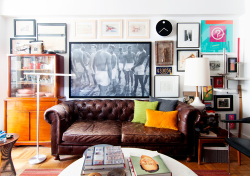
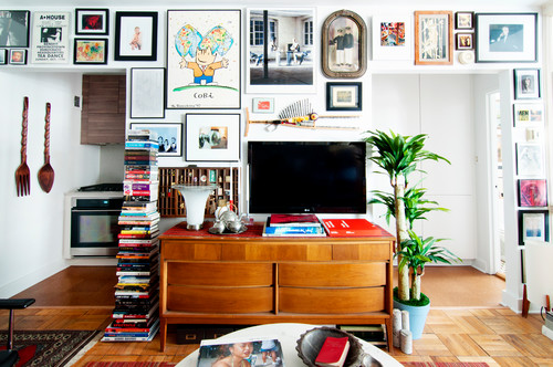
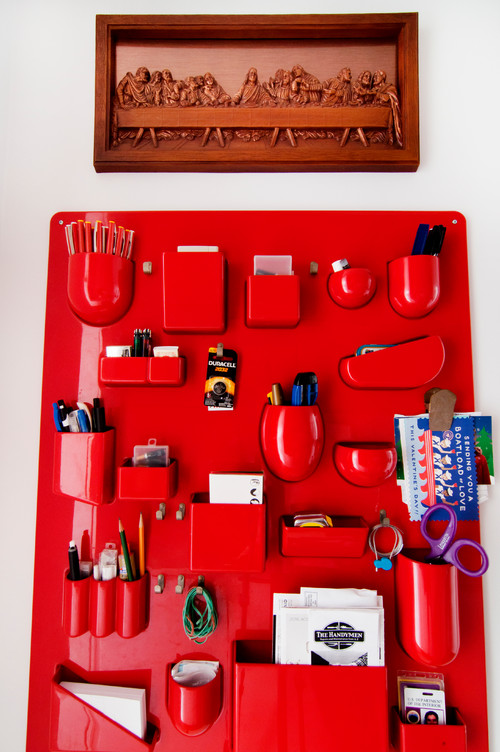
This week, we thought we’d take a look at two very different design aesthetics, a reminder that there are no real style rules — decorate how you see fit! Check out the Washington DC condo of Irwin Gueco, who has outfitted his 495 square foot space with an eclectic mix of color, texture and art. Gueco, an architect by trade and working at the National Gallery of Art, came to Washington to get his master’s in architecture. He began renting in a different apartment in the same Art Deco building he lives in now. He rented for about eight years before buying his condo.
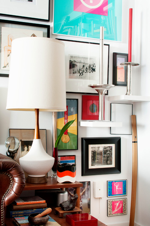
The walls in Gueco’s home are covered with art. Every wall is a gallery wall featuring photos, drawings, paintings, and posters and memorabilia from events that he’s attended.
One of the first things you notice are bright pops of color, that show up in art, but that are repeated in pillows and other accessories.
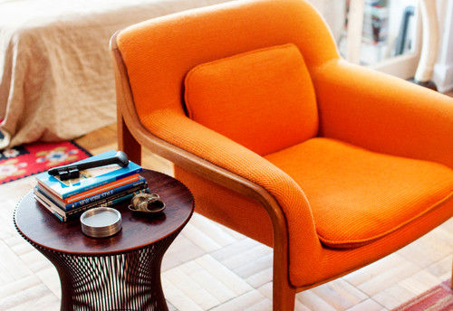
A colorful chair, inherited, from his parents, such as the 1973 orange Knoll keep things warm and fun.
Although the walls are all white, his home gives you anything but a cold, sterile feel. It’s fun, and very well thought out.
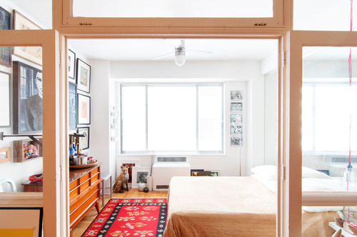
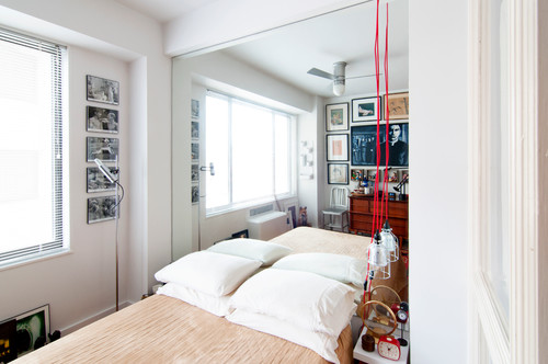
Here’s a shot of his bedroom:
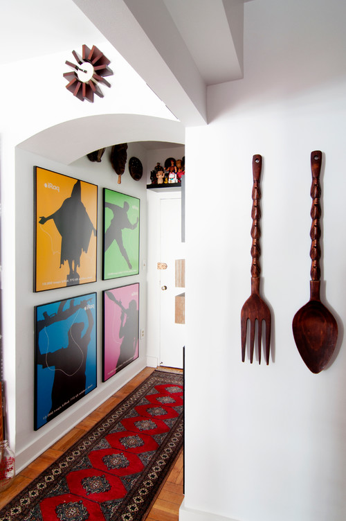
And the entryway:
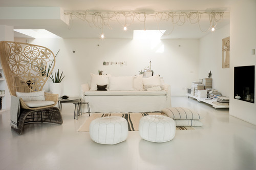
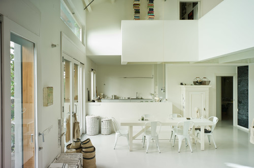
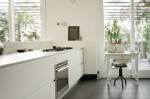
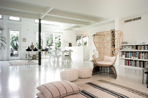
Now we take a look at a totally different approach. The apartment below belongs to Laura Dragotti and is located in an Art Nouveau building in Milan. Everything is white or off white, from the walls, to the floors to the furnishings.
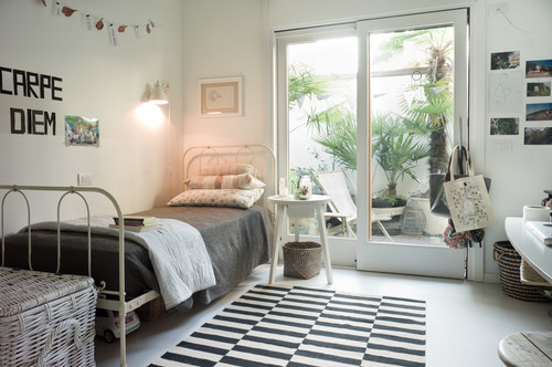
And in one of the bedrooms, a touch of black:
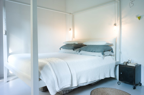
And a second bedroom:
Although these two homes would seem to be utterly different, they do have commonalities. They are simple and informal in style, and chock full of mementos and memorabilia.
The design takeaway: Keep things simple, fun, authentic, with a consistent design vision and you can’t go wrong.
Leave a Comment