A Grand, Mysterious Beach House on the Coast of Uruguay
The intriguing La Boyita Residence is located in far-away Uruguay near the coastal border with Argentina.
Martin Gomez Arquitectos designed the contemporary beach house on the country’s sandy coastline in Punta del Este.
Like an abandoned palace, the transparent beach house looks out to the east over the isolated, cool South Atlantic ocean.
The east side faces the ocean, while also putting up a transparent glass protection against ocean winds.
Outdoor living areas are sheltered from the winds off the ocean with a large courtyard.
Chunky low-slung furniture is employed in the outdoor living spaces.
A muted palette of soft neutrals captures the subtle coloration of the white sands.
A hearty fire place places logs right on an open concrete slab, almost like a table top, in the center of the great room.
The tall concrete columns are interestingly paired with sand-colored double-height curtains.
The genius here is in intriguingly combining the grandeur of palatial curtains with the brutality of concrete.
This double-height great room is flanked on both sides by low-ceilinged outdoor rooms, each having a fireplace at both ends.
By contrast with the great room, a lower roof over both outdoor patios creates an intimate, warm and sheltered outdoor area outdoors.
The sleeping wing continues this lower roof-line of the outdoor patio and is connected by glass walkway to the double-height main living area.
Altogether a very grand residence that both embraces the sea, and protects against the sometimes violent weather of the isolated region.
Design Dilemma: Three Common Design Mistakes that are Easy to Fix
It turns out that the most common interior design mistakes are also the easiest to fix! And that’s good news, since many of us live with a lingering sensation that something in our interior design is a bit “off.” Take a look around and see if you are committing one of these common interior design errors.
1) Hanging art too high.
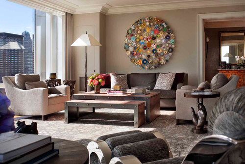
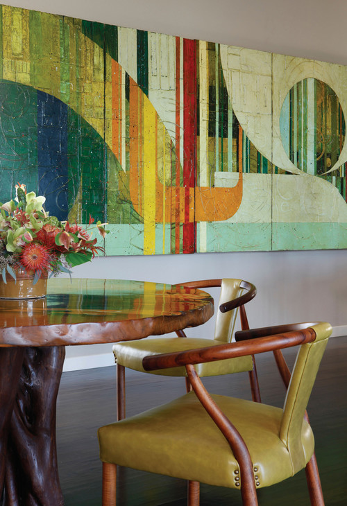
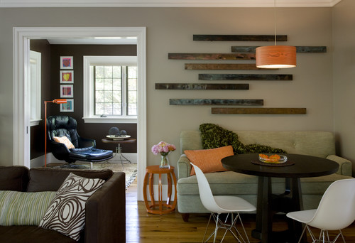
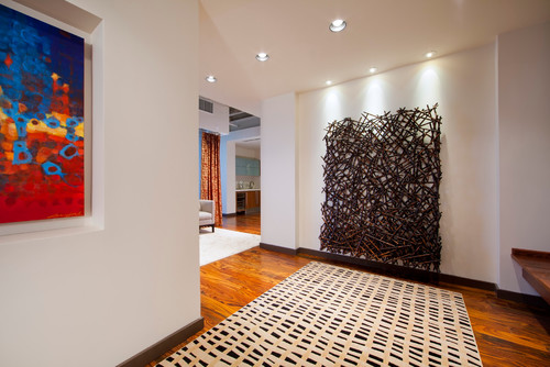
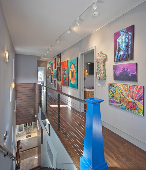
Take a good look at the photo above and below. Notice how the painting and artwork is hung so that the average person, when standing, will be able to look in the center of a painting. (In galleries, that means that the center of most paintings hovers about 60 inches from the floor.) You should aim for the same in your home. It’s important that any painting work within the context of a furniture grouping. It needs to relate. For that reason, even if you are hanging a piece in a great room with very high ceilings, you should aim to hang artwork at a level that still connects with furniture. Notice how nicely these pieces relate to the furniture groupings around them.
And here in this hallway, the piece is hung at a level in which you feel like you could become a part of the sculpture:
Note that it’s okay to go higher on a wall when you are creating a “salon” effect by hanging several paintings:
2) Going overboard with houseplants.
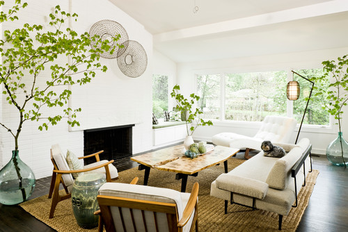
Plants can be a beautiful thing in a home, bringing in a bit of nature indoors and acting as a natural air purifier. But people often get carried away with lots of little cuttings in jars scattered about on every free surface. The effect is one of clutter and chaos. In fact, houseplants are best used as a sculptural element. That means going larger, paring down and thinking carefully about placement.
In the room below, three carefully-placed large tree branches add a natural, balanced note that manages to bring in lots of greenery while totally working within the clean, minimalist confines of the room:
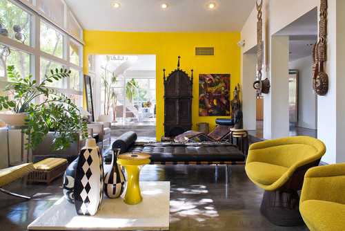
In this room, one well-placed houseplant looks just like another sculptural element, picking up perfectly where African masks have left off:
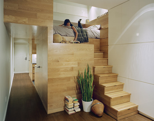
In this ultra tiny East Village studio, one plant manages to bring the outdoors in, dispelling any feelings of claustrophobia without taking up a lot of space.
3) Retreating to Neutrals.
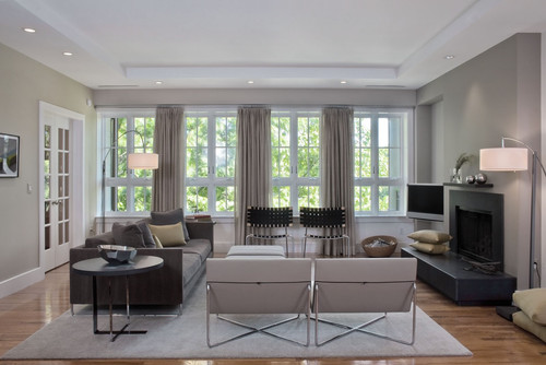
People are so terrified of making design mistakes that they often opt for the easiest choice when shopping for furniture or choosing wall colors. They go beige. Or gray. The effect is one endless expanse of greige on walls, rugs, couches, etc. It’s bland, boring, and totally lacks personality. And sure, it can be tasteful at times, but it’s also so safe that it lacks dynanism. The room below is a perfect example.
If you’ve got a case of the “greiges” know that it can easily be remedied by injecting a bit of color into your home in places where you feel safe doing so and at a relatively low cost.
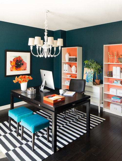
You can paint the walls a dramatic color, or invest in an interesting patterned rug:
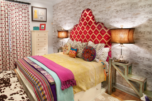
You can throw some patterned textiles into a room, via sheets, blankets and pillows:
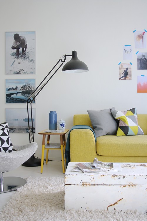
You can opt for one colorful piece of furniture, such as this yellow couch:
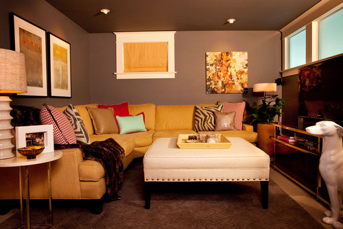
Or this one, complete with colorful pillows and artwork to boot.
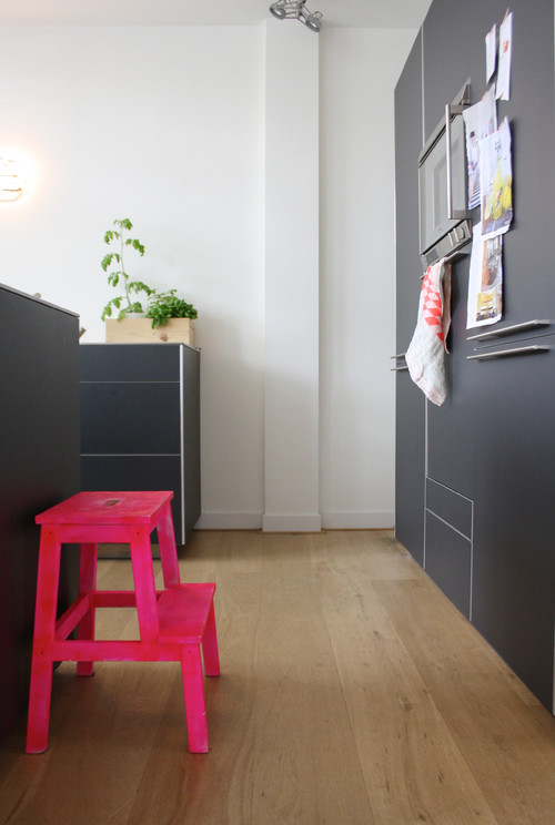
Sometimes, all you have to do is add a fluorescent pink stool!
So if you’re guilty of committing one of these design errors, take heart. It takes just a moment to fix these problems and you’ll find your home’s interior much improved.
Many Delights in a Rethinking of the Ranch-Style Home
Although this is a thoroughly 21st century living room, isn’t there a hint of the suburban American ranch house of the 1960s here too?
The home in Menlo Park, California by Spiegel Aihara Workshop synthesizes the best of both eras.
A thick hallway ceiling of solid wood is balanced over a glazed walkway.
Its 21st century stone tiles gives way to a 20th century cliche; the suburban “carpet” of mowed grass.
The weighty wood ceiling is a far cry from the acoustical fibreboard ceilings of the 1960s, but is designed to achieve the same end, softening sound.
The low-slung building with its flat transitions between materials is very 60s, yet the minimalism of the wood treatment utterly updates it.
The design is not attempting to be archly retro, but simply accepting and modernizing the tradition.
But a surprise: above the kitchen a raised skylight (21st C) gives a breather from the relentless horizontality (20th C) of the ranch home, bringing cool light in to its center.
From the cool dark shaded kitchen, a view out to the garden – you can almost see the Letraset children playing in the sun.
At the far end of the wing, the bedroom has all the openness and spare grace of 21st century minimalism.
The low-slung house is oriented to offer a cool respite from the heat of Menlo Park.
On the other side of the entry wall, an archetypal walled-off slice of the new suburbs that were still a miracle in the 60s.
The car is accepted right into the home in typical ranch style.
Its cross shaped plan gives garden views out both sides of every room.
The architects have successfully re-appropriated the traditional forms of the California ranch house, but with genuine sincerity, taking the good, and honestly trying to improve on the original.


