Design Dilemma: 5 Decor Trends for 2016
Every new year, just after the ball drops in Times Square, we begin to assess what’s come and what’s gone. What’s gone? Well, we’ll get to that next time around. For right now, we’re focusing on what’s to come, that is, the cool, hot and trending looks for the new year. Although design trends tend to move more slowly than fashion trends, there are a few real changes to look forward to in 2016. Shall we commence?
1.Pink.
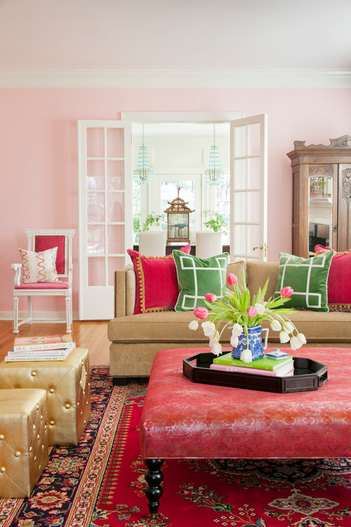
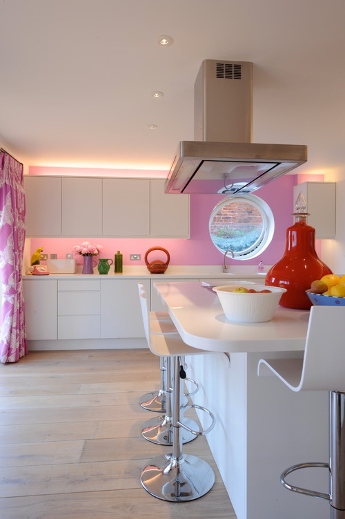
Once a color reserved solely for little girl’s rooms, pink is splashing out everywhere into all sort of grown up places. It can work as a vibrant, unexpected play in a traditional living room, as seen above, or as an unexpectedly warm move in a streamlined modern kitchen, as below. Where ever it is, what makes pink such an interesting choice is that it is a warm, embracing color that is definitely not a cliche. Pink promises to provide a whole lot of interesting new looks for the new year.
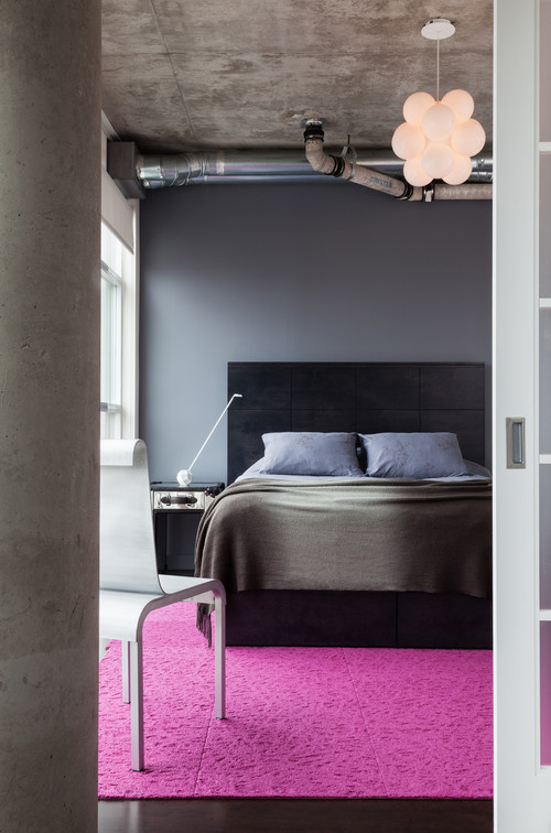
Below, a pink textured rug is just what a bedroom with an industrial vibe needs to ruffle a few feathers:
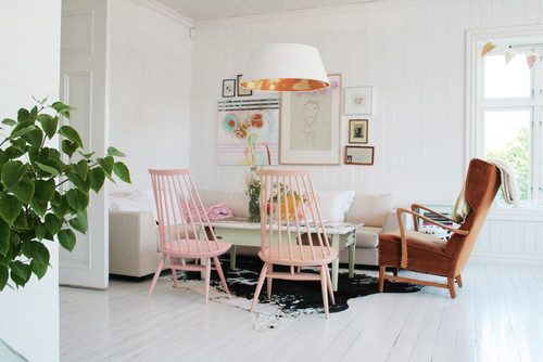
And finally, two softly pink chairs take a simple Scandinavian room to a whole new level:
2. Copper is in.
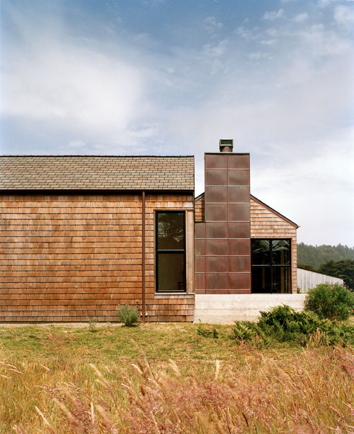
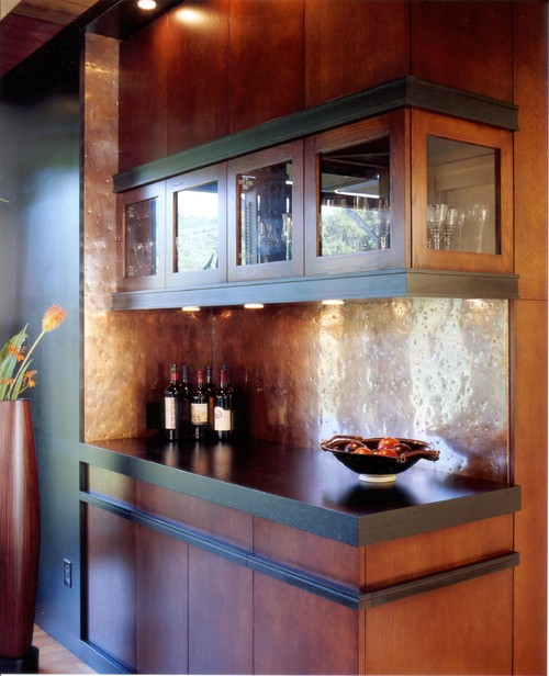
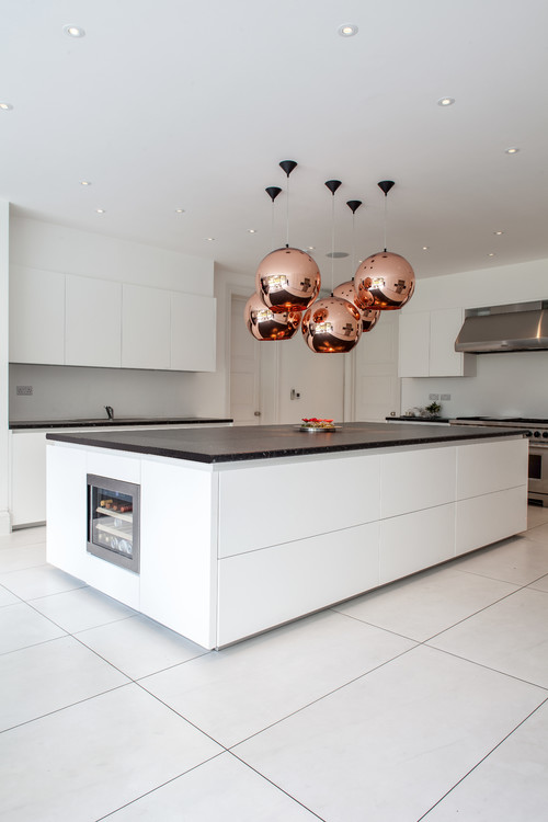
Be it outdoors, as in the chimney covering above, or be it indoors, as in a backsplash, copper and other warm metals such as brass and gold, are all the rage. If you want to incorporate this trend into your own digs, look for copper pendant lamps (as the lamp in the photo that begins this post), copper table and floor lamps, copper sinks, and copper accessories.
Below, copper pendant lamps are luminous, beautiful and make a plain white kitchen unforgettable:
3. Organic shapes and textures.
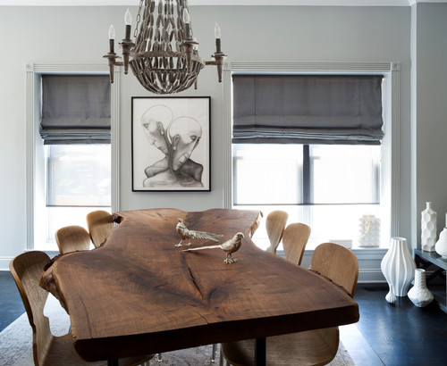
This one has been a trend now for several years. People want nature a connection to nature in our high tech age, and look for it by bringing organic shapes and textures into the home. Below, a live-edged table makes an otherwise sober Washington D.C. dining room.
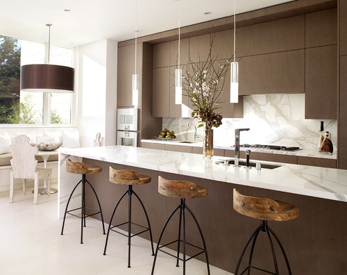
The wooden stools below add just the warm touch to a modern, industrial kitchen.
4. Lush nature, indoors.
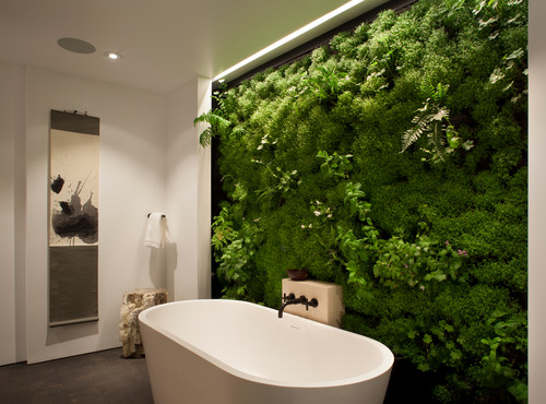
This trend is really part of the increased interest in organic materials at home. Plants are vibrant, organic, living things that can improve the air quality in our homes and send us healing, restorative vibes. Hence walls of living plants seem to be popping up anywhere, as in the bathroom above.
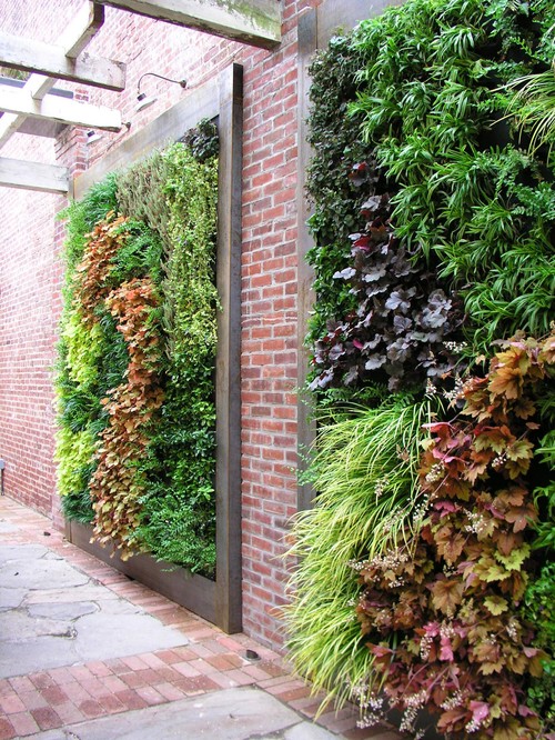
Below, a live plant courtyard wall:
And below, a bedroom cleverly incorporates the trend by creating a painting out of living plants:
5. A Tropical Twist.
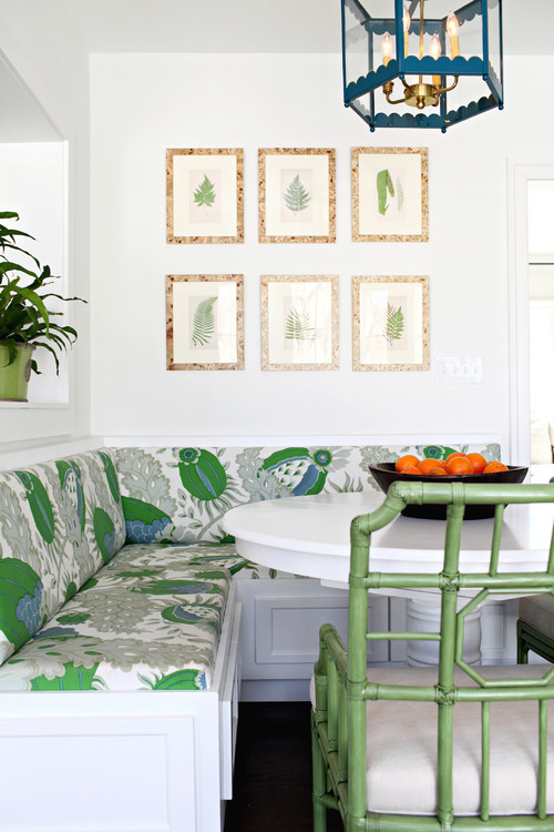
There’s definitely a theme going this year: nature, in all it’s glory. And nowhere can nature be found in more abundance than the tropics. Perhaps for this reason, we are seeing the increasing use of tropical motifs in prints, fabrics, wallpapers and in theme designs as a whole.
A banquette gets in on the tropical action:
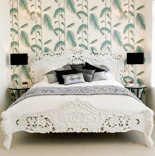
Here, a palm frond wallpaper gives this bedroom some pep.
The entryway below goes tropical with the help of a vivid floral rug and a flamingo painting:
What are some other trends spotted for 2016?
- Animal prints and ethnic prints are still going strong.
- Floral fabrics are back.
- Retro geometrics and pastels will be big in wallpaper.
- More practicality, less froth in decorating. Practical fabrics will be used on bold, glamorous furniture shapes.
- Less will still be considered more.
Design Dilemma: An Excellent Micro Apartment Design
In recent years, micro apartments have taken the world by storm. From Amsterdam to Paris, New York, San Francisco, Boston and Seattle, it seems that living in extra small, but extremely efficient and well-designed spaces is the trend of the future. The Zoku apartments, long-stay apartments in Amsterdam, caught our eye, as they embody excellent design, managing to squeeze out of only 25 square meters (or 270 square feet) a functional live/work space that also manages to be beautiful. Although these apartments were designed for temporary long stays, they are well-designed enough for year-long living. Take a look:
Above, you get an idea of the entrance, kitchen and sleeping loft. As you can see, there is storage underneath the stairs and in the entrance hall, a little niche that serves as a study area.
Above, another view of the kitchen, dining room, living room and stairs up to the sleeping loft. The apartment, while compact, still manages to feel spacious, thanks to very high ceilings. And below, another close-up of the kitchen:
And here, a view of the living room windows. Large windows help to keep the space feeling very open, bright and larger than its actual square footage:
And finally, a comfy corner for sleeping:
What makes this space so great?
1) Excellent planning for all activities. For every activity, there is a space. A small desk serves as a study area. Closets in the entrance hall provide ample storage. The efficiency kitchen is fully equipped with a fridge, dishwasher, induction cooker, microwave with grill and coffee maker. The living area incorporates a full-size couch and a television for relaxing, and the dining area seats four.
2) The designers chose not to make the bed the focal point of the apartment. By shifting all the attention to the dining space, the designers created a space that feels less like a glorified bedroom, and more like an actual living space that can adapt to entertaining, work meetings, and meals.
3) The elevated sleeping area, with a king-size bed, can be screened off for visitors. This is something unusual in many micro apartments where the bed is always in plain sight.
4) The designers went vertical, exploiting high ceilings for extra storage. The high ceilings also work to increase the spacious feel of the apartment.
5) The designers kept the windows large to allow for brightness and a feeling of openness. And light makes all the difference!
The Very Sustainable and Affordable Prefab Housing at Vila Taguaí
Suggesting a hillside cave overlooking the jungle, this living space comes standard in a settlement of sustainable and affordable housing.
The innovative alternative building concept comprises eight new wooden houses for young families set amongst the dense vegetation of the suburbs of São Paulo at at Vila Taguaí.
The houses are elevated off the ground taking care to preserve as many trees as possible.
Roads and pathways are finished in cobblestones, maintaining soil permeability. Read the rest of this entry »

