Design Dilemma: Maximalism in Denmark
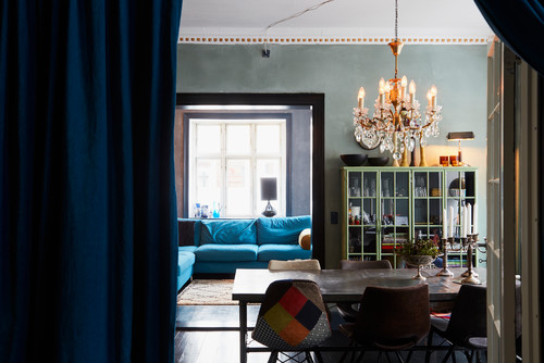
Earlier this month, we took a look at a Danish home featuring severe minimalism. Everything was white — walls, furniture, floors. This time, we’re looking at a Danish home done up in the exact opposite style Scandinavian maximalism!
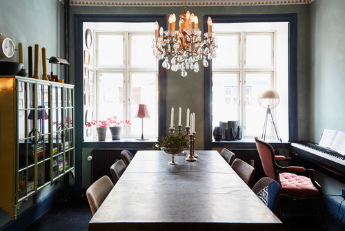
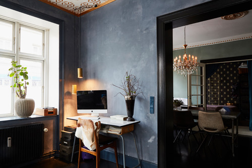
What does that mean? Try walls painted dark moody colors, ceilings that have been stenciled in a pattern or wallpapered, floors that have also been treated the same, and plenty of art work, objects d’art, shaggy rugs and dramatic flourishes. It’s not a look that you often see in Scandinavia, but the owners of this apartment wanted to try something a little different from the all-white norm.
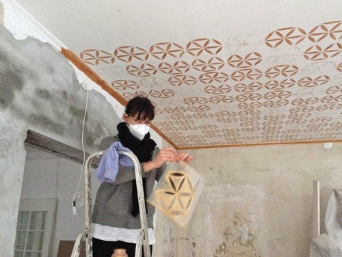
The owner, in fact, says she doesn’t believe in half measures. When you decorate, she feels you have to go all the way. It’s not enough to paint one accent wall a brilliant color and leave everything else white, as, in her opinion, there’s no consistency. So she’s worked toward consistency by stenciling her ceilings to match all the drama down below.
Here is the ceiling during the process:
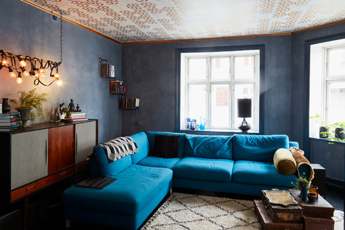
And here is the finished product:
Opting for a dark color on the walls creates a moodiness that white walls can’t touch:
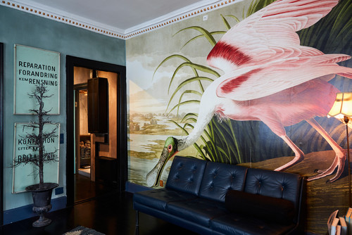
One of the most impressively maximalist features is a dining room wall papered with the image of a Spoonbill bird. The owner found the poster online for $500:
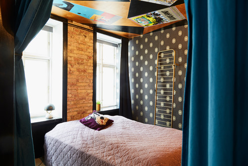
The bedroom ceilings have been painted as well, providing lots of color and pattern. The ceiling is painted gold and black and decorated with old playbills and Bjørn Wiinblad posters.
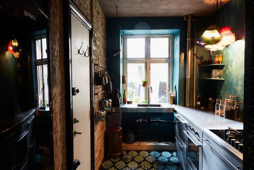
And here’s the kitchen:
Kudos to this homeowner for being brave enough to challenge the conventional Scandi all-white look! We think the moody coziness of the space is perfect for short gray Danish days and long dark Danish nights!
How to Create a Summertime Feel Throughout Your Home
It’s never too early to prepare for summer. And one of the best ways to enjoy summer for as long as possible is through your home’s atmosphere and decor.
Need expert styling tips on how to recreate the feeling of summer throughout your living spaces? Read on for the best of the bunch.
1. Go blue.
A dash of blue here and there brings to mind the seaside, lakes, and endless blue skies. There are few other colors that so clearly recalls seaside and summer imagery than the color blue.
Decorating with blue can take many different turns. You could paint an accent wall blue. Or mix and match various shades of blue throughout a room. A blue floor is different enough to appeal to those who want to do something slightly unusual.
Whatever your choice, blue is the color of summer. So let it come out to play as you do your summertime redecorating.
2. Feature summer bounty from your garden.
Welcome visitors into your house with a summertime wreath on your front door or in your foyer. Summer is when the fruits of your garden are at a high yield. A basket of fruits on your kitchen counter serve both a beautiful design element as well as being a better alternative to junk snacks. Flowers, too, are in abundance during this time. So both flowers and fruits make for perfect decorative elements.
Freshly cut wildflowers in jars and vases throughout your home will bring the beautiful outdoors into your indoor spaces. Hosting a dinner party? Flowers are a great conversation starter. And your favorite flower can say a lot about your personality type or about the character of the person you love. Aside from that, they are an earth-friendly decoration and much preferred over decorations that head to the bin after one use.
3. Spruce up your porch.
Summer evenings are best enjoyed outdoors. But if the state of your porch has hampered your enjoyment of summer evenings in years past, then change things up this year.
Put a fresh coat of paint on your porch. Do it now before it gets too hot to endeavor this undertaking. Repaint your porch swing, or reupholster it, if it has begun to look a bit natty. Purchase linens and new cushion covers. Set up a side table for drinks and other items.
Research ways to keep mosquitoes away from your house. Stagnant water is a breeding spot for mosquitoes, so make sure that anything that can collect rainwater is covered and drained. Plant natural repellents, such as citronella. And invest in candles and other bug-shooing devices for a pest-free summer evening outdoors.
4. Memorialize past summer memories.
Create a wall for commemorating past well-loved summer memories. Don’t only stick to photographs. To create visual interest, use other mediums, too. For example, frame ticket stubs or other knickknacks from that perfect vacation with the whole family.
You could frame a map of a favorite vacation spot. Or a map of the world, with pins on each spot you have visited. If you collected seashells during the trip, find a way to feature that on your memory wall.
Increase your enjoyment of your living room, or some other open space by making it a celebration of a well-loved summer from years ago. Celebrating past summers will help you realize the treasure that each summer brings with it.
5. Rethink your window hangings.
Your windows are how the sun comes in and how you view the world outside. During the winter, your drapes pull double duty in being window dressing plus warding off the chill. But during the summer, drapes become more of an obstruction than a dressing.
Instead of drapes, opt for colorful blinds that can be fully lifted up and out of the way to allow for the maximum enjoyment of the outdoors. Blinds can be drawn down when the sun’s rays are trying to break in. Go for blinds that are splashy and bright! Or use flowy, light, gauzy lace curtains that float on the breeze and give the impression of being hardly there (remember the art of Lagom). Or, use nautical rope as window dressing to give your living room the impression of being at sea, or at least along the coast.
Your enjoyment of those summer days will be improved with the right framework from which to enjoy them. It might be spring outdoors, but indoors, your home is ready to welcome summer and summertime guests with open arms.
Design Dilemma: Going Very, Very Minimal
We’re not sure if we could ever do it to this extent, but minimalism certainly has its advantages: it’s easier on your pocketbook, it’s easier on the earth, it’s easier to keep clean, and it’s one less worry during the course of the day. People who live in minimalist homes aren’t worried about the cat scratching up that leather couch, because, oops, there is no couch.
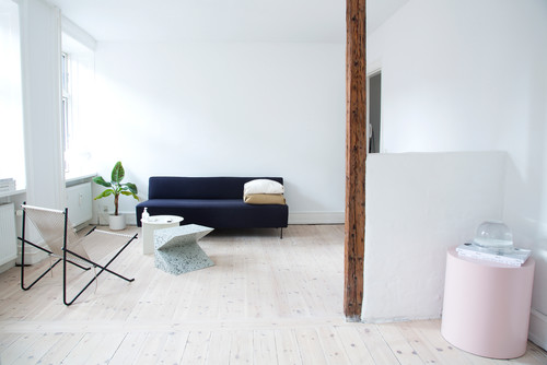
Bearing all these advantages in mind, we recently ran across this 700 square foot apartment in Copenhagen, Denmark, that takes minimalism to its final, white conclusion. The apartment is owned by Maiken Winther, a fashion stylist, blogger and former fashion editor who was looking for a serene blank canvas of an environment to combat her image-filled existence. She gets so much color at work, she couldn’t take any more of it at home. Her apartment is one option for those interested in going the minimal route.
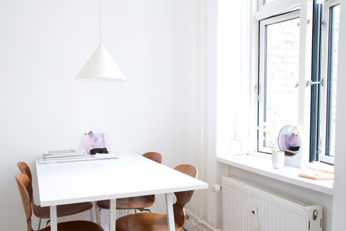
First, everything is white. The few things that are not white are mostly not white for practical reasons. The owner says she wanted a white couch, but she is a heavy user of her couch and she likes chocolate. It didn’t take a rocket scientist to predict that sooner or later, little flakes of chocolate were going to end up smeared on her white couch. So she opted for a more forgiving deep blue couch instead, and we’re glad she did. The blue adds an unexpected punch of color and accent in what might otherwise be a predictably white apartment.
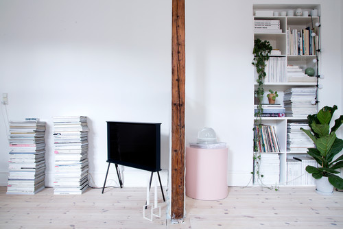
There’s one other touch of color too. Very pale pink shows up here and there, as in the round side table above and below.
Pink also shows up on the lamp below and some of the doors have been painted the same pale pink. While we’ve never considered ourselves lovers of pink, we’ve seen this color pop up a lot lately. One thing we do like about it is that it feels relatively fresh, compared to other colors Winther might have chosen. When you’re working with only one or two colors, better make them really unpredictable ones for more impact.
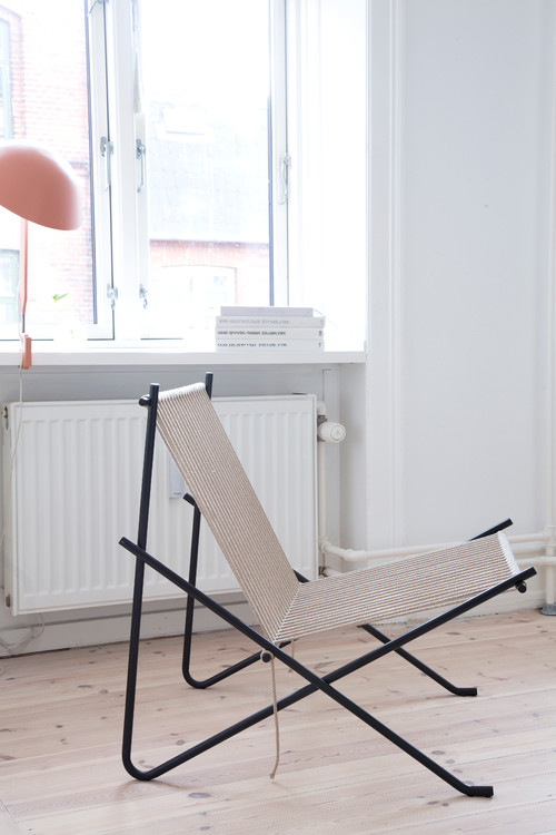
When you’re doing minimalism this extreme, the look of every piece of furniture counts. That’s why Winther bought a TV she especially liked, even when it’s turned off. When you see it from the side, it looks like the san serif I. The lamp, the chair, everything has sculptural qualities that provide some nice eye candy.
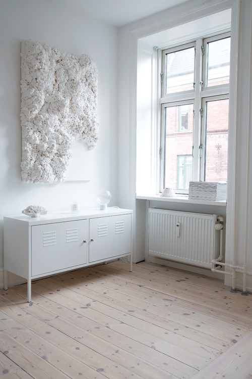
And that even applies to the wall art. The artwork below has lots of texture, which helps keep things much more interesting than a flat canvas might have in this serene environment.
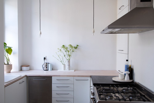
The kitchen dispenses with upper cabinets. Not having them is in keeping with the minimalist theme, opens up the space and helps the kitchen to feel larger.
Here’s the other side of the kitchen:
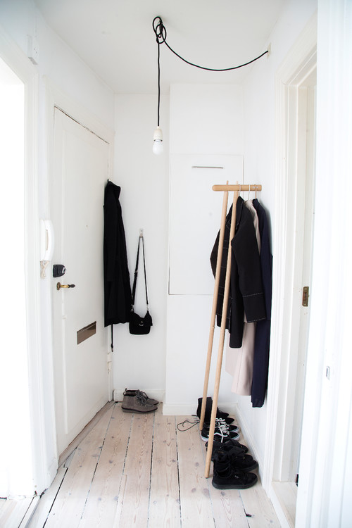
The naked bulb in the entry way and the visible clothes rack set the stage, as soon as you walk in. You know immediately what you’re in for:
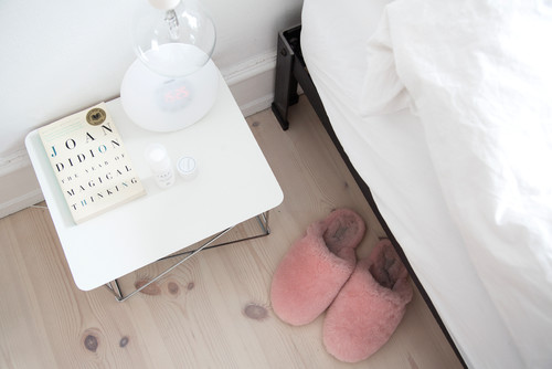
When you’ve gone this minimal, you have to take your indulgences where you find them. Winther’s one indulgence is a fluffy pair of pink slippers that fit in perfectly with the rest of her home.
So there you have it, minimalism at it’s most extreme. Do you think you could do it?
