Home Design Find - Interior Design, Architecture, Modern Furniture - Part 46
RSS

Home Design Find

VIEW: FULL | LIST | GRID

No Comments »

Design Dilemma: Moving Away from Minimalist White

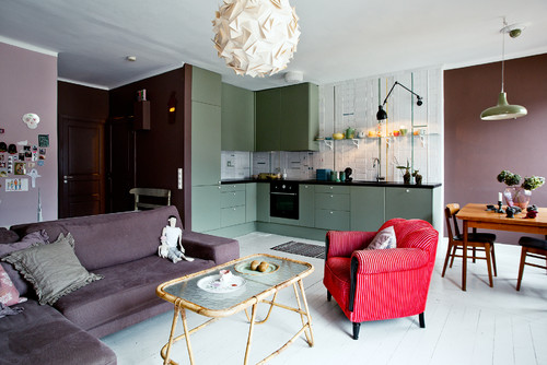
Vår lägenhet

When we think of clean, modern style, it seems that white always plays a starring role. White walls have been seen as classic and bright, the perfect way to lighten up any drab interior. But lately, the stranglehold that white has had on minimal, modernist interiors is beginning to loosen. Even in Scandinavia, the land of white minimalism, color is now coming back into vogue.

Is it possible to put a color on a wall when the effect you’re after is one of lightness, modernity, architectural purity? We think so. Let’s explore!

Craftsman Charm

Pastels push out white

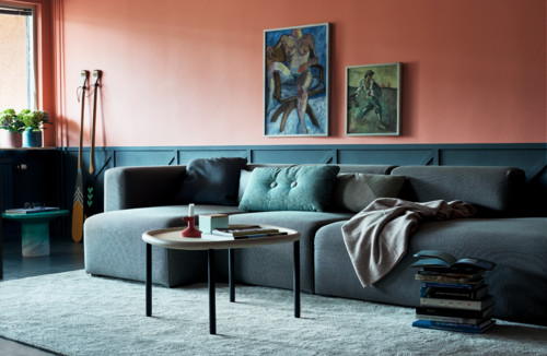
The Scandinavians know a thing or two about keeping things airy and bright and simple. But lately, even they have embraced the idea of more color on their walls. The colors they are choosing are often pastels, which manage to act almost as neutrals, allowing other aspects of the room to stand out. The living room below is one example, where a salmon pink nicely balances a deep gray paneling.

Colours

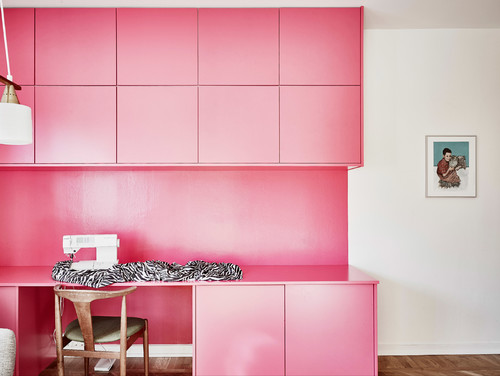
And here, another minimal pink:

Portfolio

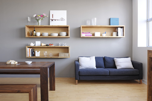
Very pale blues, grays and  greens can also serve as perfect backdrops to a modern interior.

all

Above, a color between lavender and gray adds an unexpected backdrop to a simple interior. And below, a soft cloud gray allows elements, such as the pendant lamp and decorative wall hangings to take center stage:

1217 Western Lake Santa Rosa Beach, FL

The interior below is simple and modern. What’s unusual is its lavish use of color, not only the blue on the walls, but the pops of color via lamps, the desk, and pillows. This is what they call happy modern!

Bosthlm Realestate 2

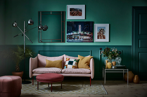
Deep jewel tones in simple spaces

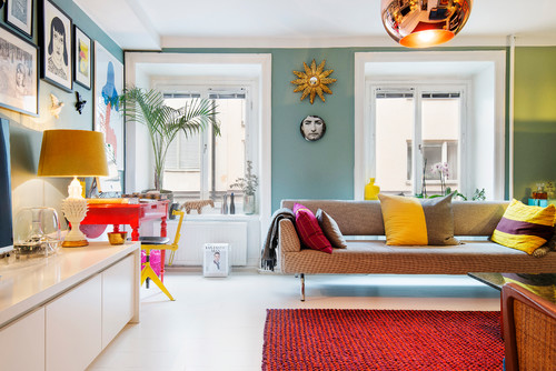
But don’t get us wrong. Pastels are not mandatory. Check out below, the home of Scandinavian interior designer and architect Daniel Heckscher of Note Design Studio in Stockholm painted his home the surpising colors of turquoise, orange, pink, blue-green and bright yellow.

Portfolio - Nya Rum


Special paint treatments

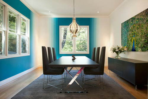
One interesting way to bring in a whole new dimension into simple modern interiors is to have fun with special painting treatments. Below, by painting stripes that seem to fade out from deep peacock blue to white, a fun, optical “fade-out” look is achieved.

My Houzz: Fun and Happy Colors for a Northern California Home

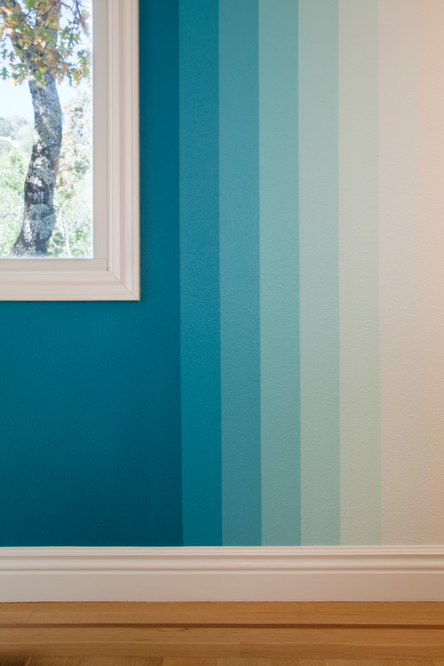
Here’s a closer look. The owner requested that the paint shop add 10 percent white to principal cyan color for each subsequent stripe, continuing the gradation for an ombré effect.

My Houzz: Fun and Happy Colors for a Northern California Home

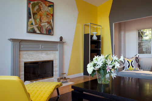
And below, in the same home in a living room, geometric colored cut out shapes define the space in a bold way that doesn’t disturb.

My Houzz: Fun and Happy Colors for a Northern California Home

>Designers have come to label colorful, modern interiors as “happy modern” and it’s clear where the term comes from. In the past, minimalism connoted a certain righteous purity that was always serious. But who says simplicity has to be serious?
No Comments »

A Getaway Cabin in Normandy Saves Money by Thinking Outside the Box

 architecture

The tiny F House by Amaud Lacoste and Jerome Vincon of Lode Architecture in Normandy, France is all about creative ways to maximise usage in a very small space.

 architecture

Rather than miniaturise everything to fit, the architects have boldly remade the rules.

 architecture

For example, a luxurious soaking bathtub, lit by LEDs from underneath takes pride of place in the main living space in front of a roaring fire. 

 architecture

This way, the bather also overlooks the scenery in the countryside from one end of the barn.

The most economical materials are used, just unfinished plywood.

 architecture

What appears to be the entrance for horses is the bathroom/living room window.

 architecture

Similarly, the kitchen is simply a narrow passageway, but because the entire wall is glazed and opens onto the terrace, is not confining.

 architecture

Almost no furniture uses up space in the young family’s plain dining room overlooking the peaceful scenery.

 architecture

Bunk beds surround the stairwell, both above low windows to one side and set into the wall on the other side.

A safety net acts as a balustrade.

 architecture

The windows under the bunks can be seen as clerestory windows above the entrance to the kitchen off of the large deck.

 architecture

The result is a tiny retreat that embraces the simple life while not breaking the bank, so a young family can relax and unwind as they leave the hustle and bustle of their Monday to Friday city life behind.

No Comments »

Design Dilemma: The Joys of a Small Bedroom

Notting Hill
Photo by Maxwell & Company ArchitectsBrowse contemporary bedroom photos

Who says that bedrooms need to be large? On the contrary, we think that small bedrooms can actually be more practical, cozy and efficient than large ones, which tend to invite clutter. A pared down, modestly-sized bedroom is in many ways much more restful than one that is very large. Think of an animal’s den which represents safety and repose. Do you have a small bedroom and you’re having trouble figuring out how to furnish it? Here are a few tips:

1) Furnish minimally, but purposefully.

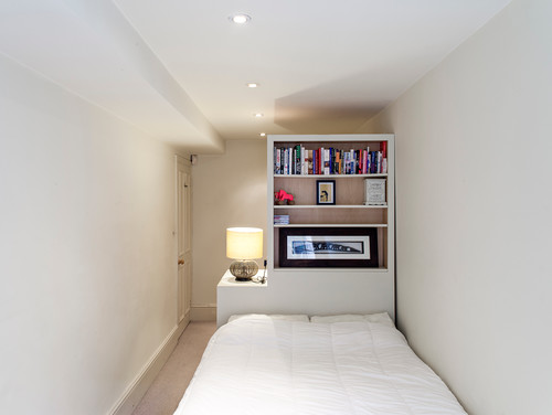
In the photo above, the architect chose to furnish a small bedroom with a multifunctional concept wall. The wall acts as a headboard, a bookshelf and storage space and room divider. It also conceals a small changing area.

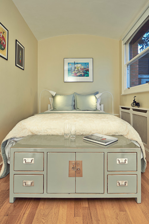
Below, the owners made use of a bit of room at the foot of the bed for a storage locker which can house shoes or clothing, as well as act as a space to stack books.

Apartment, Primrose Hill, North London
Photo by Mia Karlsson Interior DesignLook for industrial bedroom pictures

2) Make use of built-ins.

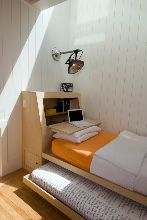
Built-ins can save the day in tight spaces. Below, a built-in acts as a headboard, storage space, and even a desk when necessary.

Bole
Photo by Malcolm Davis ArchitectureDiscover Scandinavian bedroom design inspiration

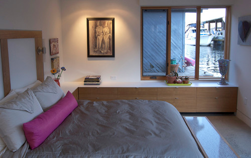
And below, a long, low, built-in console acts as a place to store clothes, without using up much floor space.

Seattle Houseboat
Photo by Terrene HomesDiscover contemporary bedroom design inspiration

3) Go streamlined on closets.

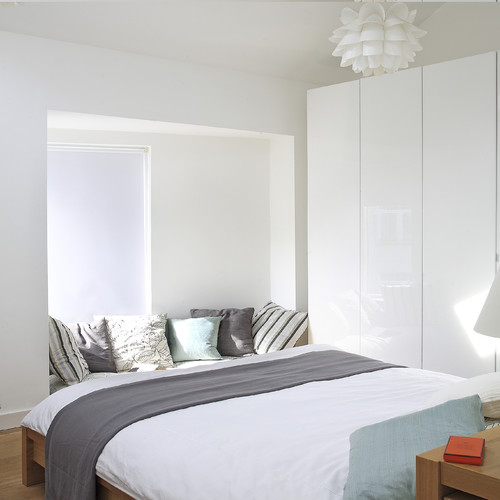
If your small bedroom doesn’t have a built-in closet, go very simple on any freestanding armoire or closet system you add. The simple, white, enameled closet below is unfussy and actually lends the room a feeling of spaciousness. The fact that the doors have no hardware also helps.

Master bedroom
Photo by Optimise DesignMore contemporary bedroom ideas

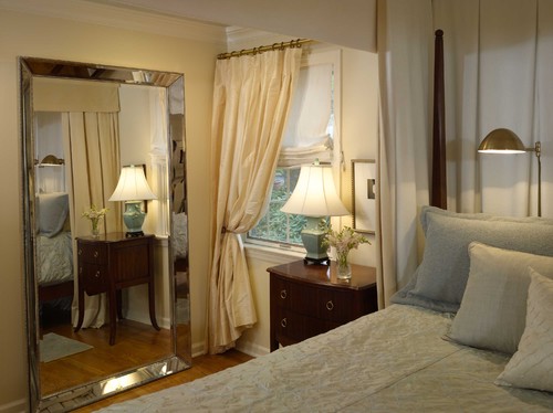
5. Avoid mirrors unless you’re extremely tidy.

Traditional Bedroom
Photo by Search traditional bedroom pictures

Most designers will tell you that adding mirrors can make any room appear larger. But adding mirrors to a room can cut both ways. If the room is extremely tight, or busy in color, pattern or clutter, mirrors can also make it feel even busier and not very relaxing. We think the better bet is to keep the room light, bright, white and simply furnished. You can never go wrong, and you’ll find you get a really good night’s sleep!