Early to Bed Sleep Cycles Cuts Energy Use in Australian Beach Home
This curious looking facade – the children’s bedrooms – gives no clue as to the wide and expansive spaces around the corner.
Dock4 Architecture designed the family home with careful attention to maximising passive solar from passage of the sun with high value double glazing and insulation.
The super efficient home overlooks the endless Pacific Ocean from Bull Bay on North Bruny Island, in Tasmania.
The house is built on a steep site with sweeping views to the open ocean, making the most of its spectacular surroundings.
The master bedroom suite is to one wing, with the children’s bedrooms in the other.
The challenge was how to design for energy efficiency when the views across the South Pacific Ocean are all to the south and east, but the sun is to the north.
Noon sun is allowed in through clerestory windows surrounding three sides of the kitchen work area.

But light also plays a key part of the home’s energy efficiency in a novel way.
Human sleep cycles are altered by the siting.
These sleepers would be roused by the very first rays of morning sun as it ascends over the distant horizon.
The earlier householders are up, the earlier they tend to go to bed.
So less electricity is consumed after dark, simply by getting up with the earliest rays of the sun.
Design Dilemma: Tips on Making the Best of Your Balcony
Somehow, the balcony seems to get short shrift. Perhaps that’s because in the United States, more emphasis has been placed on single family houses, where front yards and backyards seem to get all of the attention. And balconies? Well, leave those to city dwellers who mostly use them as a place to store old mops and buckets.
That was the old thinking, but today, more of us are moving into dense cities and we expect to see a resurgence in balcony interest. It’s a little slice of the outdoors that can have quite an impact on anyone living in a multi-family apartment or condo. To that end, we thought we’d offer a few tips on how to make the most of your balcony, no matter what size it happens to be.
- Think of it as an extension of your indoor space.
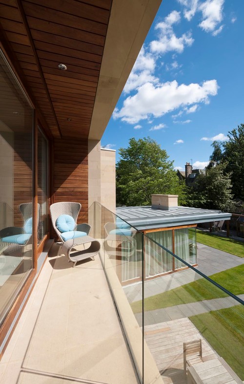
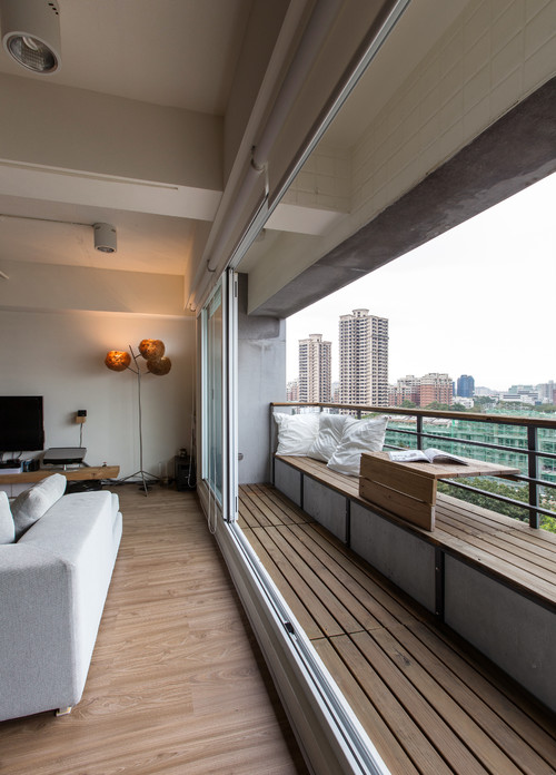
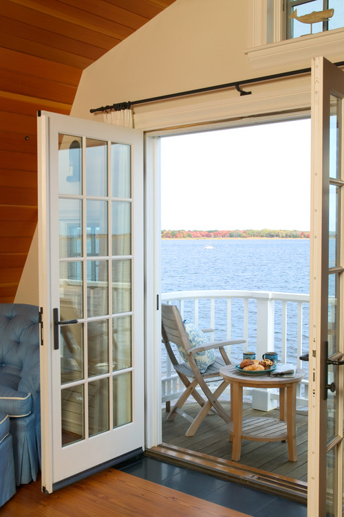
In the balcony above, just open up the sliders and your living room instantly has the feel of a terrace. Balconies can be the perfect opportunity to enlarge the feel of a small apartment, and to give any room an outdoorsy feel. Below, a balcony right off a bedroom of a Newburyport cottage gives the whole cottage the feeling of a houseboat. Enhance the indoor/outdoor feeling by keeping balcony doors unobstructed. Opt for window coverings that can completely disappear so as not to distract from views.
2. Use privacy walls to bring in interest.
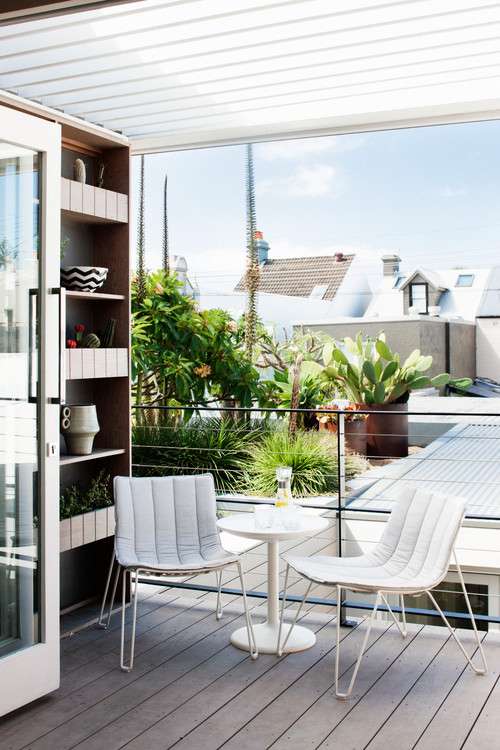
Many balconies are outfitted with privacy walls which keep you and your neighbor from feeling like you’re in the same room if you both happen to be using the balcony at the same time. If you want to keep your balcony feeling homey and not institutional, use your privacy wall as an opportunity to cozy things up. Above, the owners added a handy shelf for plants and decorative knicknacks.
3. Keep it functional.
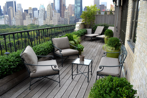
We’ve seen far too many balconies become a repository for household clutter that doesn’t fit inside. Don’t let it happen to you! If you’ve got a balcony (especially one as spectacular as the Central Park West balcony above) or even something more modest, like the balcony below, keep it clutter free, ready to welcome you and your guests when you want to appreciate the great outdoors. All you really need is a couple of chairs and a small table.
4. Add plants, plants and more plants.
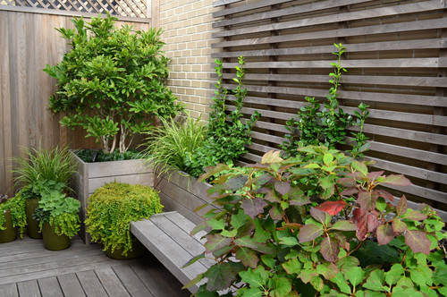
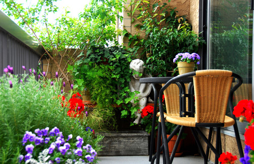
No balcony is complete, of course, without the presence of plants. Plants provide a feeling of restful ease that is particularly satisfying if you live in a busy city. Not only can seeing a bit of greenery around you make you feel great when you’re outside, but glimpsing a bit of greenery from the inside is restful and gratifying as well.
5. Bring in some color.
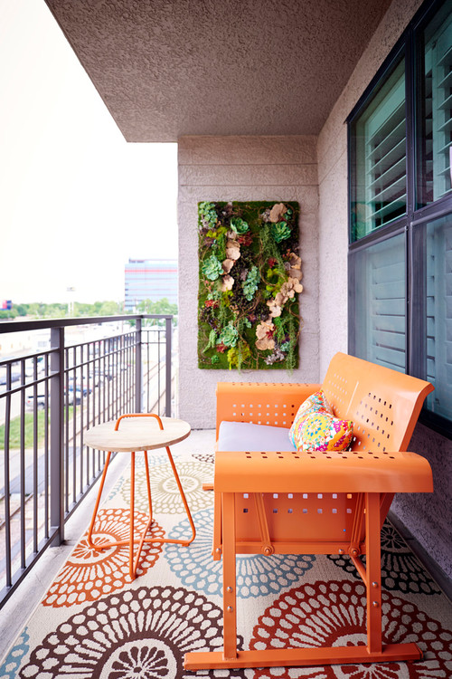
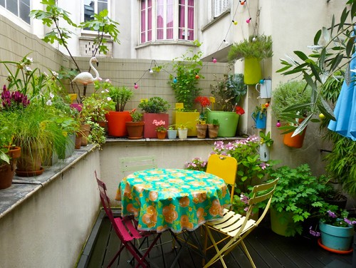
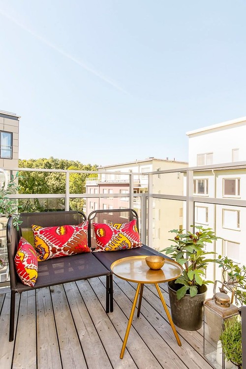
A balcony without color can feel a bit serious. One important last consideration is to bring in touches of color to lighten things up a bit. The easiest way to do this is to opt for a few colorful flowers, as you see below. But if the flowers aren’t always in bloom, try adding colorful pots, chairs and tablecloths, as you see above.
Even colorful pillows can be enough to do the trick:
>Keep these few tips in mind and you’ll see that your balcony will quickly become your favorite “room” at home!
Tiny Loft-Style Cube House on Tasmania’s Bonnet Hill
A very compact house by Dock4 Architecture has a distinctive white cube shape.
Just a simple two storey cement box, it sits deep on a hillside facing north (to the sun in the southern hemisphere)
Materials are raw and unfinished low cost materials covering the larger areas.
Instead, high quality materials used in just a few openings establish a polished finish at a low cost overall.
Notwithstanding its few windows, the white box opens from three sides.
Its two large openings act as both door and window.
Inside, the cube shape encases a loft format with the bedroom suspended within the upper volume.
Light comes from three sides, the full glazing across the
Double height glazing brings abundant light deep into the cube.
The clever kitchen island takes the form of a thick slab of wood that puts all the storage within easy reach – and well lit.

Upstairs, just the bedroom suite and a small study.

The simple cube has a pared down charm.

A window at the top of the stair is extruded from the surface.
This ensures a view through into the landscape the staircase both ascending and descending.
The 100 sq m cube house is on Bonnet Hill, Tasmania, an island off the southern Australian coast.


