Minimalist Composition with Greenery in Sultry Vietnam
A facade is employed in creating a sumptuous composition of white walls vibrantly contrasted by buzzing greenery.

Walk in closer and you realize the green wall surrounds the house on the other side of the living room.
Now the interior is bright and open and cooled by the greenery without.
The glorious house in Thảo Điền, District 2, Ho Chi Minh, Vietnam is by MM++ architect.
The vertical garden extends the surrounding vegetation onto the walls and makes the house disappear into the landscape.
A secluded outdoor shower is set on soft white marble absorbing the sunlight.
The green walls on both sides create private and blissfully serene bedrooms and bathrooms while allowing natural ventilation.
The house was renovated from a “pastiche” art deco villa into a contemporary villa with clean lines and open spaces while keeping the existing concrete structure.
By saving money by keeping the original concrete structure, it was possible to add new elements to the construction.
Instead of the glaring sunlight now it is dappled by extensive trellises.
And by using abundant growing life as part of the architectural composition, the structure is reshaped, but also the house is now cooled.
It is an architectural technique well suited to the local ecosystem.
The lines of the original art deco house have been extended by new portico supporting the green wall.
Now the formerly tacky architecture has been refined to its most minimal expression and has become a well-proportioned composition of a simple white cube with two vertical walls of vegetation, bringing it closer to nature.
Design Dilemma: 5 Decor Trends On Their Way Out in 2016
In our last post, we talked about trends that we expect to remain strong through 2016. Now it’s time to turn our attention to looks and ideas that are fading out of favor. Here are five design trends that will be ebbing away in 2016.
1). Rigorously mid-century modern interiors are out.
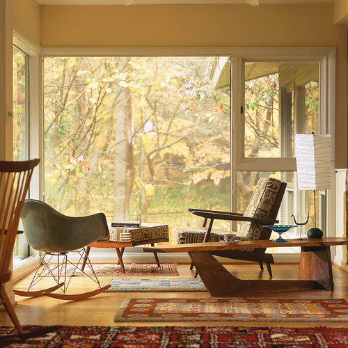
For a time, we became obsessed with the Mid-Century Modern era, to the point that at times it seemed that nothing but Charles Eames and George Nelson furniture was allowed into our homes.Well, we’ve all become a bit bored by that look. True, in the beginning it was a fresh response to overstuffed, over-cluttered decor, but it eventually became so overused as to become clinically predictable.
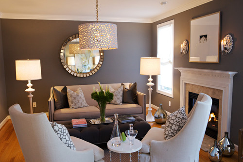
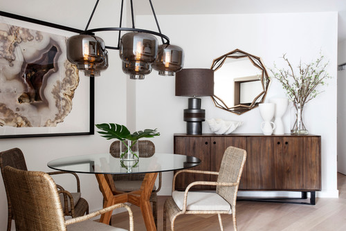
What’s in: eclectic interiors that mix eras and styles.
There’s no reason to have our creativity limited to one era when there is so much to choose from!
2. Overstuffed and over-cluttered decor.
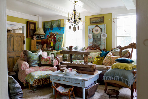
Although we’re loosening up on the Mid-Century look, the truth is that we all have so much access to stuff and distractions that we’re looking to create an island of serenity and tranquility at home. That means we’re letting go of unnecessary baubles and objects and paring down.
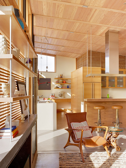
What’s in: warm minimalism. We are looking to keep things simple but comforting, with texture, light, wood and special touches.
3. A Predominance of Solids.
Of course solid color fabrics will always remain the basis of decor, but more of us are looking to mix up that look by using patterns in places where we may have once hesitated.
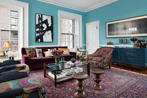
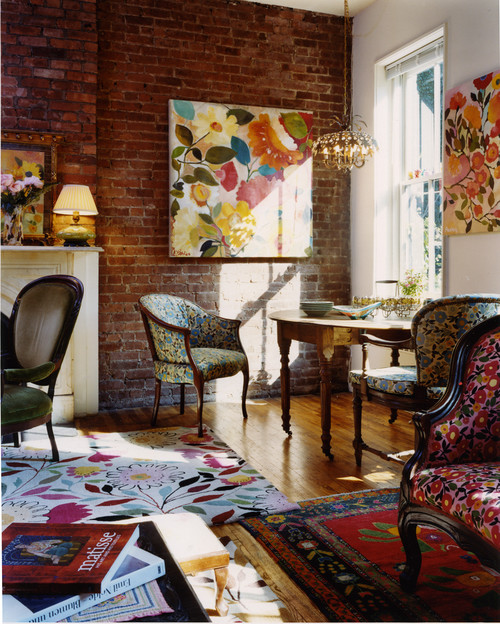
What’s in: Animal prints, tropical prints, ethnic patterns and designs on couches, chairs, rugs and curtains. Just stay away from Chevron!
4. Completely naked windows.
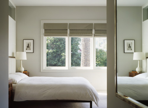
No one wants yards upon yards of fabric hung around windows, collecting dust and blocking sunlight. And yet, the trend in recent years has taken many people in the opposite direction — no curtains or window treatments at all.
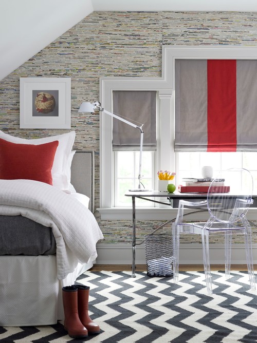
What’s in: Minimal, ethereal and organic shades and simple panels that provide privacy and block sun glare without suffocating a room in fabric.
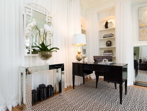
5. Mirrored Furnishings.
For a while, the Hollywood “regency” look took the design world by storm, but we all must have realized that mirrored dressers and bedside tables was not a look that would last.
What’s In: A mix of wooden and metal furniture.
Other trends on their way out:
- Desks in kitchens.
- Over the range microwaves.
- Whirlpool bathtubs.
- Tiled countertops.
- “Faux” anything.
Japanese Family’s Privacy Salvaged in Challenging Site
The architect’s job here was clear: wrestle tranquility and privacy from an environment that has neither.
Like so much architecture in overcrowded Japan, the house in Shiga, Japan is in an unpromising site.
So ALTS Design Office hide a peaceful and private space within a blend-in ugly exterior.
The childrens’ high bedroom windows upstairs are seen in the parking lot, but no hint is given that that is what they are.
Anything less banal on the outside would pierce the privacy of the family hiding their home in clear site on a parking lot.
The boring wall to the parking lot is the key to the design.
To gain peace and privacy, the architects arranged an exclusive path extended in along the front of the house.
A skylight outside, behind the parking lot wall brings daylight but not rain to this briefest of exterior views.
“This way “we gave importance to design the outside space in inside space and produced diverse and interesting space,” say the architects.
The interior blends so seamlessly into the exterior that the ground floor doesn’t feel at all claustrophobic.
And once in the anonymous public realm, no hint is given that family life goes on inside.
The zen placement of the rocks is just perfect.
“We didn’t separate into inside and outside of house simply, and designed the outside space in inside space,” say the architects. “By doing so, we brought a feeling of strangeness in a good sense.”
Only in Japan could the zen sensibility of Japanese architecture work the magic needed!


