A Serenely Refined Residence in New South Wales
Smart Design Studio’s Lamble Residence on the South coast of New South Wales catches dawn’s early light over the South Pacific.
Every room opens up to the outdoors.
Interestingly, the public spaces are split between floors.
The kitchen and dining is on the ground floor and opens out onto a garden in front of Gerringong beach.
While upstairs, the laid-back living room makes the most of its exciting panoramic views of the South Pacific ocean.
Sublimely open, the master bedroom also captures the endless sea vista from the side of the upper floor.
Up here, large slabs of stone mark out a generous rooftop terrace that is the epitome of calm and cool design.
Behind the bedroom, an elegant and understated grey and white bathroom continues the unhurried recurring large stone slabs.
The unusual arrangement with the living room upstairs, kitchen downstairs ran afoul of local planning provisions, which go so far as to dictate the configuration of rooms within a site.
Eventually the council approved the plan. So downstairs, the garage, laundry and downstairs bathrooms are at the back of the site, with the kitchen and dining room and children’s rooms in front.
From the street, the house resembles an ark, clad in untreated cedar which will weather to a soft grey.
The translucent door panel is beautifully played against the soft greys of the stone entry, while a wide door in untreated cedar pivots on a central hinge.
Translucence and soft greys blend for a calming effect on the street-facing side of the house, baffling any traffic noises.
It is a quiet and refined house, and one with a serene and lasting beauty.
Casa Till – Pure and Simple Bliss on the Chilean Coast
Casa Till by WMR Arquitectos is simply constructed from onsite pine for a tiny carbon footprint in a staggeringly lovely setting.
The spectacular uninterrupted panoramic views are perfectly preserved by the supreme humility of the construction.
The client’s wish was that the house should blend into the landscape so that from a distance it would not be visible.
Solar panels on the rooftop supply all the electricity used by the house in its extremely remote location.
The design is just a simple straight shot with a bedroom at each end and the public living space in the center.
A sliding wall can separate off the master bedroom at the end of the house, or incorporate it and extend the living space as seen here.
The utmost in straightforward design, the house is not fancy or elaborate.
This simplicity makes the staggering views all the more stunning.
Truly a one-of-a-kind blissful dream home.
Design Dilemma: Getting A Little Funky at Home
As a long, hard winter comes to an end, and the first fresh breezes of spring linger in the air, we feel a bit like changing things up at home. And namely, we feel like bringing home a bit of colorful personality that’s in your face cool. We’re calling it “getting funky.”
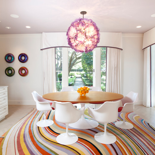
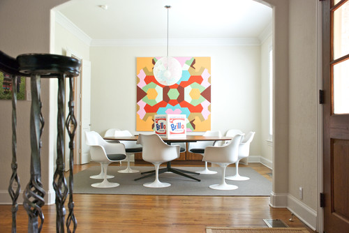
We’ve run across a few interiors that really seem to epitomize exactly that spirit of funkiness. Beginning with the dining rooms pictured above and below.
Lets face it, the room above are totally cool. It’s a combination of the Tulip Chairs, classic and mod at the same time, the psychedelic rainbow rug, and the pop abstract art right down to the Brillo sculpture on the table, that makes these two rooms feel spunky, free and fun. The eye catching, in your face, pendant lights, also add another note of cool.
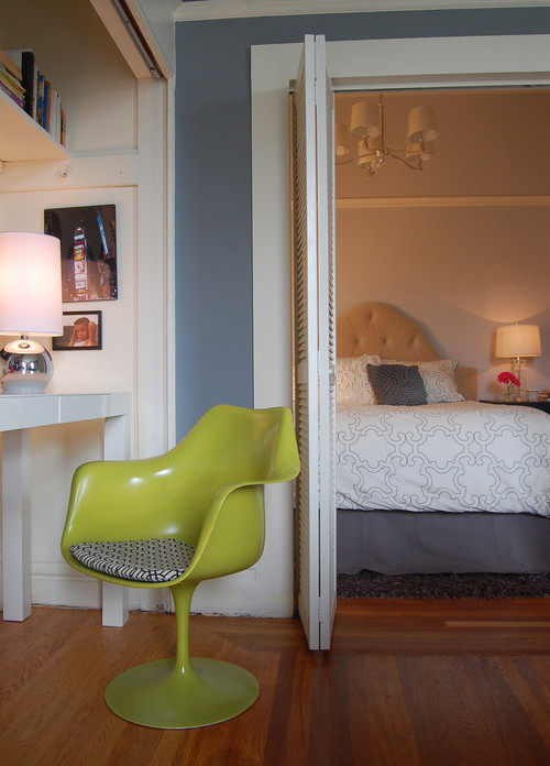
And sometimes it takes just one element to funkify a room. Check out the lime green Tulip Chair below in this bedroom:
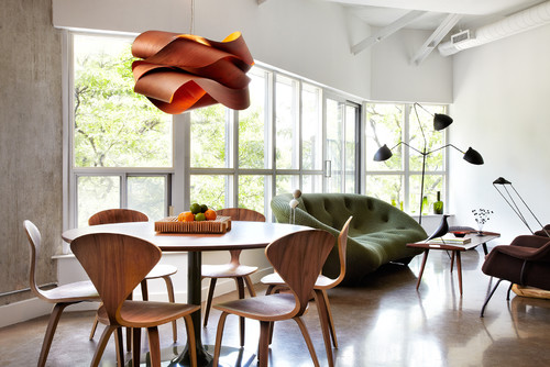
Below, find a funky living room. What makes it so beyond the pale? We think it’s the fact that every piece of furniture is treated as a sculptural element, with an emphasis on natural, organic shapes. According to the designer who put these shapes together, the organic, curvaceous forms make the angular space feel “sensual.”
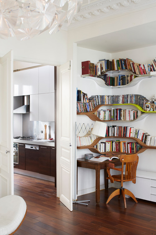
Here, a bookcase is the sculptural element that lends this corner office space it’s funk factor.
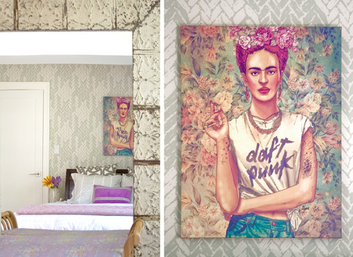
Now there’s all kind of funk. There’s funky offbeat, and funky boho and funky cool. Art is an essential part of any of those looks. Below, check out a funky boho bedroom made cool by a painting of Frida Kahlo wearing a Daft Punk t-shirt.
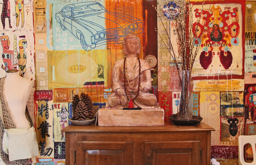
And below, a nice little funky vignette incorporates a Buddha and an eclectic mix of artwork.
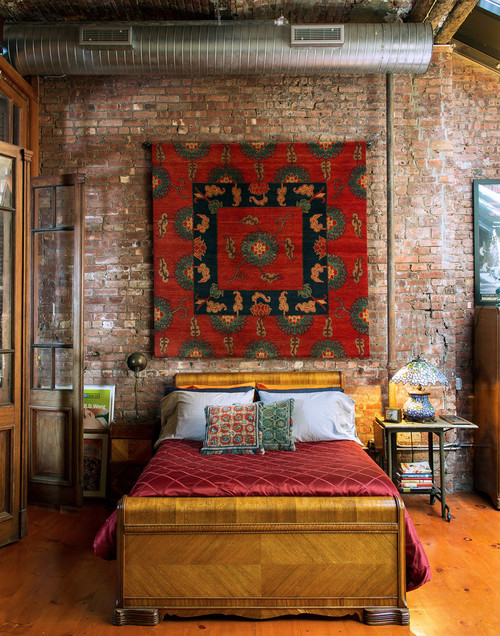
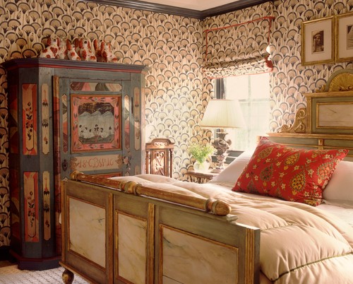
Here’s another bedroom rendered cool by the use of a Tibetan rug as a wall hanging. Vintage furniture pieces combined in an eclectic mix also up the funk factor.
Wallpaper can be an interesting way to go funky.
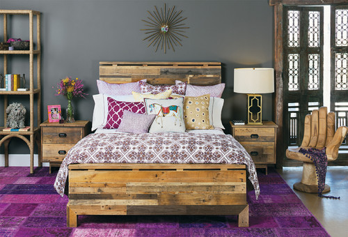
And so can the use of reclaimed wood furniture.
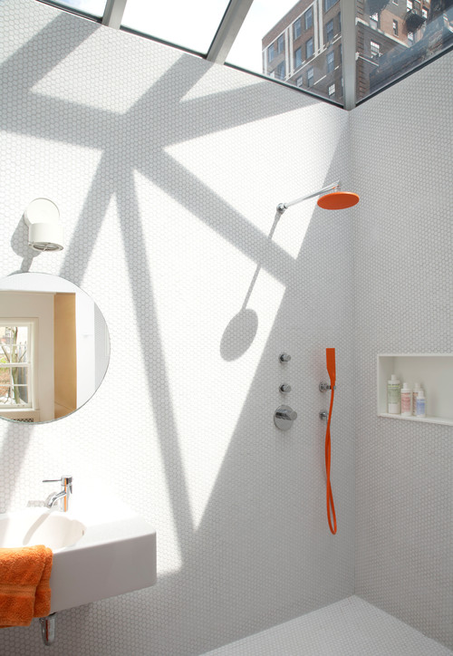
Sometimes, funkiness is not about layering lots of pattern, texture and color. It can be adding just one unexpected element in an otherwise pared down space. Like this orange fixed showerhead and and handheld showerhead in a bathroom:
Let’s recap how to go funky.
- Be adventurous when it comes to color, pattern and texture.
- Be eclectic. Mix eras.
- Go sculptural. Buy furniture the way you’d buy a piece of art, thinking of line and form, not just comfort.
- Go vintage. Many of the coolest pieces are from earlier time periods.
- Add original art, the quirkier the better.
- Broaden your decor to incorporate unusual elements, such as wallpaper or reclaimed wood.
- Add just one unexpected element in a pared down space.
- Let yourself go and have fun!


