Design Dilemma: Five Design Trends for 2017
Welcome to 2017! As we ring in the new year, we’re assessing design trends to get a handle on what’s “in” and “out.” Now certainly, design trends do not move as fast as fashion trends do. It takes several years for a look, let’s say “industrial” or “Mid-Century Modern” to run their course. And at times, it seems as if some of these trends are never going to die. Mid-Century Modern is a good example of a long-lived trend that has now been around for close to two decades. And yet, little by little, styles and interior ideas are changing. For example, this year, as opposed to recent years, the large furniture chains are suggesting that 2017 will be the year of Japanese Minimalism and Italian Vintage Modern. Here’s a quick look at a few of the trends that prognosticators predict will be hot this year.
1. Green as the new black.
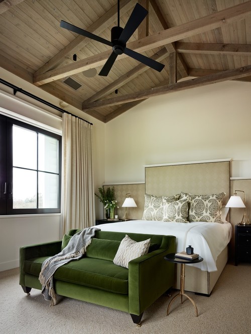
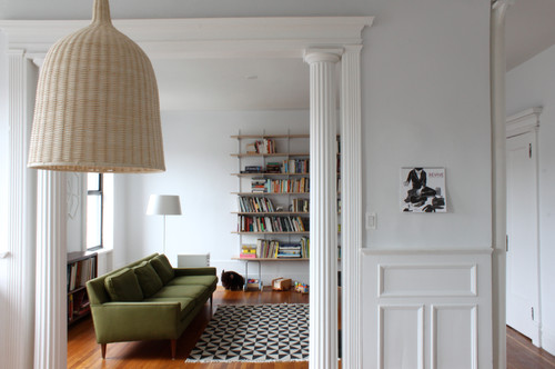
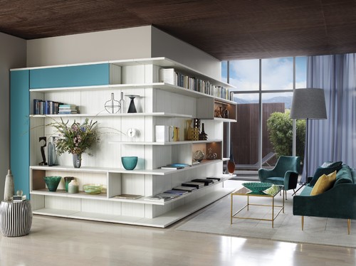
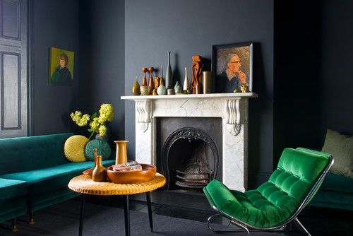
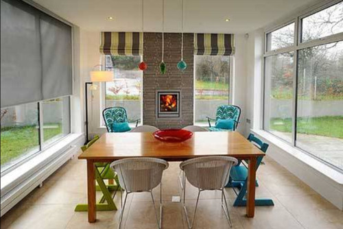
Deep dark green, emerald green, forest green and deep olives, seem to be the “it” color of the year, as seen above and below. Green is organic and soothing, and depending on the exact tone, can come off as homey or regal. Expect to see more forest green sofas and emerald green occasional chairs!
2. Jewel tones.
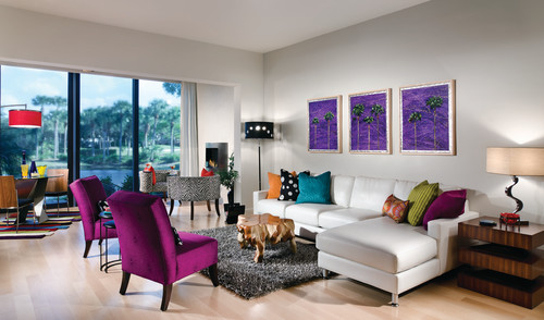
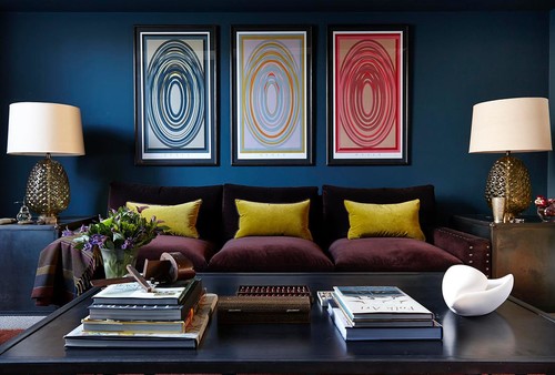
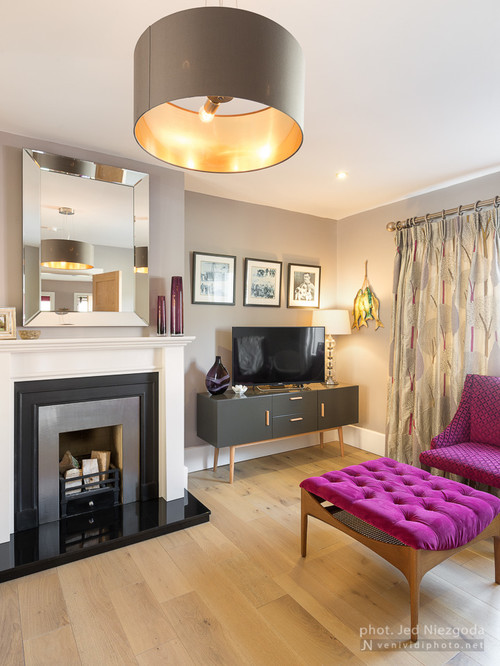
And it’s not just emerald green that is back in a big way, any jewel tones, from deep blue to magenta to deep purple are favored this year. Jewel tones are warm but elegant. In velvet, they project a sense of luxury and posh comfort which is a nice change from the hard-edged metal and distressed leather of the industrial style, or the prim, muted grays and beiges of Mid-Century Modern. Below, a living room manages to use many jewel tones while still coming off as light-hearted and lively.
And below, a living room utilizing some of the same jewel tones comes off in a completely different way, as a cozy parlor for evening conversation:
And here, again, emerald green, which pops in a wonderful way against smoky, charcoal walls:
3. Upholstered Bedheads.
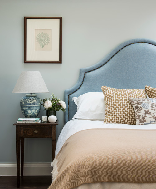
Another interesting trend we’ve noted is the move toward upholstered bedframes over the wooden and metal frames of the past. Upholstery can come off as luxe — like something you might see in a high-end hotel. While it’s a shift away from hard edges, we wonder how long this trend will last given the fact that more of us are conscious of banishing allergens such as dust mites from our bedrooms!
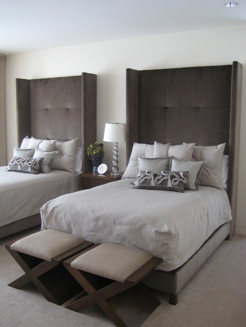
The nice thing about upholstery, is that without much effort or fanfare, you can achieve a completely different vibe. Above, a traditional bedroom sports a powder blue headboard that suggests the homey comfort of grandma’s house. And below, tall headboards upholstered in velvet exude a sense of luxury and sensuality.
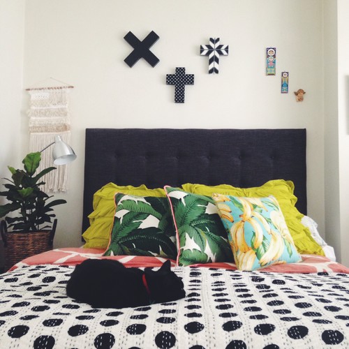
The black upholstered headboard below manages to come off as youthful and graphic when paired with a graphic polkadot bedspread and bright chartreuse pillows:
4. Warmer materials, including terra cotta and cork.
With the advent of the industrial look, metals have had a good, long run. But in 2017, prognosticators predict that people will be looking to bring more warmth into their homes. This may come in the form of terra cotta tiles, cork walls or floors, or more use of wood.
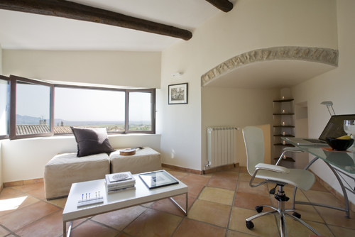
Below, a living room warms up, thanks to terra cotta tiles.
Here, cork floors add warmth:
And below, traditional wood floors are always in style! Note the jewel tones in the room:
5. Closed kitchens.
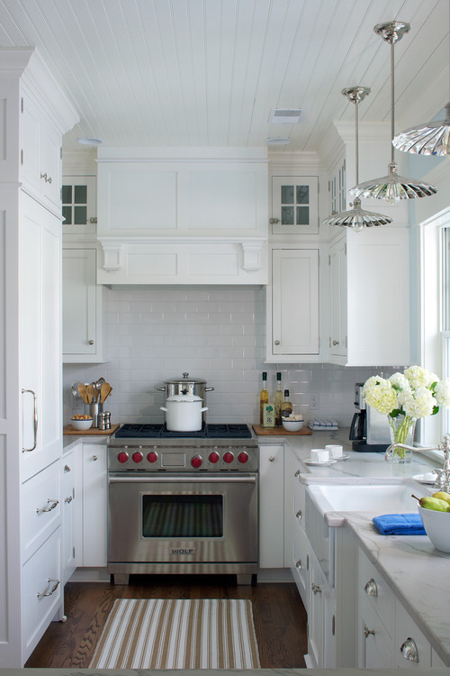
This is a surprise development, as open kitchens have been heavily favored for a number of years. But naturally, as with any trend, there is always a backlash. Although many of us love the interactivity and informality of an open kitchen there are those that crave the privacy and formality of a closed-off space.
Are you curious about what’s headed out of style? Tune in next time as we explore the trends to avoid in the new year!
Design Dilemma: Two Contrasting Styles, Two Design Aesthetics
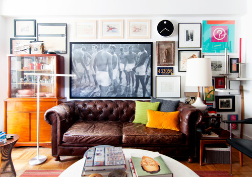
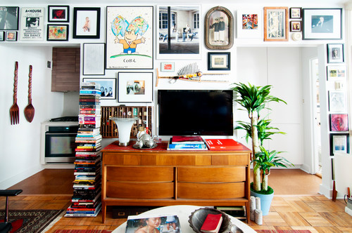
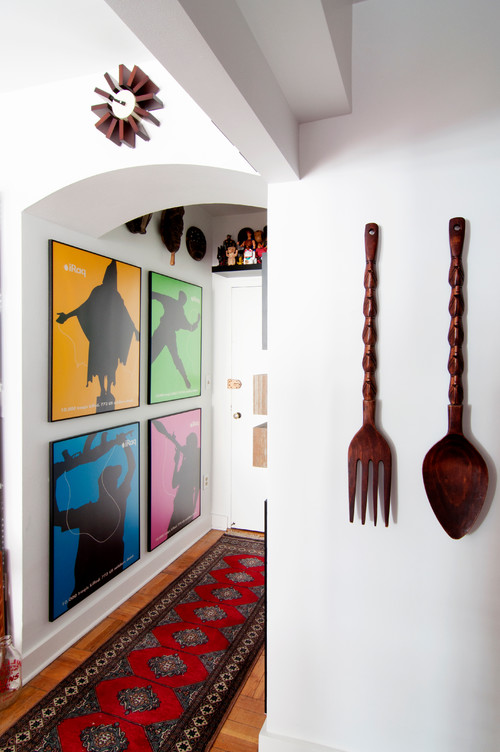
This week, we thought we’d take a look at two very different design aesthetics, a reminder that there are no real style rules — decorate how you see fit! Check out the Washington DC condo of Irwin Gueco, who has outfitted his 495 square foot space with an eclectic mix of color, texture and art. Gueco, an architect by trade and working at the National Gallery of Art, came to Washington to get his master’s in architecture. He began renting in a different apartment in the same Art Deco building he lives in now. He rented for about eight years before buying his condo.
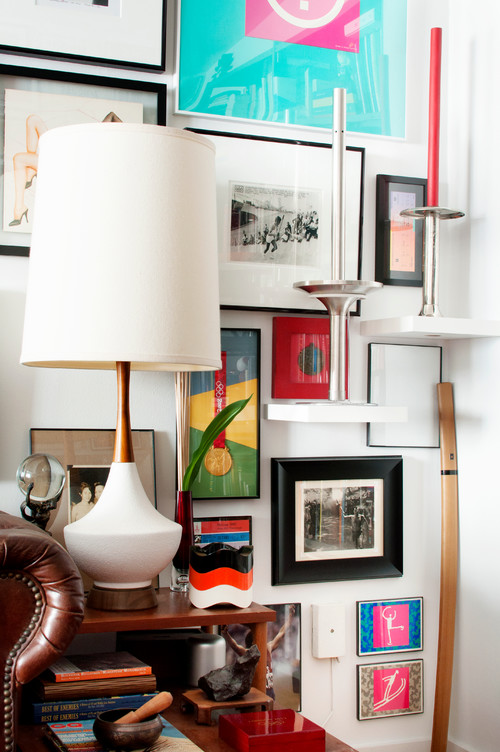
The walls in Gueco’s home are covered with art. Every wall is a gallery wall featuring photos, drawings, paintings, and posters and memorabilia from events that he’s attended.
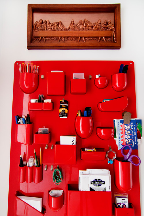
One of the first things you notice are bright pops of color, that show up in art, but that are repeated in pillows and other accessories.
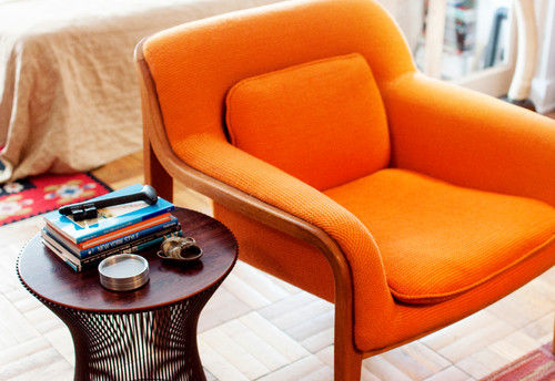
A colorful chair, inherited, from his parents, such as the 1973 orange Knoll keep things warm and fun.
Although the walls are all white, his home gives you anything but a cold, sterile feel. It’s fun, and very well thought out.
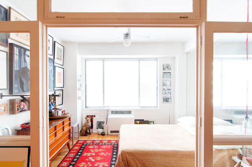
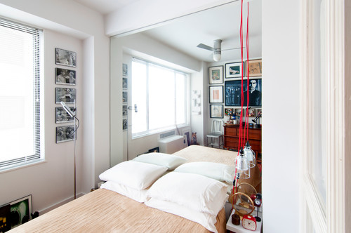
Here’s a shot of his bedroom:
And the entryway:
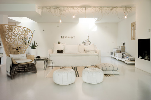
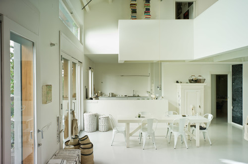
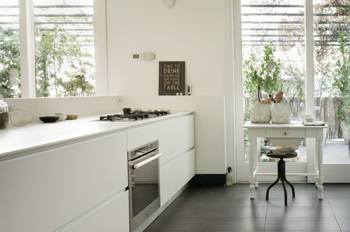
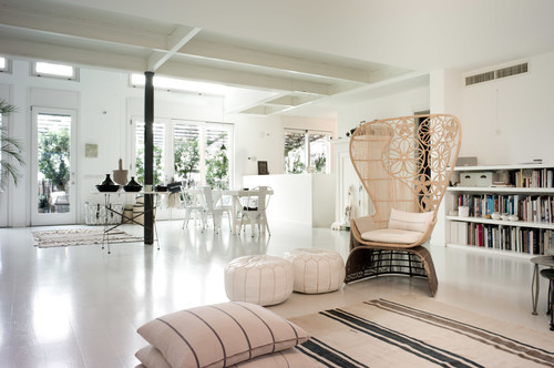
Now we take a look at a totally different approach. The apartment below belongs to Laura Dragotti and is located in an Art Nouveau building in Milan. Everything is white or off white, from the walls, to the floors to the furnishings.
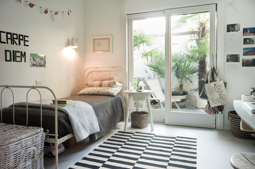
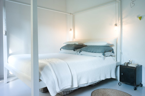
And in one of the bedrooms, a touch of black:
And a second bedroom:
Although these two homes would seem to be utterly different, they do have commonalities. They are simple and informal in style, and chock full of mementos and memorabilia.
The design takeaway: Keep things simple, fun, authentic, with a consistent design vision and you can’t go wrong.
Design Trend: Freestanding BathTubs
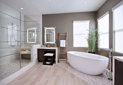
If there’s one design trend that’s been going strong in recent years, it’s the trend to freestanding bathtubs. Elegant, often sculptural, with a bit of an artistic flare, a stand-alone bathtub is a chance to inject a little bit of luxury into a bathroom. And plenty of people, it seems, are seizing the opportunity. There are probably several reasons for the trend. For one, separate shower stalls are now standard in many newer homes, as opposed to the tub/shower combo of earlier years. This frees homeowners to select something a little bit different when it comes to the tub. Also, bathrooms in newer homes are often larger, allowing more space than the smaller bathrooms of the past. So there’s plenty of space to experiment with a freestanding tub. Finally, more homeowners are looking for luxury at home, and there’s no simpler way to get that feeling than with a freestanding tub.
If you’re interested in installing a freestanding tub in your bathroom, here are a few things you should consider:
1. Do you have the space? Will you be able to place your tub a few inches away from the wall, or will it feel “squeezed in”? When it’s delivered, will it even fit through your doors and up your stairways? Avoid nasty surprises by measuring carefully.
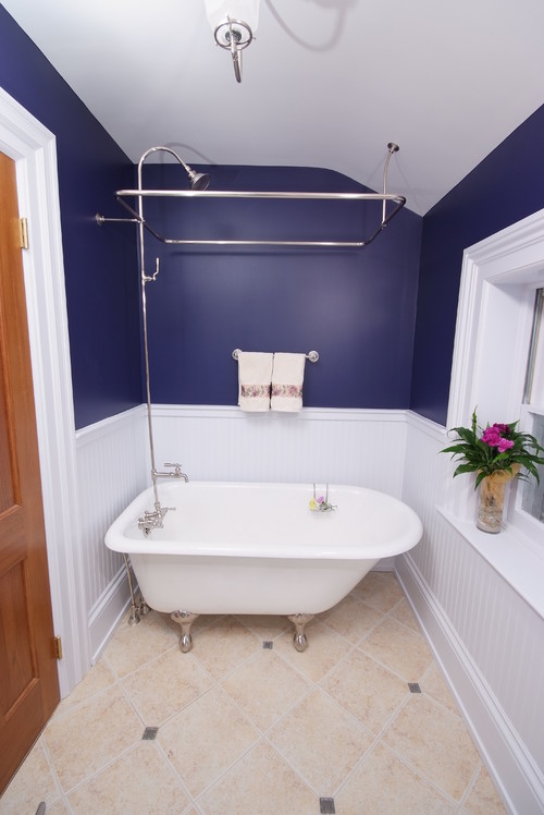
2. Consider a smaller foot-print claw foot tub for smaller bathrooms. The bathroom below is not very large, and yet, a smaller claw foot tub fits in quite nicely. In fact, the bathroom feels even bigger because there’s space around the tub to give the bathroom an airy feel. Designers say that the negative space provides more emphasis to the tub as the “pièce de résistance.”
4. Consider putting your tub on an angle if you want to make a striking statement. Angled tubs do two things: First they demonstrate you are unconcerned with how much space your tub is taking in your bathroom. That, alone, is a great luxury. Two, they also create beautiful sight lines. They provide you with a beautiful view while soaking in your tub and a gorgeous view upon entering the bathroom.
5. Consider a soaking tub if you have limited space. Compact soaking tubs are much deeper but smaller. Although you’ll need the same amount of water to take a bath, you can squeeze one into a much smaller room.
6. If your tub comes undrilled and you don’t want to disturb its pristine beauty, you might consider a floor-mounted faucet, as seen above in the angled tub. Floor-mounted faucets have a “cool” factor far and beyond traditional faucets mounted inside tubs.
A wall mounted faucet, as seen below, is another alternative.
8. Go Artsy. If you have the space for a freestanding tub, go the extra mile to make your tub selection extra special. Pick out an unusual, dramatic shape or style for added oomph.
9. Consider a slipper tub in a traditional bathroom.
If you’ve got a traditional old home, perhaps a Victorian with chair rails, wainscoting and the rest, nothing can look more fitting than a freestanding tub with high sides, sometimes called a “slipper” tub. The high sides of the tub act as a comfortable headrest for extra long soaks. A large double slipper allows two people to bathe and sip champagne at the same time. What a treat on cold winter days. Special bonus points if your bathroom happens to include a fireplace!
What it boils down to is this: if you are lucky enough to have the space to consider a freestanding bath you should definitely seize the opportunity. Freestanding tubs offer a special chance to show off your own personality and artistic flare, whether you opt for streamlined and modern, a very traditional claw-footed tub, or a zen-inspired Japanese soaking tub. The design of your tub will set the tone of your bathroom, and can indeed serve as inspiration for the décor or other rooms in your home. And besides just the look, there’s nothing more relaxing than taking the time to relax in a hot bath!
