Design Dilemma: Turning a Bedroom into a Closet
Surely it’s a sign of the times when we find ourselves afflicted with far more things than space to store them all. In fact, that’s the case for many of us, who find ourselves overloaded with clothes, shoes, purses, and luggage. We may also happen to have a spare bedroom that remains empty most of the time. What’s the solution? How about turning that spare bedroom into an actual closet?
The plusses of this bold move are many. For one, turning an extra room into a walk-in closet can be as simple or as complicated as you want to make it. It may mean simply installing removable clothing caddies, or it may mean a complete overhaul with built-ins.
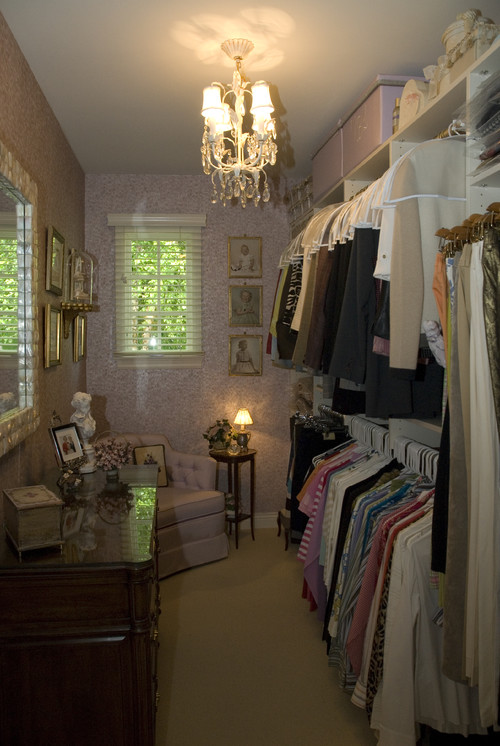
Here’s the simple version:
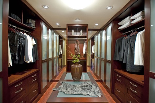
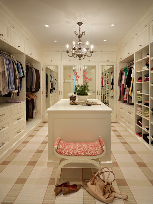
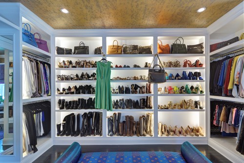
And here’s what the fancy walk-in closet might look like:
Another huge plus is that you are actually making a savvy use of space. If you have a guestroom and no guests, a home gym that rarely gets used, a home office that is unnecessary, due to the advent of the laptop, then turning that wasted space into a walk-in closet to store your goods and eliminate clutter in other parts of your home makes lots of sense.
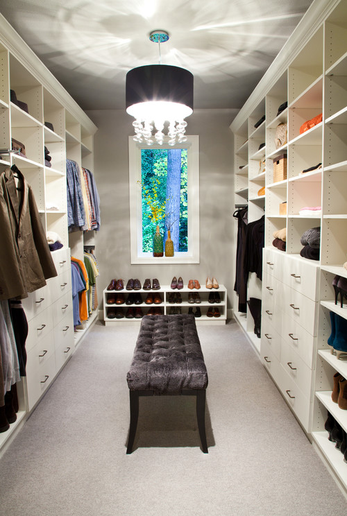
And there’s one more huge advantage. You’ll actually be able to find your stuff! With easy access and great organization, you may find yourself less likely to buy more things you don’t need, since you can easily assess what you have. Just think how easy getting dressed would be in the closet below:
So what should you keep in mind if you’re thinking of creating your own walk-in closet?
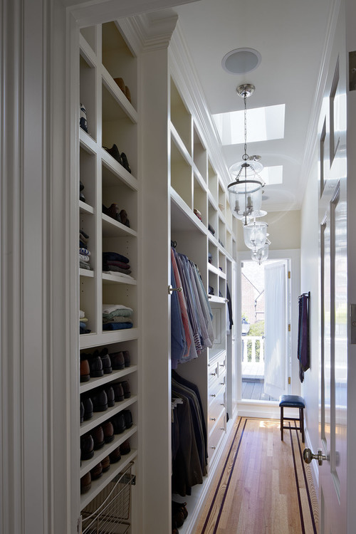
1) Opt for a room with low light, if possible. A room with windows that receive bright sunlight could end up fading clothes. For that reason, you might opt to take only a portion of a room to create that closet, or you might opt for a hallway space, as you see below:
2) Consider whether you want a wall mounted or floor mounted system. Wall-mounted closets are affixed directly to the wall or hung from a rail mounted onto the wall. As you see below. They’re cheaper, and often combine coated-wire baskets and racks with hanging wood shelves for a contemporary and utilitarian look.
Floor-mounted closets are attached to the wall as well, but get most of their support from the floor. Made of particle board panels covered with melanine, they can look like built-ins, and thus are more expensive, and traditional looking:
3) Take it beyond just the racks.
If you’re going to the trouble of converting a bedroom into a closet, go all out and think beyond just racks for hanging clothes. Consider shallow drawers for underwear, socks and belts; deeper drawers for sweaters and T-shirts; and open shelves for shoes and sweats. Throw in racks to hang ties or jewelry, and a shoe rack for shoes.
4) Consider LED shelf lighting.
LEDs use less electricity, produce less heat and can be surface mounted and plugged in, so they don’t require ceiling access.
Here’s what they look like:
5. Do your research.
If you’re lucky enough to have the opportunity to build a walk-in closet, make the most of it! Visit different stores, check out various systems, and plan, plan, plan. You can hire a closet company to design your system, or you can design it yourself.You can hire a contractor to build it, or do the work yourself. Expect to spend between $500 and $1,500 if you do it yourself. If you’re looking at something fancier, you can expect to spend between $1,500 and $8,000 for a medium-quality closet, and $8,000 to $12,000 (or more) for a higher-end closet with all the trimmings.
Nice Graphic Design in Black and White Swedish Cottage for an Artist
The biggest part of this black and white cottage at the resort location at Ingarö-Evlinge, in Sweden, is dug into the slope at the far border of the property, creating a large horizontal platform at ground level to its side.
The Casa Barone was designed by Widjedal Racki Bergerhoff for a young Italian painter and his Swedish wife with a studio space that enabled the homeowner to work inspired by the lovely surroundings.
One of the more intriguing aspects is that the bath (to the left) overlooks the living room.
As can be seen in the plan, this means the view out over the water can be shared by the bather.
This sofa occupies the corner of the living room overseen by the bather behind the wall.
A skylight above the bath similarly connects the bather with the sky above.
The glossy black wooden floors with the contrasting softness and shelter of the soft and white cushioned sofas are a delight.
While the waterside cottage houses just the painter and his wife, there is ample entertaining space for dinner guests.
These glossy black wooden floors throughout the ultra-modern Casa Barone anchor the home into the view.
Upstairs too, warmed by a fire, the bedroom shares the same glossy black painted floor as downstairs.
The view as you descend from the bedroom via the central stair, creating a a super-narrow tall void that beautifully slices the white space.
There had been an existing home on the property, but it sat in the middle of the property leaving only unusable narrow and highly sloping ground around it.
By digging in next to the site of the existing flat foundation of the old house, a new exterior flat space was created.
Industrial Chic Makeover of a 1960s Icon
Casual industrial chic is amusing and never cold in this black interior makeover of a landmark work.
Chadbourne + Doss Architects have reconstructed one of Seattle architect Fred Bassetti’s earliest designs from 1962.
Now a new metal skin with interior cedar liner wraps over the roof and grounds the house to the site.
Glass forms both sides of this delicious reading room with a warm fire at one end.
Black surrounds nearly all surfaces of this stark white kitchen.
Viewed from the opposite side, a warm wood encases and is supported by black steel beams.

This cedar wood lined “box” shape is new, wrapping and encasing the home.

Rough and rustic boulders are feature that bring the wooded site in to a patio under the family home.

By extreme contrast, bathing spaces are ethereally bright, smooth and seamless.

Yet all the materials used throughout are natural but installed and crafted in an extremely crisp manner.

Entering the glowing white center of the home has got to be a sensuous delight after the matte black of the bedroom.
Altogether a sensitive makeover of an icon.

