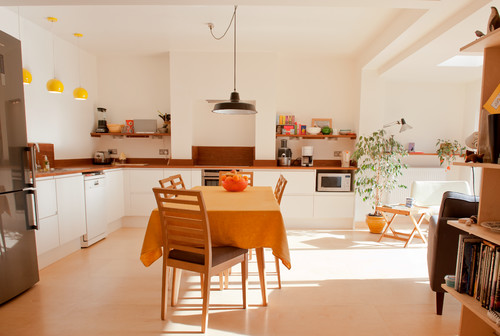
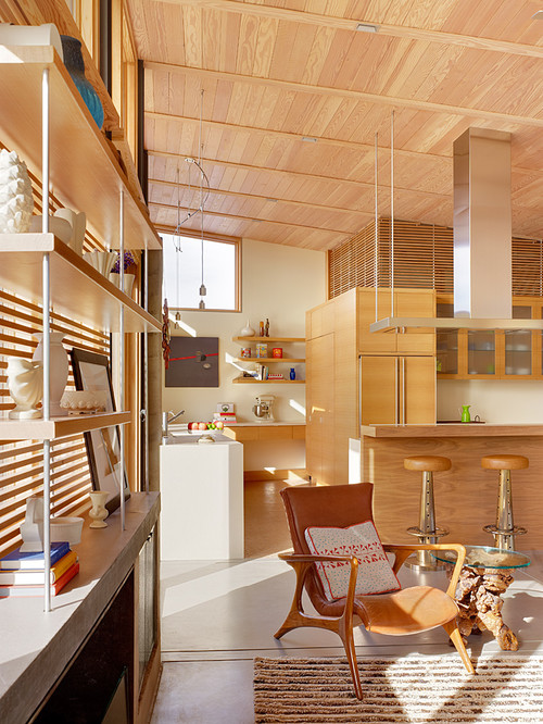
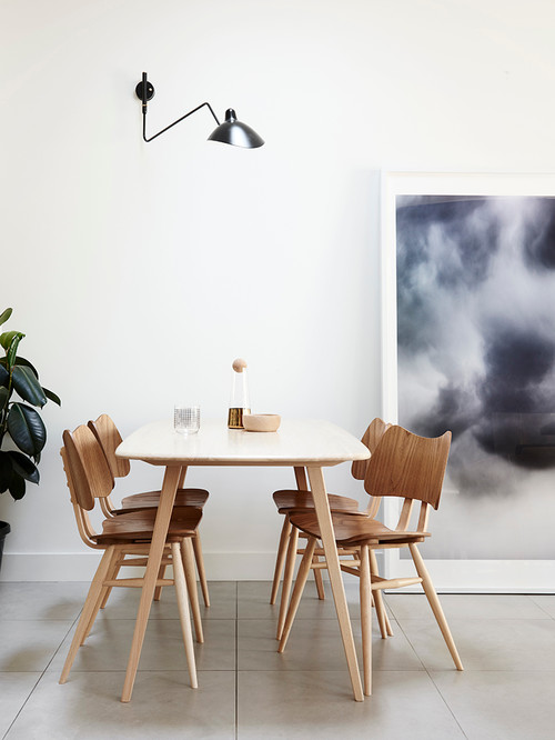
If there’s one decor style which seems to capture the zeitgeist of our times better than any other, it’s what has become known as “warm minimalism.” In an age in which sustainability, climate change, excess consumerism, and growing inequality have become the issues of the day, there is something about a welcoming but very simple environment, boiled down to a few essentials, which seems to reflect the spirit of our times. Environments like these:
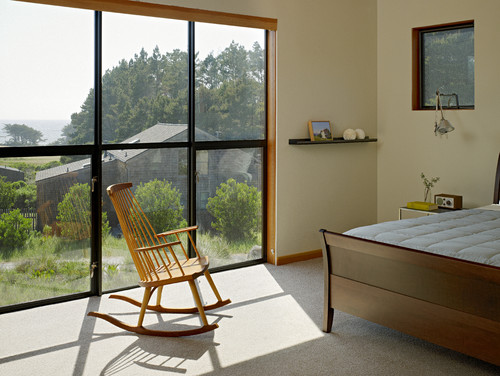
And this:
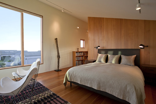
And this:
Why are these environments so appealing, and what do they have in common?
To answer the first question, many of us feel increasingly jaded by societies in which we are constantly expected to grasp after the next new trend. Instead, we are in search for classic environments that will endure the test of time, spaces that do not require expensive designer furniture, rooms that embrace sustainable woods, and that are not filled to the brim with “stuff.” at the same time, classic minimalism, as it is widely understood — no color, no rugs, sharp lines and empty spaces — does not provide the sense of retreat and welcome that most of us are after in our homes. In an increasingly competitive world, we want a space that gives us a kiss and a hug when we come home, not a cold shoulder.
So that answers the question of why we find spaces like those below appealing.
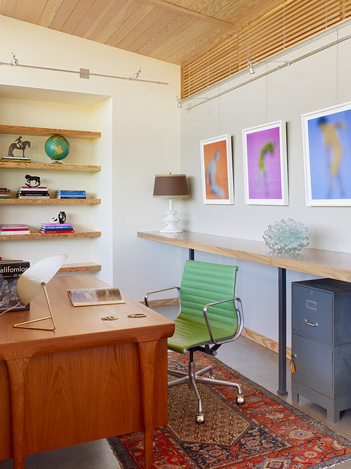
The second question of what these environments have in common is easy to spot. Warm, minimal environments make liberal use of wood. Wood is often on the lighter side of the color palette to emphasize airyness and spaciousness. There is a distinct lack of clutter. Organic shapes, rounded corners, nubby textures, are important design elements, as is the concept of light and space itself. While it might seem easy to pull off such a space, it really isn’t. If your home doesn’t have good bones, it will be harder to let minimalism shine the way it should.
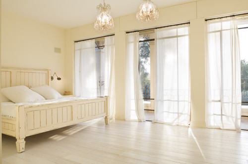
The bedroom below just wouldn’t be the same without the huge window and all the light streaming in.
So if your space has good bones and you think you have the restraint to pull off this decor style, here are a few tips:
1) Try Coco Chanel’s tip. Design what you think is the perfect room and then remove one object. It could be that extra lamp, object d’art, or side chair.
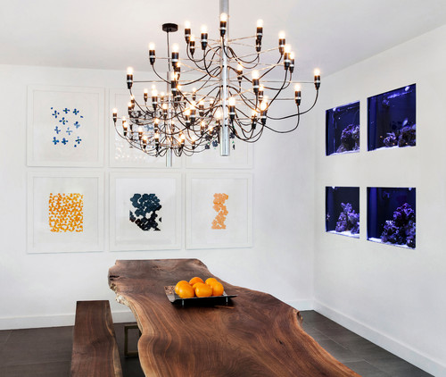
2) Use warm woods but don’t go crazy. Wood, used in just the right amounts, can warm up a space that might otherwise seem clinical. But if you add too much, the minimalism effect gets lost. So use wood judiciously. Below, a dining room makes use of wood and organic, live-edge table to warm things up.
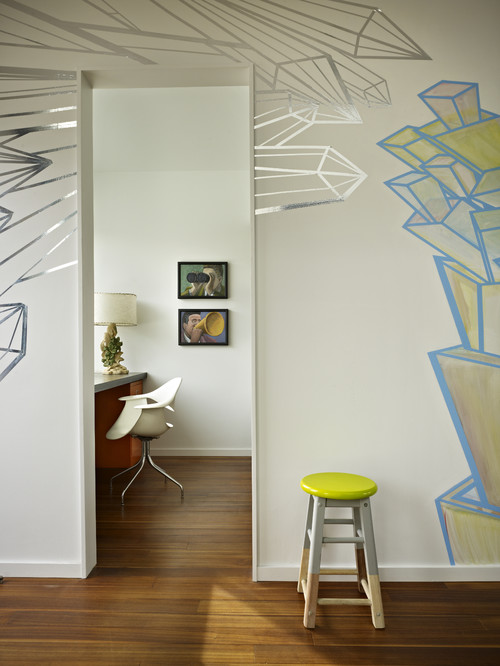
3) Art and touches of color make a big difference in an otherwise empty room. Below, two pieces of art and one simple yellow stool steal the show. Notice also how the lamp brings in a touch of nature, always critical in a warm space.
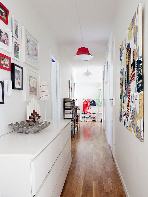
And here, a simple white hallway is warmed up with lots of art and touches of color.
4) Steal a page out of the Scandinavian playbook, and paint a simple room all white, then fill your walls with artwork and touches of primary color. You can see that aesthetic at work in the hallway above.
5) Make editing a regular part of your life. The hardest part of having a warm minimal space is keeping it minimal. In order to do so, you’ve got to purge regularly, giving away things — extra clothes, books, art objects, that seem to find their way into your home. If you don’t love it, let it go!
Brooklyn is home to the brownstone and San Francisco the “Painted Lady.” Boston is admired for red brick townhouses and Los Angeles for the Spanish-stucco villa. But where do you go for cutting-edge, futuristic architecture that we normally associate with cities like Dubai and Tokyo? The answer is Miami. There are some seriously interesting residential projects in the works, each more daring than the last. Here are five of them:
Designed by Pritzker prize-winning architect Zaha Hadid, One Thousand Museum is Hadid’s first residential skyscraper in the western hemisphere. Internationally renowned for her designs incorporating the organic in a sensuous and usually soaring way, the new residence elegantly blurs the line between art and architecture. Take a look at the magnificent swimming pool below:
And here is a rendering of the building from outside, where balcony openings are reminiscent of Antoni Gaudi’s organic, almost animalistic forms and shapes:
One Thousand Museum will include duplex townhomes, half-floor residences, full-floor penthouses, and a single duplex penthouse. Interiors are being designed by an elite team of designers, including lighting artists and residential technology specialists. Every residence will offer multiple oversized terraces that form part of the tower’s sensual, sculptural exoskeleton.

Gran Paraiso Residences
These residences are located in the Paraiso master planned community developed by Jorge M. Pérez of The Related Group, the nation’s leading developer of multifamily residences and one of the largest Hispanic-owned businesses in the United States. Located in the Miami district of Edgewater, Gran Paraiso overlooks Biscayne Bay, with Miami Beach just over the horizon. Like One Thousand Museum, Gran Paraiso also has some important names in architecture attached, including architect Bernardo Fort-Brescia of the Miami-based architecture firm Arquitectonica and Italian designer Piero Lissoni, internationally renowned for the design of hotels, residential complexes, corporate headquarters, yachts, and lifestyle products.
As you can see from the above picture, the design is more linear and less organic than Hadid’s, but nevertheless striking. Here’s a different view:
And an interior shot:

Based on what we can see, the Gran Paraiso looks to be one of the preeminent places to live and play in Miami.
Hyde Beach House Hollywood


Marina Palms
Located in North Miami, Marina Palms Yacht Club & Residences (pictured above) is two, 24-story towers with 468 residences that overlook Biscayne Bay and the Atlantic Ocean. This is the place to be if you love boating or water sports. The development includes a 112-slip private marina that can accommodate yachts up to 90 feet long. There’s open ocean access for boaters via Haulover Inlet, just 20 minutes away, plus plenty of aquatic activities: jet skis, kayaks, water skiing, windsurfing and snorkeling. Inside, you quickly understand that living here is not just about the boat:

The condos are either two or three bedrooms and range in size from 1,821 to 2,500 square feet.
Aria on the Bay
Meanwhile, Aria on the Bay is a whole different concept. Overlooking Biscayne Bay, the building will feature panoramic floor-to-ceiling windows offering endless bay and city views, spacious floor plans and easy flow between rooms.
Here is a view of a bathroom that feels almost like it’s outside:

Below, the lobby manages to feel both “glam” and organic at the same time:

The Aria features oversized balconies, a pet friendly green park, tennis, volleyball and baseball, areas as well as a children’s playground.
We say kudos to South Florida, for moving the country a few steps ahead when it comes to residential design!
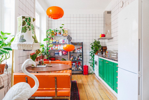
Have you ever craved quirky, kooky, colorful design in your home, but you don’t quite feel you have the courage? Well, we’ve found some inspiration for you! This home, in Stockholm, Sweden, appeared on a Swedish real estate site, and we took notice. It’s a 56 square meter apartment up for sale for 5.05 million kroner. And it couldn’t be funnier or freer in design!
What we’re liking is its bold use of primary colors — the sort of colors that come straight out of your child’s box of crayons, along with wacky, idiosyncratic, design choices that move this apartment out of the realm of the simply colorful into the world of the wild.
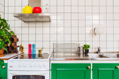
Above, the lower cabinets in the kitchen are painted a bright kelly green which stands out, in a good way, against the basic white tiled kitchen wall that remains a clean, modern, grid backdrop. Accessories like salt and pepper shakers in magenta and sky blue and bowls and tea kettles in cherry red and lemon yellow, help balance the color of the cabinets and pick up on the happy, child-like theme.
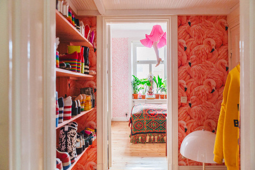
Pink flamingo wallpaper in the hallway continues the feeling of the unexpected. And the funky platform shoe collection points to more off-the-wall individuality. We wonder if the owner of this apartment might actually be a professional clown?
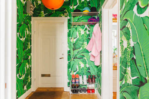
In a different hallway, bold, green palm-frond wallpaper again picks up the playful nature theme. Contrasting elements are the bold pumpkin orange pendant, along with a few colorful shoes and clothes on a practical shoe and clothes rack.
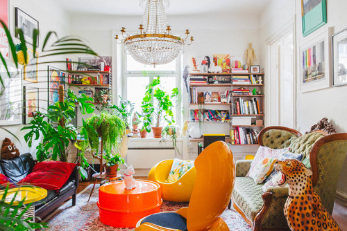
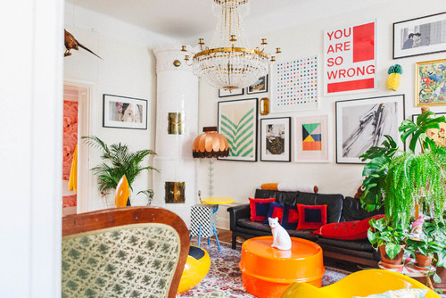
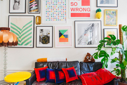
Take a look at this living room. We’d call it unapologetically maximalist, with its mix of eras, colors, prints, and artwork. And the best thing about it is that there is nothing particularly trendy or costly in sight. This is pure vision (and a practiced, studied eye) at work.
Another angle:
And here’s a view of the gallery wall:
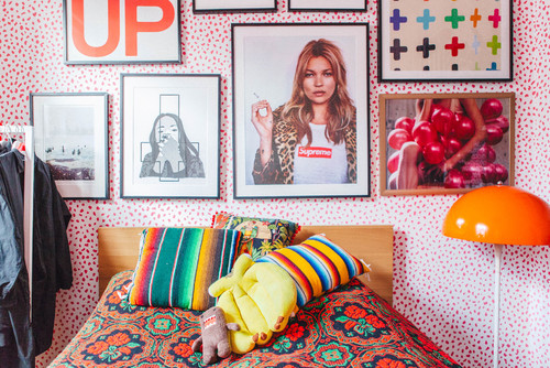
Here’s more in the bedroom:
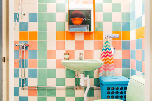
And the happiness continues in the bathroom:
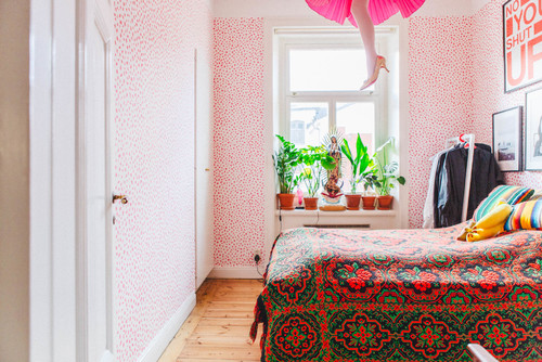
Polka-dot wallpaper and a hanging pendant leg lamp make for pure laughs.
This Scandinavian home is the exact opposite of what so many of us associate with “scandinavian” design. It’s not about minimalism or all white, or all black, and we applaud the owner of this home for taking a path so very different from most.
What’s our take away for going quirky?
- Be fearless. Take chances with color and design choices. It’s okay to go kitsch!
- Use wallpaper. It’s an opportunity to inject instant funk into any space, depending on how bold you go.
- Mix patterns. In the bedroom below, a small polka-dot wallpaper looks great with a larger-patterned, bolder bedspread.
- You can never go wrong mixing bold primary colors. Colors of equal intensity that contrast and complement on the color wheel will always look great together, as long as they are also allowed to breathe with a white or neutral backdrop.
- Forget the name-dropping. There’s no need to drop a lot of money on new “brand name” and “designer” pieces. All you need is a thrift shop around the block and a good eye.
So the question is, would you have the guts?
