Design Dilemma: A Back to Basics Moment
We’re having a back to basics moment. Again and again, at furniture and design fairs and between the covers of glossy shelter magazines, we are noting that one thing rings true for 2017: designers are pushing simple, streamlined styles that are mature and timeless rather than radical or wild. Perhaps it is in reaction to the political and social tenor or our time. What we are looking for these days can be boiled down to no excitement.
Reports from the Salone del Mobile in Milan this year seemed to support this theme. Sober and calm, for example, pretty much sums up what was on view earlier this year, in the form of were luxurious minimal pieces and very large, comfortable sofas where the entire family can cocoon together. Sofas were not avant garde, but safe. And while large, they were not bulky. The rule of thumb was simple lines, rounded forms and neutral colors, finished in high quality materials with lots of attention to detail. Gray, beige and tweed made a big appearance in this mature, sober environment.
So what does this look translate to at home? Let’s take a look.
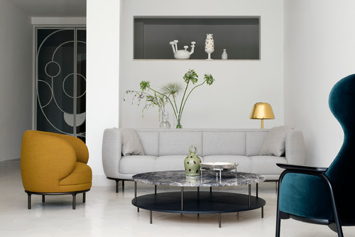
Below, the sofa “Vuelta”, by Jaime Hayon for Austrian company Wittman, seems to exemplify the spirit of 2017. The design is simple and classic. The material is a tweedy gray. The couch is a large one, but it is not bulky in any way, perched as it is on dainty black legs that eliminate a bulky feel.
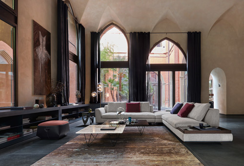
And here is yet another interior direct from the Salone Del Mobile. It’s the Tama Living sofa amd Mwamba carpet by Eoos Design, for German manufacturer Walter Knoll.
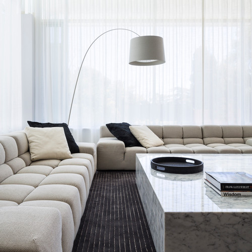
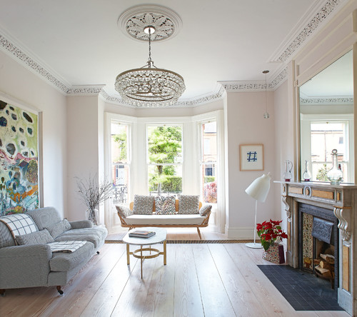
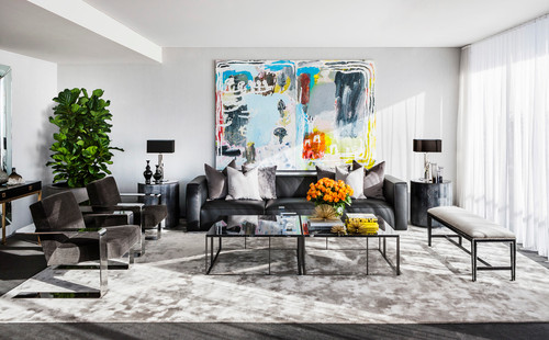
The Manhattan living room below seems to pick up on a few of the trend to sober calm. The colors are neutral and feel tranquil. The room feels timeless, embracing a mix of furniture styles, both modern and traditional. A few dramatic elements like large art add some spice.
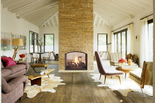
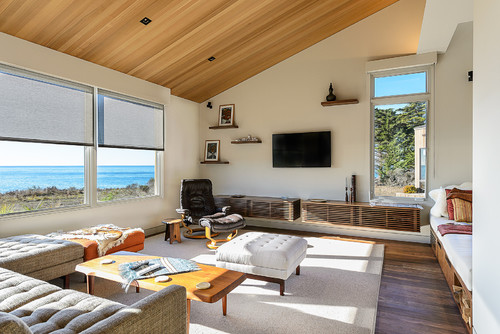
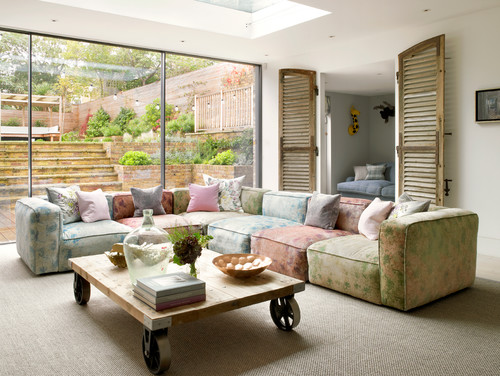
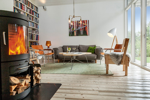
And here, a farmhouse feels modern and fun, but calming, thanks to sculptural furniture in rounded and organic shapes in soft neutral colors.
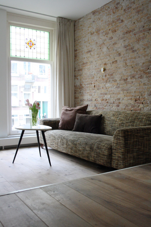
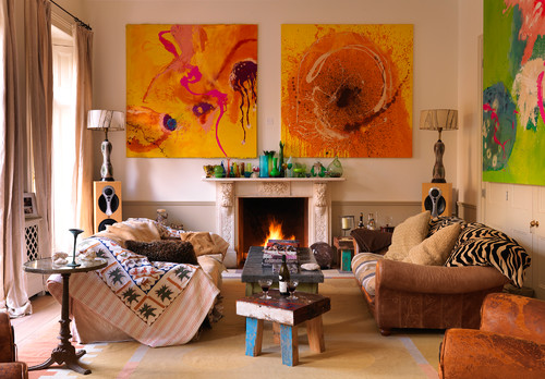
Here’s another relaxing space:
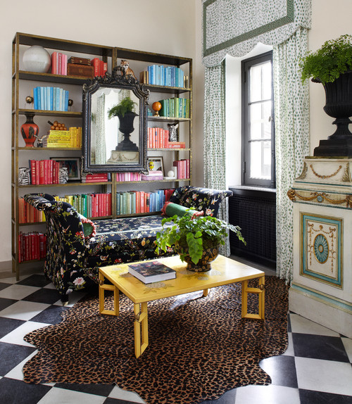
And here:
And here:
And here:
So what should you keep in mind if you want to go back to basics?
- Don’t overstuff your rooms with furniture. Pare back. In most instances, just a couch and coffee table are enough for a living room.
- Choose less furniture, but very comfortable furniture. Make sure that couches are big enough to really stretch out on. Your rooms should invite relaxation.
- Glory in neutrals. Avoid brighter colors, and stick with either grays, beiges or softer almost pastel-like colors.
- Choose rounded furniture pieces with organic shapes.
- Embrace tweed — on upholstery and carpets.
- Celebrate natural light. Let the light take the center stage, rather than the furniture.
In unpredictable times, nothing calls like the lure of predictability!
Design Dilemma : Area Rug Transformations
One of the easiest ways to lend eye-popping style to any room is through one element alone: an area rug. In one fell swoop, a room can become classic or trendy, sophisticated or wacky. An area rug is one of the easiest ways possible to show off your personality, whether you’re a wallflower or the life of the party. And the best thing about rugs is that they can easily be swapped out or traded when you tire of any one look. Just switch them around from room to room, or layer them when you want something completely different. If you don’t take advantage of all the possibilities a good rug can give you, you’re really missing out on an opportunity.
So what’s your personality?
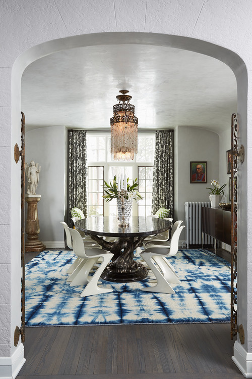
Classic with an artsy twist.
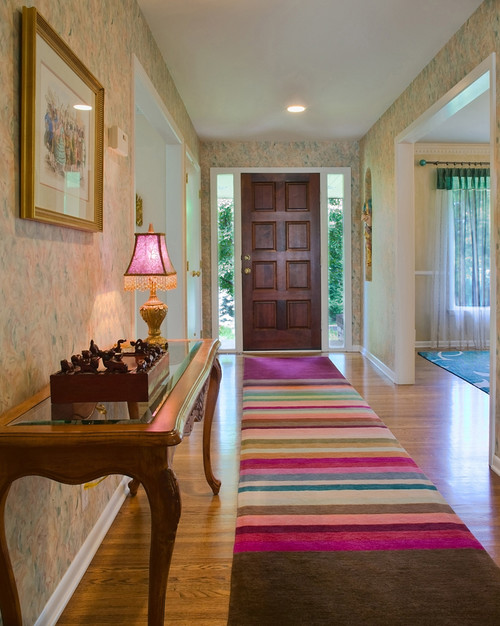
Let’s say you like order and classic decor, but you have an adventurous side that enjoys the arts and a little bit of color. The runner above called Bar Chart Bliss by Julie Dasher Rugs, is the perfect choice to inject a little drama in a very classic interior without going too wild. It’s just bright enough and unexpected enough that your friends will know you’ve got a wilder side but it’s also extremely practical and resistant to dirt and stains. That alone makes it an excellent choice for high traffic areas like the entry.
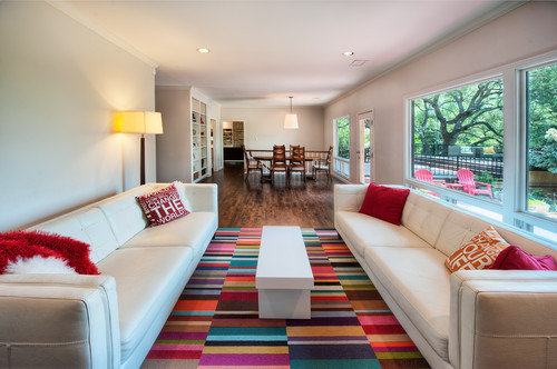
The colorful geometric rug above also fits in with this personality type. Geometry suggests order and refinement but the bright colors are certainly beyond the pale!
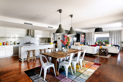
The rug above, is another of the color block looks. Again, the rug gives the room an artsy vibe, but in an ordered sort of way that looks great with classic white couches and white metal chairs.
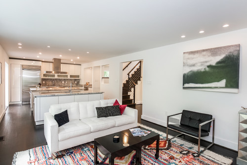
This shaggy, colorful area rug in a Washington DC home is just unexpected enough to inject some bo-ho flare into a crisp all-white interior.
Buttoned up Glam.
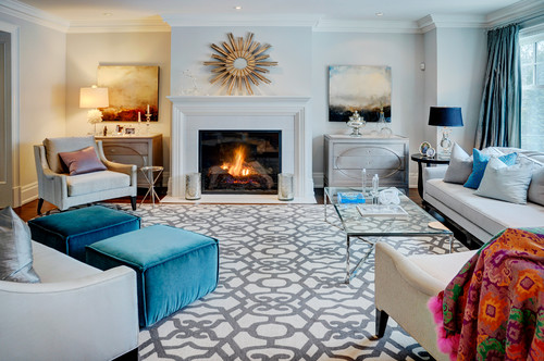
So you follow the trends and you like luxury, but you like to keep things sophisticated and not too in-your-face. The perfect rug for you could be this arabesque geometric rug in gray and white. The pattern is stylish and vibrant, but the gray and white palette refrains from taking over the room. The effect is a room that feels warm and lively but at the same time urbane and cozy.
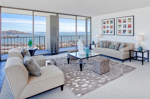
The room above takes a page or two out of the buttoned up Glam page book. The muted gray is cool and sophisticated but the raised shag of the rug hints at just a little bit of glam.
Solidly traditional.
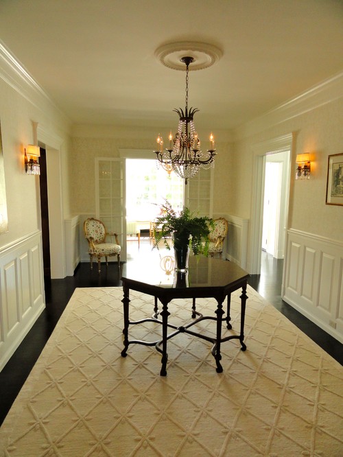
Got antiques, a historic home, and a penchant for beaded chandeliers, chair rails and wallpaper? Check out the butter yellow rug above, which manages to hold its own while letting the room’s architectural details stand out. The key to its pop is the raised diamond design that takes this solid rug beyond the place where most solid rugs are willing to go. The color looks fantastic against dark wood floors and picks up the butter color of the walls.
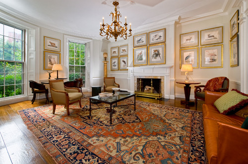
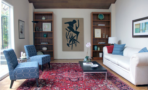
And what is there to be said about oriental rugs? They are always on point, working in both traditional and modern interiors. Their vibrant colors and patterns stand up to pets and children, and they always enhance any room of the house.
The room above is more transitional than traditional, but it uses a traditional oriental rug to lend the room a sense of rooted timelessness.
Sexy and Mod.
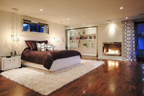
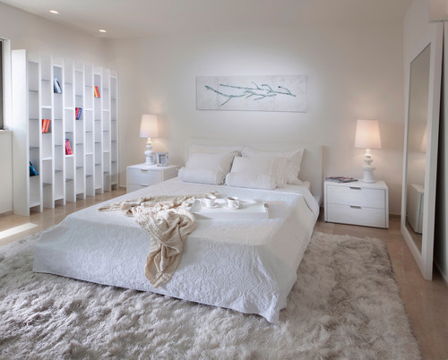
Shaggy flokati rugs were all the rage in bachelor pads of the 60s and 70s, and they still have their appeal today. Soft underfoot, shaggy rugs are perfect in the bedroom, where they speak of romantic nights before a roaring fire. Shags are particularly adapted to bedrooms, since bedrooms get less foot traffic, ensuring your shag rug will not get crushed and matted. Check out another soft, sexy bedroom below:
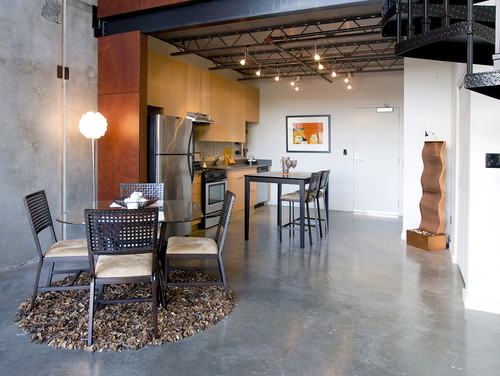
The leather rug above is a little too small for the environment, but the look is still sexy and modern in a masculine sort of way.
Outdoorsy.
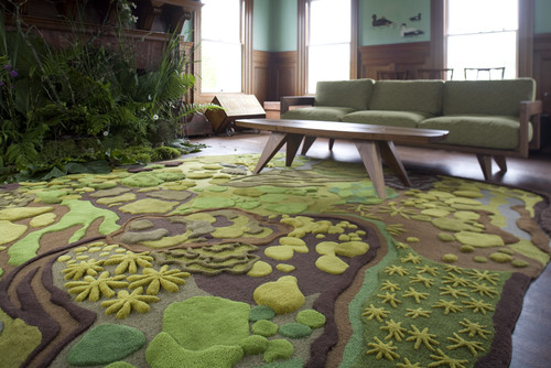
Do you wish you were living in a tree house? The next best thing may be this textured rug with a forest motif.
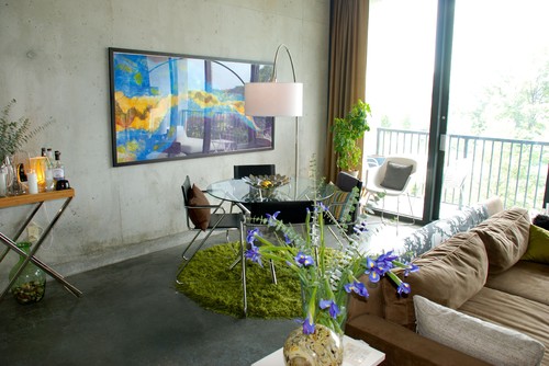
Or perhaps the grassy rug below:
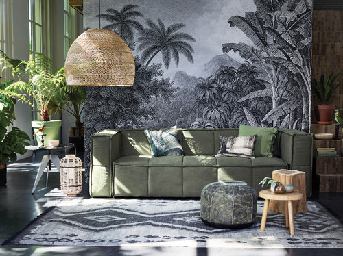
And in the room below, a patterned kilim feels appropriately earthy with the forest green couch.
Low-key
And when is a neutral, plain rug the best choice in a home? When you’ve got dramatic, stellar artwork that you want to take center stage!
Design Dilemma: The New Way to Do Floral
Floral pillows, floral wallpaper, floral couches, brings to mind visions of grandma’s house. But it doesn’t have to be that way. There’s a way to do floral that can feel funky and modern, hip and au courant. We’ve found a few interiors that embody all that. Let’s take a look.
Going Bold
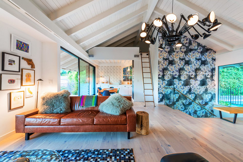
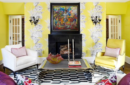
One of the best ways to bring floral patterns out of the grandmotherly mold is to make them big and bold. That’s something grandma wouldn’t have done. In the living room below, an accent wall of big bold flowers adds a funky punch that is complemented by smaller patterns on both the wallpapered kitchen wall and the geometric patterned rug.
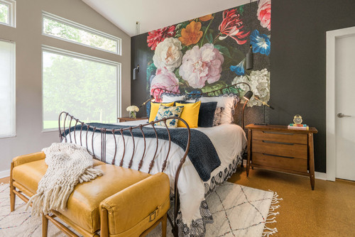
In the bedroom below, a huge floral wall treatment instantly gives a bedroom a luscious punch. What makes the wall feel particularly modern here is that they sit on a wall painted black. Grandma wouldn’t have done that, either.
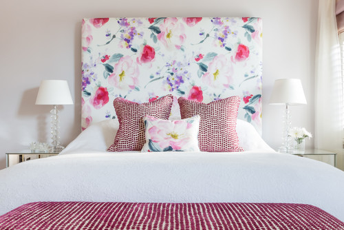
And here, a headboard upholstered in a dramatic and large floral makes a bedroom feel fresh and feminine.
Mixing Patterns
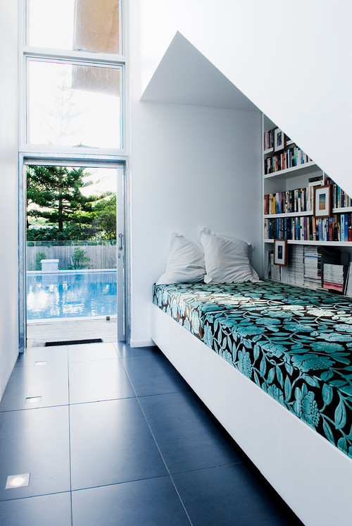
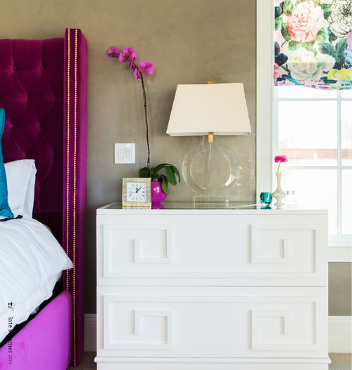
The new take on floral involves mixing florals with other sorts of patterns. In the rooms above, we see floral mixed with animal prints, geometric prints, and smaller scale patterns. Grandma’s tendency would have been to do up a room entirely in florals.
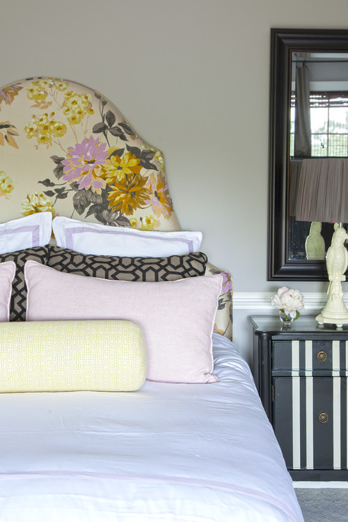
In the bedroom below, an upholstered floral headboard looks fresh and fashionable when contrasted with pillows with a geometric pattern
And below, another mix of florals and geometrics.
Floral with lots of white.
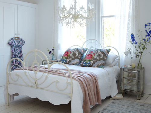
Large doses of white always seem fresh and modern.
And here:
And here:
A More Graphic Floral Pattern
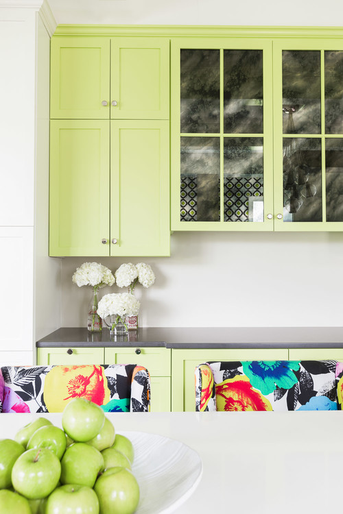
Floral patterns are not all equal. The more modern spin on floral involves patterns with a more graphic take and bolder colors. The print on the chairs below, for example, have an almost pop art Andy Warhol quality:
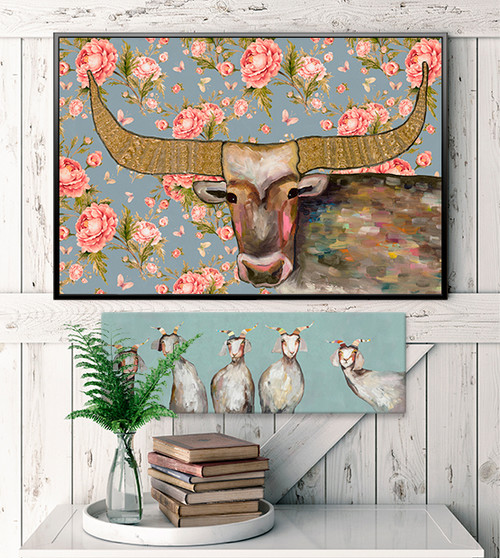
And so too does this actual painting incorporating flowers and a cow’s head.
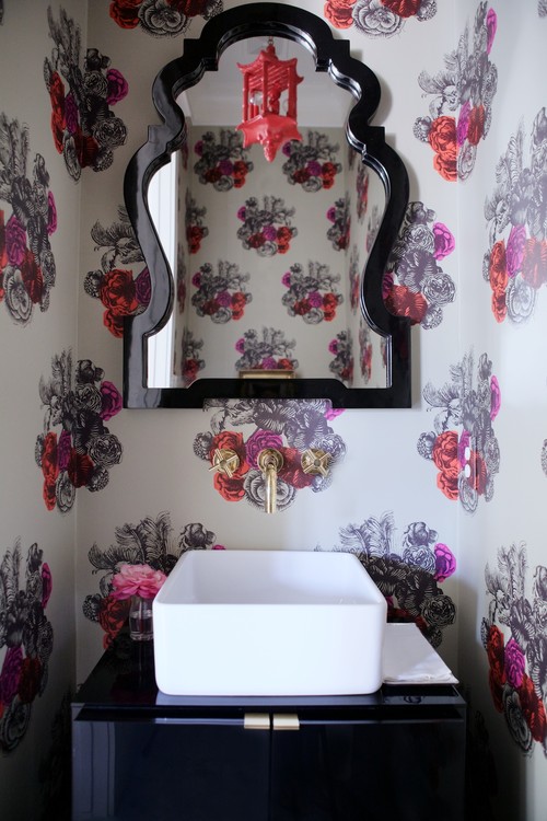
And below, vivid purple flowers in a guest bathroom feels very hip.
So what’s the takeaway? Simply put, florals have moved way beyond the faded floral prints of grandma’s house. No need to shy away!
