Design Dilemma: The Many Shades of Black Leather
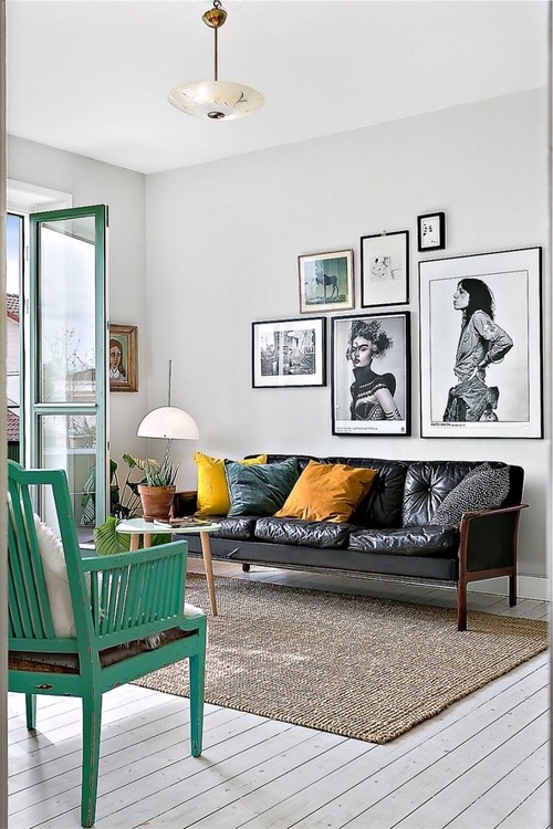
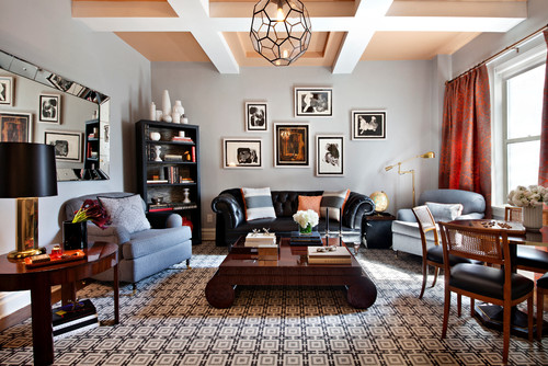
It used to be that black leather held connotations of bachelor pad masculinity. If you owned a black leather couch, you were a single guy living in a modern high-rise of glass and steel, and you threw some really wild parties, all week long. But somewhere along the way, all that changed. The vintage black leather couch in the photo above, for example, comes off as homey and inviting in a space that exudes anything but pumped up masculinity. Knowing that black leather is a practical option in so many households where pets and children have to be taken into account, we’ve dedicated this post to looking at how differently black leather can appear, depending on what you do with it.
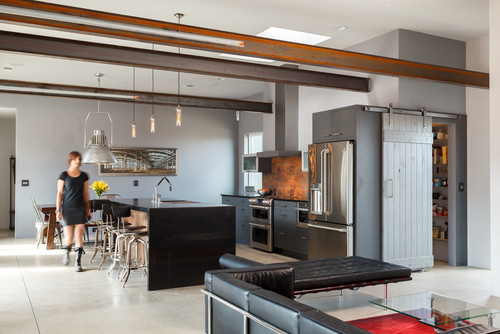
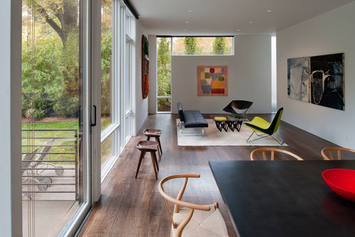
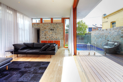
In the room below we find black leather in a setting in which it is used most often — that is, very contemporary, featuring glass, steel and dark cabinetry. This may be the most typical, black leather bachelor pad look.
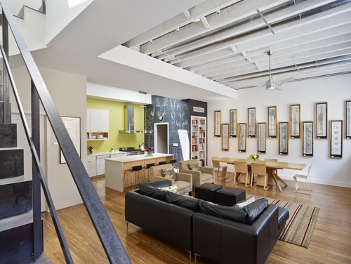
But black leather couches are adaptable and flexible enough to find a home in any type of interior. Below, we find black leather fits comfortable in a Scandinavian design living room using light woods, white cabinets, and an open, airy floorplan. With a chalkboard wall and the Japanese prints, this feels like a family home.
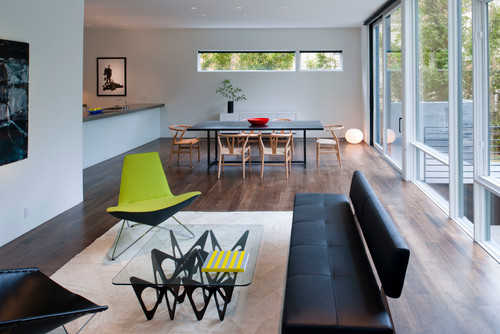
Who says black leather has to feel heavy? In the living room below, an armless design couch feels as light as a feather, and fits in perfectly with a Japanese minimal interior.
Here’s another view:
Here’s another black leather couch in a minimal room with an Asian feel:
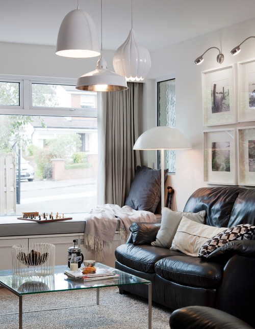
But black leather can feel cozy and contemporary too, like a place where you would just want to snuggle:
It can also feel, youthful, fun and funky, depending on how you accessorize:
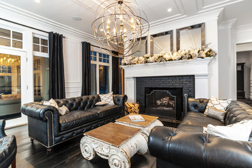
And here is a very traditional take on black leather, with a slight industrial vibe:
Here, black leather comes off as part of an upscale mens’ club:
And below, it comes off as homey and restful:
Are you considering investing in a black leather couch?
- Lighten up the heaviness that some black furniture pieces have by investing in color, elsewhere in the room. This could be a brightly-colored rug, bright throw pillows, or an occasional chair in a bright color, as seen in one of the rooms above.
- Consider painting a wall a bright color to provide some lift.
- Art, art, and more art is critical to offsetting the heavy feel. Notice that almost every interior featured here relies heavily on artwork. Black and white art works fabulously with black furniture.
- Add pattern. Patterned pillows and rugs add interest and keep a room from looking too monotone.
- Texture is critical. Nubby pillows, shaggy rugs, wooly throws, velvety arm chairs, will help give your room a comfortable feel.
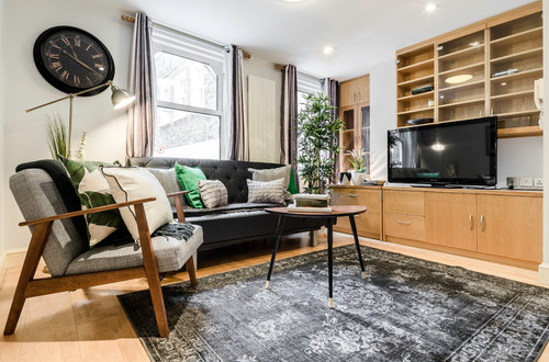
- If you want to keep things neutral, consider gray rugs, as in the picture above. If they’ve got a light pattern, even better.
- Consider oriental rugs and kilims. They are colorful, classic, handmade, and provide a nice warm counterpoint to the coolness of black leather.
- Add touches of black elsewhere in the room. Adding a bit of black here and there, in accessories, or even as a paint trim around doors or windows can help pull your room together.
Design Dilemma: Cozying Up to the Modern Fireplace
With winter in full swing, we’ve retreated indoors to cozy up beside the fireplace. What kind of fireplace are you sitting by?
These days, there are many options to choose from, ranging from contemporary to traditional, and we thought we’d take a look at the modern fireplace in all its permutations. Shall we?
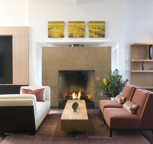
What distinguishes a modern fireplace from a traditional one? Usually, a modern fireplace will have far less detail. Often, there is no mantle, but a flat, clean line that is most often left completely unadorned, but which occasionally provides a frame for a painting, and in some instances, a TV.
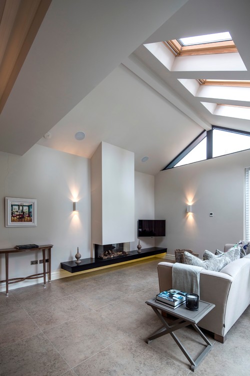
Below, an open concept living room in a London apartment virtually requires an open, streamlined fireplace, like the one below.
What’s so great about this fireplace is that the long, horizontal lines of the fireplace perfectly balance out the tall verticals of the room, which are emphasized by the vertical chimney that reaches for the skylit ceiling. The owners have avoided making the television the focal point by discreetly placing it off to one side. The message is that what is valued here is hearth and home, not staring into a screen.
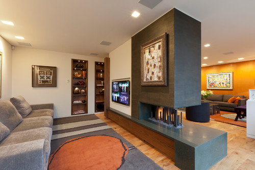
Also in the contemporary vein is this double-sided fireplace that is built to conveniently heat and be seen in two rooms — a living room and a den. It’s the perfect way of maximizing the presence of a fireplace in your home, without maximizing costs. Here, the owners have opted to use the flat space directly above the fireplace to hang a painting.
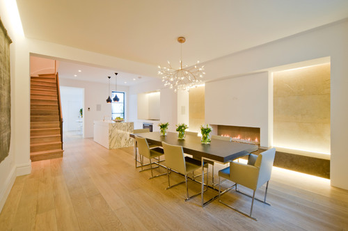
We know that contemporary fireplaces look cool in contemporary spaces, like the modern dining room below:
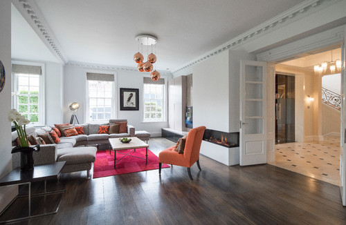
But what about traditional spaces and period homes? Can contemporary fireplaces work there? You bet! The London home below is a typical, traditional rowhouse, with a formal entryway and crown molding. But somehow, the low-slung contemporary fireplace without a mantle or traditional hearth fits in perfectly with the elegantly simple aesthetic.
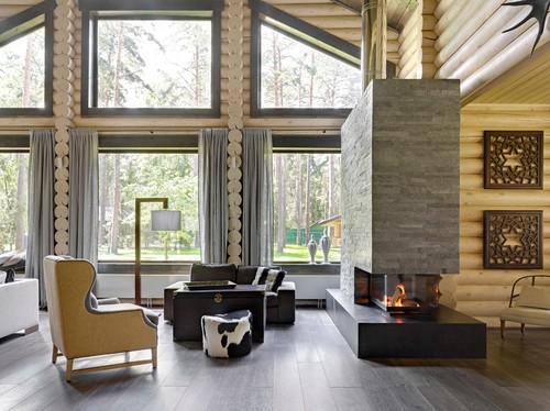
And again, in the rustic Russian cabin below, a fireplace contemporary in style, looks quite natural along with all the rusticity of the log walls, thanks to using a rough stone material on the fireplace to balance out the room’s rustic elements.
This contemporary fireplace in a London home has a TV screen built right in. While we’re not sure what this arrangement will do to the lifespan of your TV, it certainly is a space saver that acknowledges the importance of the TV in most homes today.
And another fireplace with the same idea, although this fireplace is made of stone. The stone helps to disguise to some degree the TV, making it a touch less prominent:
The asymmetric modern fireplace below with shelving and seating on each side is one of the few we have seen incorporating a mantle, which allows for leaning a photo.
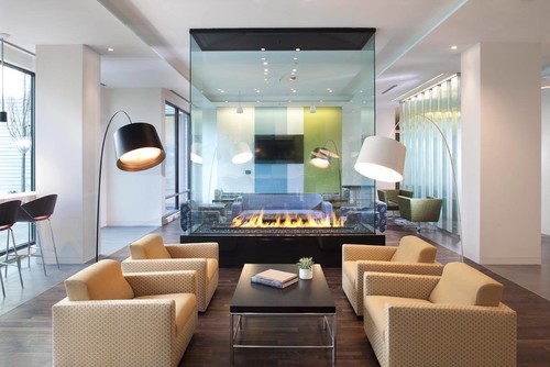
One of the coolest fireplaces we’ve seen is this glass fireplace, that virtually disappears when it’s not in use.
Here’s another with the same idea:
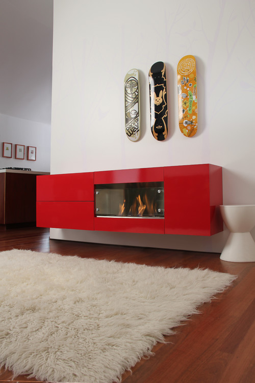
Finally, this modern fireplace would seem to be just a bright red console or cabinet when not in use.
So as you can see, there are a million different ways to go modern with your fireplace. And a contemporary fireplace doesn’t have to mean boring!
Design Dilemma: Five Design Trends on Their Way Out in 2017
We’ve already discussed a few key trends for 2017, including upholstered headboards, the return of forest green, the use of jewel colors at home, and a greater use of warm materials such as cork, wood and terra cotta tile. Now it’s time to discuss the trends of last year that are quickly fading.
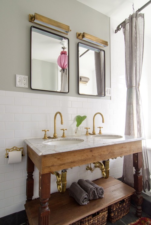
- OUT: Glitzy metals like chrome, brass, copper and gold. IN: unlacquered brass and organic textures.
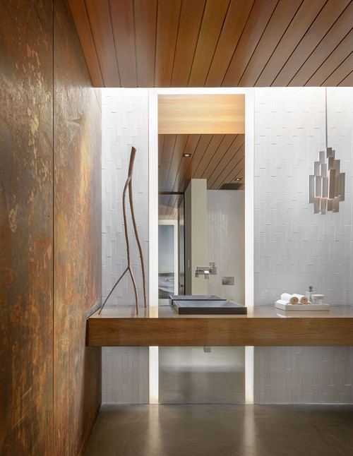
Brass and gold had a very brief run in popularity in the last couple of years, but already the tide has turned away from Trumpian glitz. Instead, the design world is increasingly turning to very organic materials, or at the very least, unlacquered metals and unlacquered brass, in what is known as a “living finish” that resembles something very organic and alive. You get a bit of the idea below, with a wall of unlacquered brass that lends the bathroom a soft, organic spa feel.
2. OUT: Minimalism. IN: Maximalism.
Minimalism has had a very long run, thanks in part, to the availability of products that has most of us swimming in more than enough stuff. Many of us just want to pare down. However, in recent years, this has often been taken to an extreme, especially in modernist and Mid-Century Modern environments where layering and patterns seemed verboten. Well, these days we’re craving a little coziness. Maximal interiors, like the one below, are not necessarily cluttered, but make full use of patterns, colors, layers, and a rich mix of textures and materials, including leather, velvet and sheepskin, contrasted with metal and wood.
The maximal living room below, does much the same thing in a profusion of rich deep color, pattern and textures. Say yes to wallpaper ad patterned rugs!
3. OUT: Reclaimed and dark woods. IN: lighter woods.
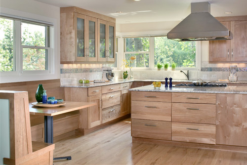
Reclaimed and dark woods have been everywhere in the past few years. So ubiquitous, in fact, that we all knew it was just a matter of time before the trend would grow old. Well, that time has come. Instead of reclaimed woods and very dark finishes like mahogany and ebony, people are opting for lighter woods such as oak, birch and pear which always seem to feel fresh and modern. Raw wood finishes, especially popular on dining room tables featuring “live edges” will continue to be popular. The red birch kitchen below is one example.
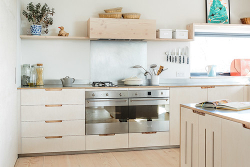
And below, another kitchen utilizing sustainably-sourced birch plywood:
4. OUT: Open kitchens. IN: Separate kitchens.
We’re still trying to wrap our heads around this one, as open kitchens are a mainstay in many homes and still highly-prized. Still, there are a subset of cooks who want to be able to shut the doors on the mess and cooking odors in the kitchen. Luckily, many designers and architects are listening to their desires.
5. OUT: Marble. IN: Terrazo and other types of stones and composites.
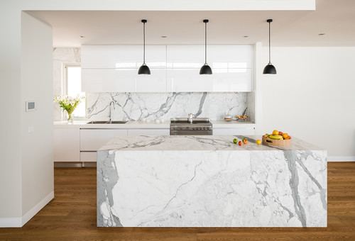
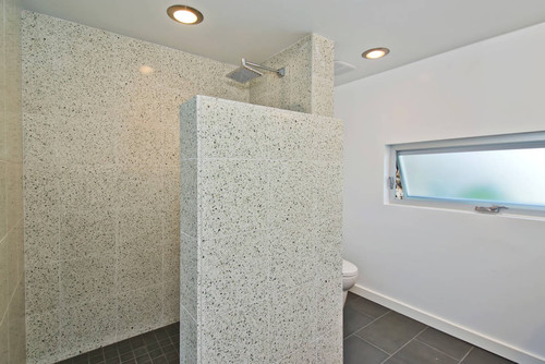
It’s hard to believe that luxurious marble could ever really go out of style, but what’s happened is probably just a reaction to overexposure. It seems that every upscale kitchen these days features Carrara marble countertops and backsplashes. People are likely to opt for something a little different in 2017 by choosing other types of materials, including Terrazzo. (Likewise, subway tile also suffers from overexposure and is likely on the way out.) Below, a shower style in Terrazzo:
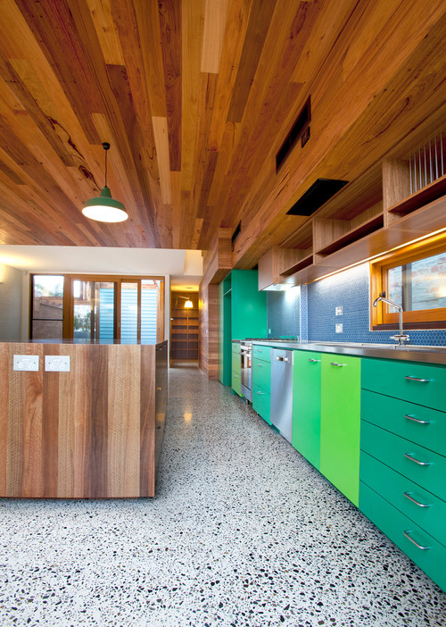
And below, a Terrazzo floor:
